


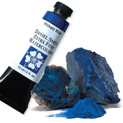
Daniel Smith Extra Fine Watercolours
 Dan Smith started his business in 1976, dedicated to bringing the highest quality inks to the print-artist community. In 1993, Dan set out to create a line of watercolours with one goal in mind: to bring the watercolour artist the very best product available. His dream came to fruition with the introduction of a hugely innovative collection of 27 paints that just happened to change the world of watercolours forever. Our pigments may come from every continent except Antarctica but our paints are manufactured in Seattle, Washington.
The DANIEL SMITH paint making lab is neither big nor impersonal. It is a world of machinery and colour, where the air smells of linseed oil, and everyone’s clothes are splattered with paint. The manufacturing R&D lab is the soul of the company, a place where ideas are shared, artist’s voices are heard, and new DANIEL SMITH colours are brought to life by a talented and dedicated production team. Artisans making paint for artists, they have your complete satisfaction in mind.
Each year more of the Daniel Smith chemist’s inventive creations are introduced. Early on, DANIEL SMITH Inc. was the first to offer Quinacridone pigments in artists’ paints. These fantastic, powerful colours, originally created for the auto industry, gave artists new and vibrant choices perfect for glazing. A buying frenzy ensued, and since then, these colours have been copied by other paint manufacturers. After all, imitation is the sincerest form of flattery.
DANIEL SMITH currently offers 249 different watercolours, with more in the works every year. The sheer range of possibility they offer is endless and unparalleled in the industry. Their amazing selection spans the spectrum from the historical, to our natural earth and PrimaTek colours, to their Quinacridones, the brightest and boldest colours modern technology has to offer.
Neutral Tint

Features & Benefits of the new Neutral Tint Watercolour.
Quick and reliable way to darken a colour while retaining transparency.
Produces gorgeous glowing darks rather than muddy colours.
Tones down colours.
Makes lovely, colourful shadows when mixed with colors.
Wonderful alone for quick value sketches.
When working with a limited palette, Neutral Tint is a great choice because it is the compliment to every colour!
Great for travel sketching when palette space is limited, and still be able to create a good range of colours.
Reliably darkens a colour like using the color’s complement - without having to use the exact complement.
A Benefit to Artists at all levels, enjoy watercolours without worrying about muddying the colours.
Primatek Colours
Certain colours have captured the imagination of artists for hundreds or even thousands of years. Daniel Smith's exclusive PrimaTek® Colours are made from naturally occouring pigments, reviving a tradition of making paints the way the ancient Egyptions, Mayans and other early cultures did. to find these rare pigments, Daniel Smith's mineralogist circles the globe, going to some of the most remote areas of the world. their diversity is amazing, from the subtle earth tones of Hermatite, Zoisite, Tiger's Eye and Sedona to the exquisite jewel shades of Rhodonite, Amazonite and Lapis Lazuli Geniune. As you Paint with these colours, we know you'll experience something new in your watercolour mixtures and paintings.
One or two customers have had questions about Lapis Lazuli genuine. They expected a much stronger blue colour and also found that the pigment had separated from the gum arabic in the tube. Below is more information from Danial Smith on this pigment;. The separation of pigment and gum arabic can also occur in other colours such as Cobalt Violet and Smalt.
"Our Lapis Lazuli Watercolor is a color we are very proud of. Back in 1998, Lapis Lazuli was the very first PrimaTek color manufactured in our lab. It was the excitement and enthusiastic response from artists that pushed us forward to developing more and more natural pigment colors. Our Lapis has remained one of our most popular colors. The “oily substance” you are referring to is actually Gum Arabic, the binder we use in all our watercolors. True Lapis Lazuli is naturally a very dense pigment and because we have so much Lapis pigment in our paints, pigment can settle to the bottom of the tube (think of sand in water) which then pushes the Gum Arabic to the top, if there is some separation when squeezed onto your palette you can stir the gum Arabic back into your pigment or wipe it away if so desired. Your color will not be affected. Our Lapis pigment is 80% pure; you cannot find a purer Lapis pigment from any manufacturer in the world. Lapis pigment does not look like Lapis gem stones – once pigment is brought down to the micron level (half the diameter of a human hair) the refraction index changes, and becomes a lighter blue color. Adding more pigment than we already add would not change the color that you see from our tube – a subtle blue.
To give you a scope, Ultramarine Blue Pigment, PB29, is one thirtieth the cost of Lapis Pigment. Yet the very inexpensive Ultramarine Blue is one of the deepest blues you can purchase. Some other companies will add synthetic ultramarine blue to their Lapis paint to make it darker, but we do not. This adulteration changes some of the Lapis characteristic color properties. Pure Lapis has specific light reflective properties (due to the irregular and angular shape of the pigment particles). A touch of golden pyrite as an inclusion adds a delightful shimmer. The result is an elegant, almost three-dimensional effect that is completely different from the predictable blue of synthetic ultramarine pigments.
What we give to artists is actual pigment that we process ourselves to exacting standards. I have two chemists that verify every batch and then compare them against retain batches such that we have batch to batch consistency. There are only 5 companies in the world that have their own chemists and operate to this high standard, and we are one of them."
Click here for detailed information on the Daniel Smith Extra Fine Watercolour colours including several videos of the colours baing painted out.
Luminescent Colours
Used alone or mixed into standard colours, they create striking effects of light and colour. Miniscule particles of titanium-coated mica are the secret. Different size particles and thicknesses of coating provide the dazzling array of choices only DANIEL SMITH offers.
Interference and Pearlescent colours appear almost colourless, but when applied over a dark colour the bounce back gleaming colour. The Interference colours actually take on different hues according to where the viewer stands and how the light is striking them. Viewed from one angle, Interference Green is exactly that - a shimmering, pearly green. Viewed from another angle, it reflects a redish hue.
Daniel Smith's Duochrome colours, the newest in the Luminescent line, bounce between two distinct colours depending on the reflective light. Pure visual excitement!
The Iridescent colours reflect light directly and provide a fascinating sense of depth, along with intense colour and a distinctive sheen.
Click here for detailed information on the Daniel Smith Luminescent Watercolour colours including several videos of the colours baing painted out.