Liquitex Professional Acrylic Ink
Super fluid, professional level acrylic paint
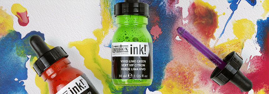
Created using super-fine pigments suspended in a state-of-the-art acrylic emulsion, Liquitex Professional Acrylic Ink offers extremely fluid acrylic paint with vibrant colour. Quick drying and permanent, these inks are non-clogging and water resistant making them ideal for a wide variety of artistic techniques.
Spectrum: 30 Colours
Properties: Highly pigmented, Fluid
Consistency: Extremely fluid
Finish: Satin
Available in a range of 30 vibrant colours, Liquitex Professional Acrylic Inks are made with super-fine artist grade pigments that are captured in a cutting-edge acrylic emulsion. As each colour is made with the finest artist pigments, these inks can offer incomparable lightfastness, so your artworks will go down in history! These fluid acrylic colours can be used for a whole variety of different artistic applications; ideal for airbrushing, screen-printing and stamping amongst others. Ink can be watered down to an even more fluid consistency to create interesting watercolour effects. Liquitex inks can also be seamlessly used with any other Liquitex Acrylic paints or mediums. The entire Liquitex Acrylics system is completely intermixable, so whether you want to use Soft Body, Heavy Body, Inks, Paint Markers or a combination of all four, they can be mixed perfectly to bring your artistic visions to life!
Techniques
|
|
|
Colour Matched
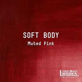
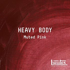
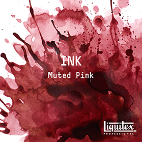
Colours are also matched across the Liquitex Professional Acrylic range, so you can use your favourite colours no matter which medium you choose. Liquitex use only the highest grade artists pigments to ensure maximum lightfastness and permanence of artwork so it will last the test of time.
|
|
|
Above are swatches of Liquitex Muted Pink from the Muted Colour Collection, demonstrating how Liquitex colours are colour matched across Soft Body, Heavy Body and Acrylic Ink. | ||
Uniquely Intermixable
You're creative vision will be limitless with the knowledge that all Liquitex Professional Acrylic paints and mediums are all fully intermixable. Every product in the range has been specifically developed with maximum compatibility and versatility in mind; a compatible acrylic binder is used in each product to ensure inter-mixability whilst preserving their archival quality. Switch between your favourite Liquitex Professional Acrylic products to bring interesting textures to your work; layer tube colour, paint markers and ink or work wet in wet with mediums for limitless effects. Go your own way and try out your favourite techniques, or mix and match to create your own methods!
Choosing your Liquitex Professional Acrylic Inks
The Liquitex Professional Colour Chart is designed to help you select the perfect colour for your work. Each colour has its own unique characteristics and personality, which the colour chart addresses. Some pigments are brighter, and some more opaque, some even stain your painting surface. All of these individual characteristics add to the creative experience and can be worked to your advantage to enhance your images.
Colour characteristics: Each colour chip on the Liquitex Professional Acrylic Ink product page shows both the 'masstone' and the 'undertone' of each colour. The masstone refers to the colour when it is applied at its thickest, creating a very dense and opaque colour. The undertone of a particular colour can be seen when it has been applied sparingly in a thin layer, or has been watered down to become more transparent. Some properties of particular colours only become apparent in the undertone.
Opacity: The colours in the Liquitex Professional Acrylic Ink range have varying degrees of opacity. Some pigments, such as the cadmiums, offer very dense opaque colour that will allow very little light to pass through. These kinds of pigments are denoted with a black box. Some pigments, such as the Phthalocyanine colours behave more like stained glass; allowing light to penetrate through to create transparent colour. These kinds of colours are labelled with a white box symbol. Other pigments such as Carbon Black and Sap Green fall somewhere between the two, not completely opaque but also not fully transparent. These colours are known as translucent and are labelled with a half white, half black box.
Single or Mixed Pigments: Single pigment colours are formulated to help maximise the true and unique character of the colour. These colours will also give brighter, cleaner mixes compared to their mixed-pigment counterparts. Mixed-pigment colours offer the convenience of a pre-mixed colour, comprised of two or more pigments, that would otherwise be difficult to mix on your own and achieve the same brightness.
By looking at these characteristics, you should be able to narrow down and select the colours that will be of most use to you. You can also see all the colours from the Liquitex Ink range being used and painted out. Watching the playlist below will give you a better idea of how the inks behave on paper and will help you to select your colours.
> Watch the playlist of all 30 Liquitex Professional Acrylic Inks
Composition and Permanence Chart
The composition chart below includes precise pigment information, giving you a little extra information to help you choose the best colours for your work.
Composition and Permanence Chart | ||||||
Colour # | Colour Name | Lightfastness | Single of Mixed Pigment | Opacity | Pigments | |
|---|---|---|---|---|---|---|
159 | Cadmium Yellow Light Hue | I | S | Transparent | Quinophthalone Yellow (PY138) | |
337 | Carbon Black | I | S | Translucent | Carbon Black (PBK7) | |
470 | Cerulean Blue Hue | I | M | Opaque | Titanium Dioxide (PW6), Phthalocyanine Blue (PB15:3), Chlorinated Copper Phthalocyanine (PG7) | |
115 | Deep Violet | II | M | Translucent | Quinacridone Magenta (PR122), Carbazole Dioxazine (PV23) | |
186 | Dioxazine Purple | II | S | Transparent | Carbazole Dioxazine (PV23) | |
234 | Iridescent Bright Gold | NR | M | Opaque | Iron Oxides/Titanium Dioxide Coated Mica | |
236 | Iridescent Bright Silver | NR | M | Opaque | Iron Oxides/Titanium Dioxide Coated Mica | |
229 | Iridescent Rich Bronze | NR | M | Opaque | Iron Oxides/Titanium Dioxide Coated Mica | |
230 | Iridescent Rich Copper | NR | M | Opaque | Iron Oxides/Titanium Dioxide Coated Mica | |
292 | Naphthol Crimson | II | S | Transparent | Naphthol Carbamide (PR170) | |
599 | Neutral Grey Value 5 | I | M | Opaque | Titanium Dioxide (PW6), Carbon Black (PBK7) | |
317 | Phthalocyanine Green (Blue Shade) | I | S | Transparent | Phthalocyanine Blue (PB15:3) | |
316 | Phthalocyanine Blue (Green Shade) | I | S | Transparent | Chlorinated Copper Phthalocyanine (PG7) | |
319 | Phthalocyanine Green (Yellow Shade) | I | S | Transparent | Chlorinated and Brominated Copper Phthalocyanine (PG36) | |
320 | Prussian Blue Hue | I | M | Transparent | Phthalocyanine Blue (PB15:3), Carbazole Dioxazine (PV23 RS), Carbon Black (PBk7) | |
321 | Pyrrole Red | I | S | Transparent | Pyrrole Red (PR254) | |
114 | Quinacridone Magenta | I | S | Transparent | Quinacridone Magenta (PR122) | |
335 | Red Oxide | I | S | Opaque | Synthetic Iron Oxide Red (PR101) | |
315 | Sap Green Permanent | I | M | Translucent | Chlorinated Copper Phthalocyanine (PG7), Diarylide Yellow HR70 (PY83), Carbon Black (PBk7) | |
432 | Titanium White | I | S | Opaque | Titanium Dioxide (PW6) | |
129 | Transparent Burnt Sienna | I | S | Transparent | Synthetic Iron Oxide Red (PR101) | |
130 | Transparent Burnt Umber | I | M | Transparent | Synthetic Iron Oxide Red (PR101), Carbon Black (PBk7) | |
332 | Transparent Raw Sienna | I | S | Transparent | Transparent Iron Oxide Yellow (PY42) | |
333 | Transparent Raw Umber | I | M | Transparent | Transparent Iron Oxide Yellow (PY42), Transparent Iron Oxide Red (PR101), Carbon Black (PBk7) | |
561 | Turquoise Deep | I | M | Transparent | Phthalocyanine Blue (PB15:3), Chlorinated Copper Phthalocyanine (PG7) | |
740 | Vivid Lime Green | I | M | Transparent | Quinophthalone Yellow (PY138), Chlorinated Copper Phthalocyanine (PG7) | |
620 | Vivid Red Orange | I | S | Transparent | Naphthol AS (PR188) | |
412 | Yellow Medium Azo | I | S | Transparent | Arylide Yellow 5GX (PY74) | |
414 | Yellow Orange Azo | I | S | Transparent | Diarylide Yellow HR70 (PY83), Diarylide Yellow (PY83) | |
416 | Yellow Oxide | I | S | Opaque | Synthetic Iron Oxide Yellow (PY42) | |
NR – Colours not rated for ASTM lightfastness. Internal testing indicates this pigment to be the equivalent to ASTM I and II. Some composition and pigment information may change based upon availability or improvements to the range. | ||||||


