£5 OFF Orders over £50 | Use Code 585C
Colour Mixing
The objective of colour mixing in painting is to create the largest number of options from the minimum number of colours and to be able to mix the colour you want. The ability to succeed depends initially on the quality of the colour. Winsor & Newton was founded in 1832 by two artists determined to improve the range of colours available to painters and provide colours of greater permanence.
Serving these aims decade after decade requires the understanding and application of colour theory by Winsor & Newton to their ranges.

Mark Jessett Painting in Designers Gouache
Basic Colour Theory (subtractive colour mixing)
For reasons of simplicity, we are taught when young that the three primary colours - red, blue and yellow - are all that are required for colour mixing. In fact, in pigment form every colour has both a masstone and an undertone which is different to the next colour.
Looking at the illustration below for example, a blue pigment will have either a red undertone or a green undertone in comparison to another blue pigment. Ultramarine is a red shade blue whilst Prussian blue is a green shade blue.
The undertone or bias of each colour however, is relative to the next one. For example, Winsor Blue is red shade in comparison to Phthalo Blue, but both would be classed as green shade blues. The colour bias is often most easily seen in a tint. (as below)
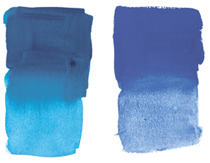
Left-Right: Phthalo Blue and Winsor Blue
So, red, blue and yellow alone are not the whole story and in fact six colours provide a wider base for colour mixing: a red with a yellow bias, a red with a blue bias, a blue with a green bias, a blue with a red bias, a yellow with a red bias and a yellow with a green bias.
Applying This In Practice
The hue and undertone of each colour are best seen on the Designers Gouache Hand Painted Colour Charts produced by Winsor & Newton. Printed tint cards can only indicate hue and undertone as closely as is possible within the limitations of the printing process.
So, in practice: if an artist wants to mix green; blue and yellow are used. Looking at the illustration below, the greenest or cleanest green is made by using a green shade blue and a green shade yellow.
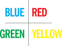
Three Primary Colours
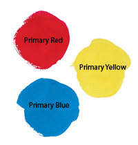 Of course, the use of three primary colours alone remains a good learning exercise. In this case, it is necessary to choose the red, blue and yellow which are the purest, e.g. the red which is as far as possible mid way between a blue shade and yellow shade. This ensures the cleanest violets and the cleanest oranges when using only one red.
The 3 primary colours recommended for Designers Gouache are: Primary Yellow, Primary Blue and Primary Red.
Secondary Colours - if any two primary colours are mixed together, the result is a secondary colour.
Tertiary Colours - are the mixtures made from a primary and its secondary in the colour wheel.
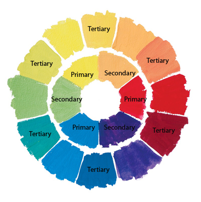
NB. Complimentary colours - are those that lie opposite each other on the colour wheel. If you place complimentary colours next to each other in painting, it has the effect of making each one appear more intense. If you mix them together you will achieve deep, dense darks.
The Six Colour System
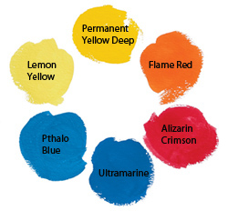
A broader spectrum can be mixed with six colours as discussed under Basic Colour Theory earlier. As a learning exercise, the move from three colours to six also begins to introduce other variables like opacity, tinting strength and covering power. Here is the recommended six colour palette for Designers Gouache: Lemon Yellow, Permanent Yellow Deep, Phthalo Blue, Ultramarine, Flame Red and Alizarin Crimson.
Traditional colour mixing theory for painters Vs ‘CMYK' the "4 Colour process"
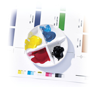 CMYK is an abbreviation used to describe the following colours, sometimes known as the 4 Colour Process.
C - Cyan, a bright greenish blue
M - Magenta, a blue shade red
Y- Yellow, a middle yellow
K - Black
The three printing ink colours are cyan, magenta and yellow, and across the world these are used in print technology. As there are limitations within printing and painting theories this gives rise to different primaries being used.
More commonly used in photography, printing and design, these colours can be found in the Designers Gouache range: Permanent Rose (CMYK Magenta), Primary Blue (CMYK Cyan), Primary Yellow (CMYK Yellow), Lamp Black (CMYK Black).
But, remember that each artists' colour has a masstone and an undertone; that artists require a package of handling properties and that permanence is also important. The recommended primaries therefore offer the best practical mixing properties combined with permanence wherever possible. However it is at the discretion of each individual artist to choose their own primary colour to achieve the results they desire.
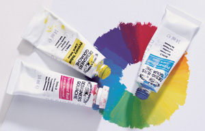
CMYK in Gouache
Proportions Used In Colour Mixing
A secondary colour is not necessarily achieved by mixing equal proportions of primary colours. Using the three primary colours of your choice, combine the primaries in different proportions to show the spread of possible colours. eg. mix red with yellow to show the range of oranges produced.


