
Colour Theory to Improve Your Paintings
Colour theory is an almost endless area of research that can feel a little daunting, especially if you are only beginning on your creative journey. However, there are a few simple strategies that can ease you into the wonderful benefits that knowledge of colour theory can bring.
I have learnt these strategies from a variety of sources; from long-established artists encountered on art holidays passing their information to me, to formal arts education and also my own wandering experimentations.
I won’t go into detail about all my colour theory knowledge, but instead, would like to provide 3 simple strategies that will make a big difference to your work.
Strategy 1: Pictorial Depth
This is something that can make a huge difference between artwork that looks amateur and artwork that looks more professional, and it applies to abstract as well as representational artwork. It can also be applied to whatever medium you are using from mixed-media to oil paintings and everything in between.
Essentially, this strategy is defined by the following:
Cool colours recede (go back) and warm colours advance (come forward).
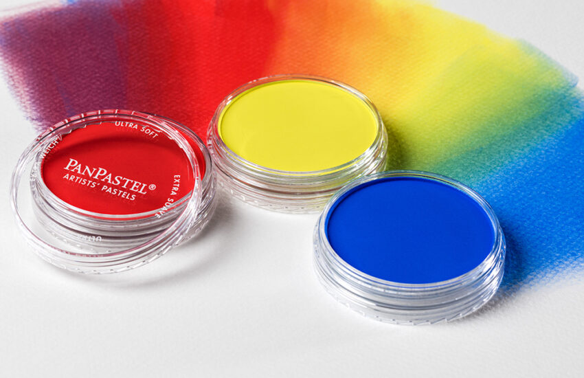
Generally speaking, blues and greens are cool and recede in pictorial depth and reds and yellows are warm and advance.
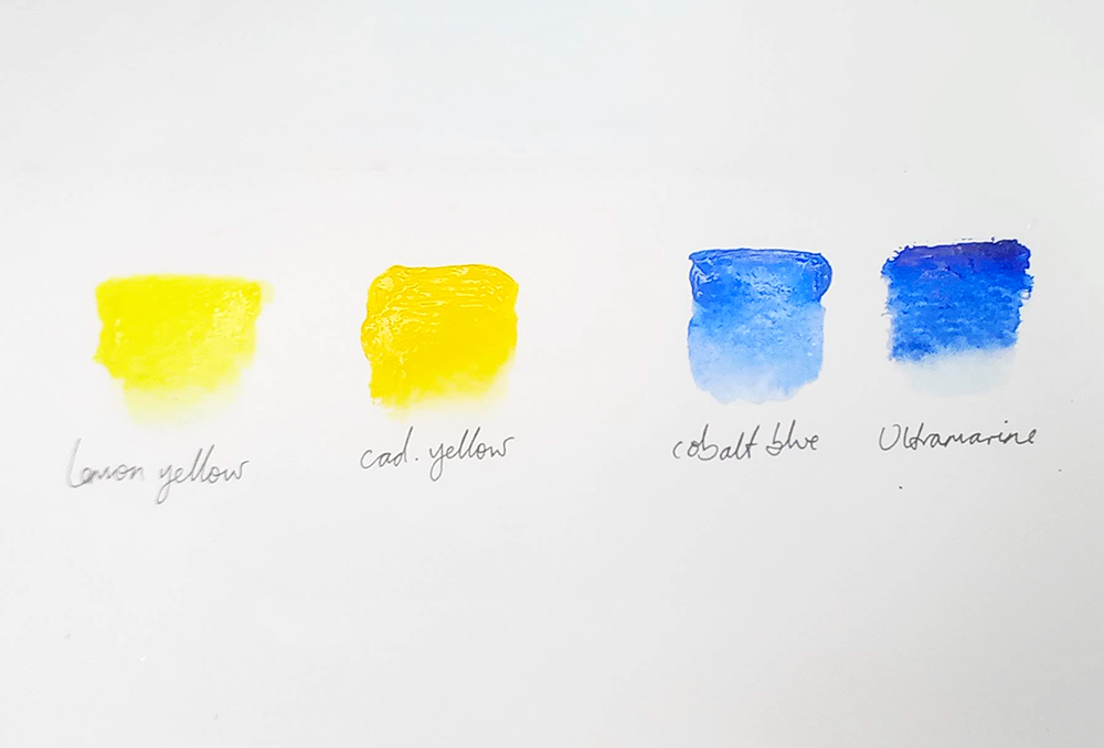
However, within these hues, we have warm and cool versions.
For example, Ultramarine Blue is warm, because it leans towards red on the colour spectrum. Cobalt Blue is cool because it doesn’t.
Cadmium Yellow is warm, because again, it leans towards red on the colour spectrum. Lemon Yellow is cool because it doesn’t.
Cadmium Red is warm because it has an orange tint, while Alizarin Crimson is cool because it leans towards purple on the colour spectrum.
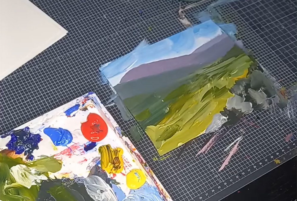
In the landscape painting above, I used Cobalt Blue in the distant mountains (cool) and Ultramarine Blue in the foreground greens (warm).
Whatever hue you use (main colour) if you use a cool version, it will recede (go back) in the pictorial depth i.e. appear as though they are further away. If you use warm versions, they will seem to pop forward in the pictorial plane.
So, if you were to paint some distant mountains, you would want to use cool colours to enhance the feeling of depth. If you were to add some warm orange grasses at the foreground, you would want to use warm yellows and red.
We need a mix of both warm and cool colours to enhance the feeing of pictorial depth in our artwork.
Dirty and Clean Colours
You might have heard people use this terminology to talk about colours, and it relates to our discussion of warm and cool.
As I said above, within each colour hue (main colour family) you have warm and cool versions. Depending what colour we want to mix, some of these will lead to dirty mixes and some will give clean mixes.
Dirty Mixes are muddy or earthy because they contain elements of all three of the primary colours (blue, red, yellow).
Clean Mixes are more pure or clear because they will have colours that don’t lean towards other shades.
For example:
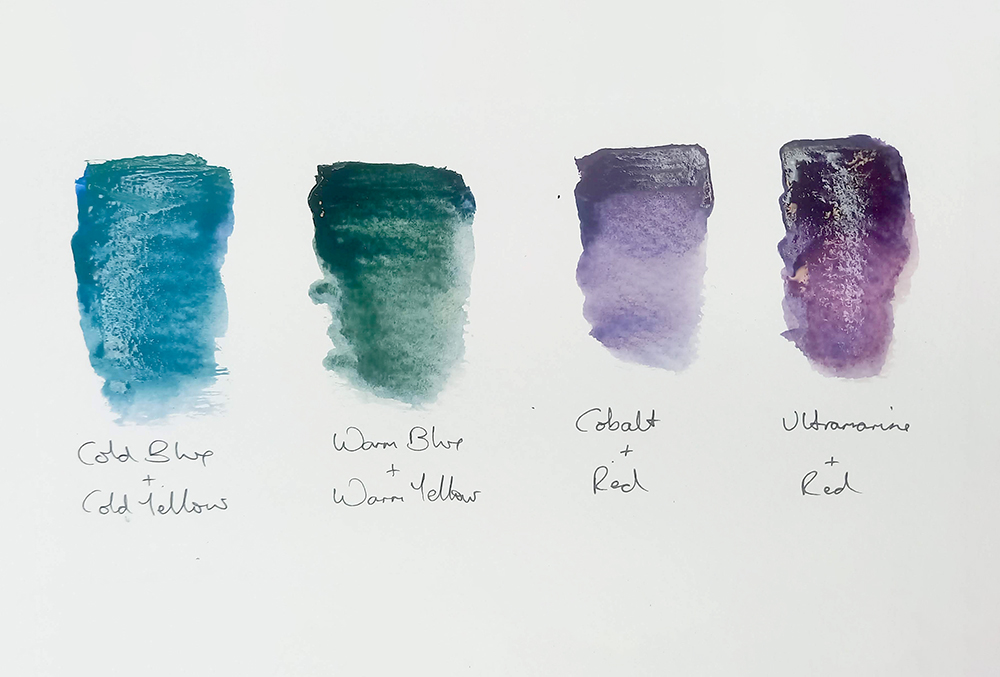
Ultramarine Blue leans towards red, so makes a beautiful clean purple, but mixed with yellow makes a dirty green.
Cadmium Yellow leans towards red, so makes a beautiful clean orange, but mixed with blue, makes a dirty green.
Cobalt blue leans slightly towards green, so if you mix red to it you get a dirty purple, but mix it with Lemon Yellow, and you get a lovely tropical (almost turquoise) green.
Sometimes we want dirty colours (for example for forest greens) and sometimes we want clean colours (for example for a tropical ocean). It’s important to know why we get the mixes that we do so we can learn to control them.
When you experiment with new colours, keep a note of whether they seem warm or cool to you.
Strategy 2: Mixing your Own Black
It is important to know how to mix your own black, so that you can then mix the full spectrum of greys and pastel shades.
Tube black is OK, but in some contexts can be a bit overpowering and can lead to a limited variety of greys.
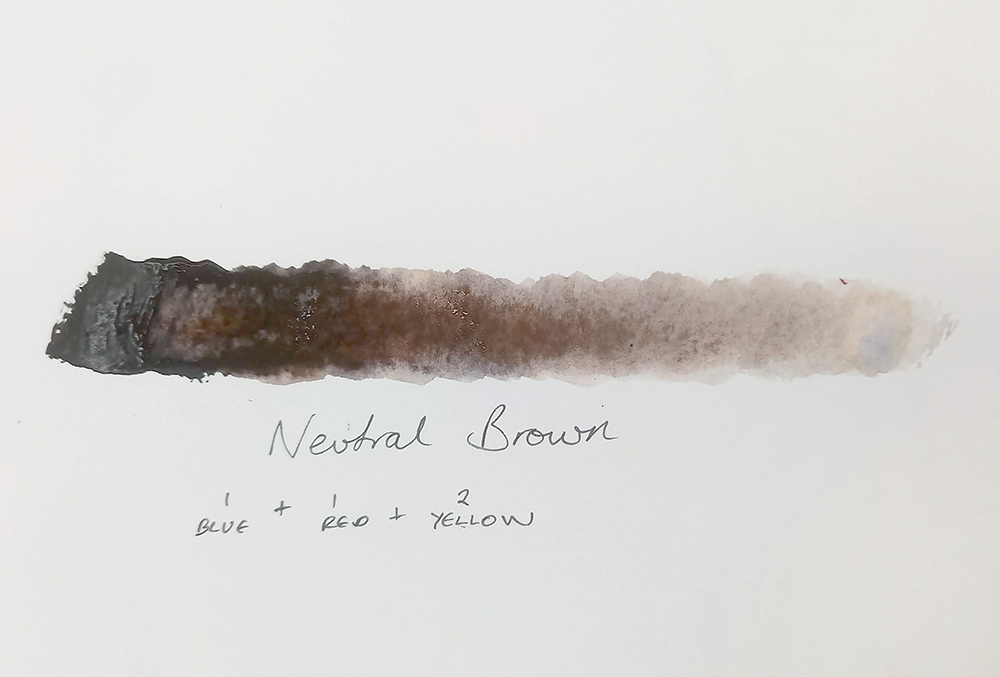
To make black I use the following mixture:
1 part Ultramarine Blue, 1 part Cadmium Red, 2 parts Cadmium Yellow
This will give you a lovely chocolate brown.
Add Ultramarine Blue to this brown until it takes you to the black that you want.
If it goes awry use this guidance:
- If the mixture is too brown – add more Ultramarine Blue
- If the mixture is too green – add more red
- If the mixture is too purple – add more yellow
Once you get your black, add varying amounts of white to get an amazing array of greys.
You can, of course, enhance this further by adding more yellow to make a green/black (and getting beautiful green/greys) or adding more red to make a purple/black (to get beautiful purple/greys) and so on.
Strategy 3: Add Brown to all of Your Colour Mixes – even your whites
This is an odd one, but it definitely works, trust me!
When you set up for a painting, start by mixing a good dollop of brown (see instruction above) and add a hint of it to every subsequent mix that you make, even the white mixtures.
This will ‘tone down’ your tube colours and do the following:
- Give a unity to your painting by linking every mixture to the other, through the shared presence of brown (even if the brown is imperceptible). This means that no area will overshadow or stand out too much from another.
- It gives a sense of depth to your colours. They don’t look as shallow or flat as they might have done.
- Your paintings therefore, look more professional and considered.
- Provide a sense of realism to your work, even if your painting is semi-abstract. The colours will be more like those that we see in the ‘real world’ outside. After all, colours in the environment are rarely super vibrant like they are out of a paint tube.
This works the best with acrylics and oil paints, but can be applied to watercolours depending on your subject matter.


Very useful, easily understood suggestions, especially the use of browns to connect colours. Thank you.
Glad you found it useful Jane.
Really interesting colour theory tips. I look forward to trying them all out! Thanks!
Good luck with your experimentations Teresa! Let me know how you get on with them [email protected]
Light bulb moment …Tracey’s explanation is very clearly & simply explains why my “intuitive” attempts have been hit and miss …I think my next stop needs to be the online “Vault Studio ” classes , thanks joe
Glad to hear you found Tracey’s tips helpful Joe!
Thanks Joe, that’s very kind. I also have an online art school http://www.artschoolbysubscription.com which has more art school tips if you’re interested. Best, Tracey
Very practical, simply put and much appreciated.
You’re very welcome Murray 👍
A very complex subject made more understandable thanks Tracey kindest regards Steve
Thank you Steve. Yes it can be complex can’t it, I’m always learning with colour theory.
thinking of using water soluble oils for the first time . what would be your basic set of oils to start off with and what mediums
Hi William. Thanks for your message. We stock a range of Water Mixable Oil Sets that are suitable for beginners. There’s quite a few options available depending on the number of colours and the size of tubes you want to get started with. You don’t really need any mediums to get started, but Linseed Oil is one of our most popular mediums if you wanted to give it a try. A thinner would also be useful to have as thinning water mixable oil paints with water alone can make them dry a little tacky.