Discover the Beauty of Schmincke Horadam Naturals
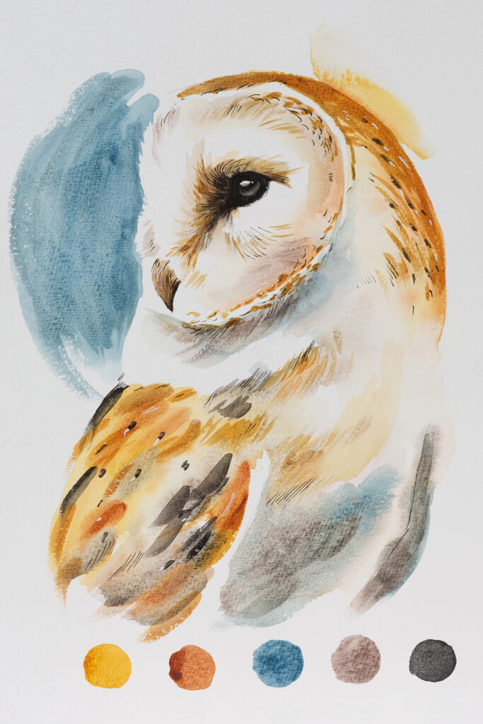
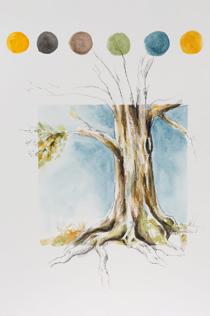
Schmincke Horadam Naturals offer a delicate palette of sixteen colours made with natural ingredients. Inspired by traditional paint-making recipes, this new range of colours includes historic hues like Stil De Grain and Indigofera, as well as one unusual colour that is exclusive to this range. Join us as we discover the versatility of these subtle shades inspired by nature.
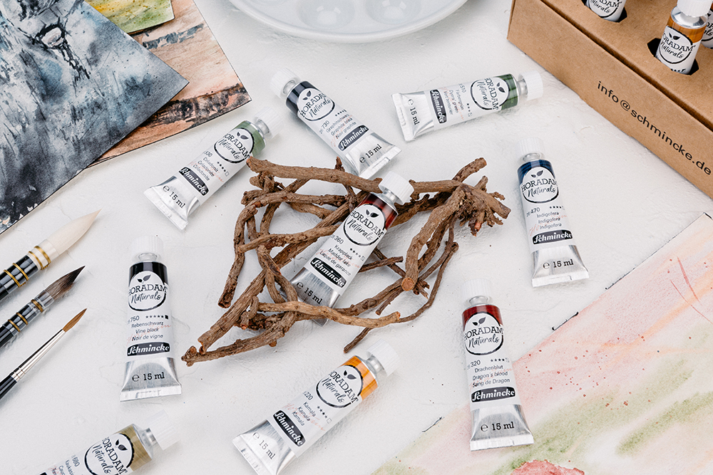
The Schmincke Horadam Natural Watercolour Paint range introduces us to a palette of 16 intriguing colours derived from minerals, resins and plants. Unlike the standard Horadam and Super Granulating ranges, these Schmincke watercolours do not contain honey. This means that vegan artists are free to enjoy and experiment with these natural shades. In the Naturals range you’ll find some familiar colours alongside more unusual hues inspired by historic recipes. As a standalone palette, this beautiful group of colours works well. However, they also mix well with other watercolour and gouache paints if you’re looking for a broader palette of colours.
How do Horadam Naturals differ from Schmincke’s other Watercolour Paints?
Horadam Naturals are a unique range of paints that blend the qualities of both watercolour and gouache. Like watercolours, these paints offer beautiful transparency, however they dry to a matt finish more akin to gouache. This paint range is also manufactured entirely from plant and earth derived pigments, and doesn’t include honey like the rest of the Schminke watercolour family. With a formula free of animal-ingredients these colours are entirely suitable for artists that follow a vegan lifestyle.
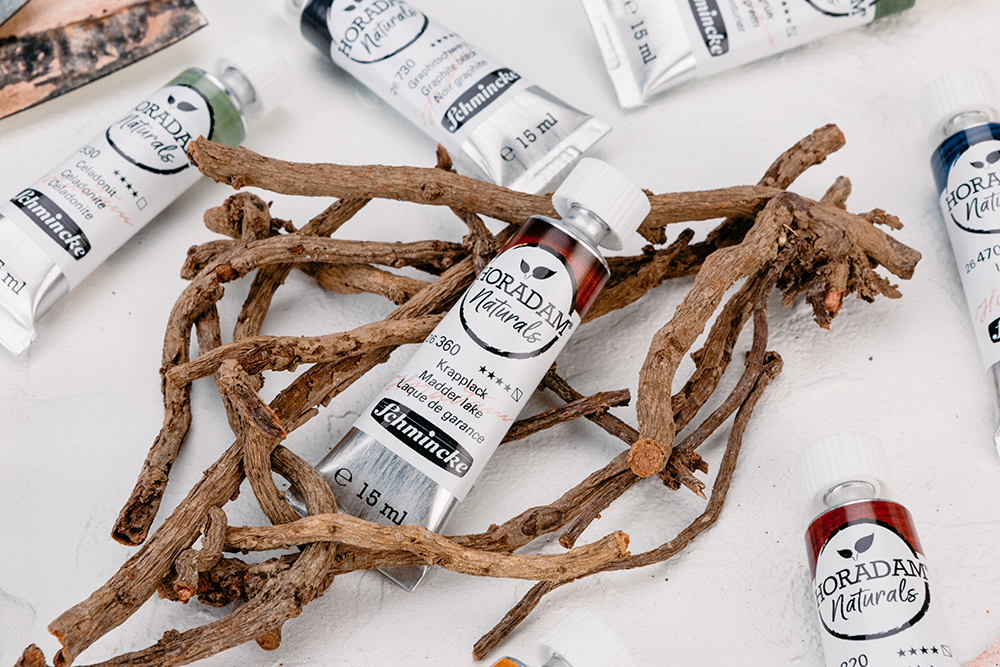
The natural pigments used in this line of colours gives the paint some unusual properties. For example, they have a slightly coarser texture than you’d expect from a traditional watercolour or gouache paint. The pigments also give these colours a delicate fragrance. Take Curcuma, for instance, which has a warm, spicy scent or any of the earth colours which have a subtle earthy scent.
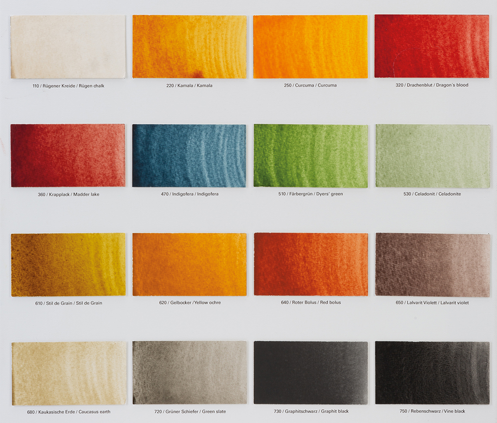
Most colours in the range are semi-transparent. A lot of historic plant based colours are fugitive at best, however, the way in which Schmincke has manufactured these new colours means that 15 of the 16 colours have a lightfastness rating between 3 (lightfast) and 5 (extremely lightfast) stars. Because of the nature of the pigments used there may be slight variation in colour from batch to batch.
Rügen Chalk
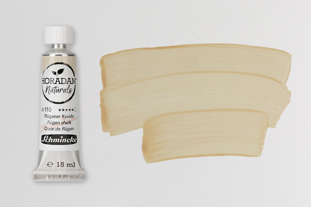
Pigment: PW18 | Lighfastness: Extremely Lightfast | Opacity: Transparent
Rügen Chalk is a warm, transparent white made using a pigment derived from fossilized calcium carbonate. It shares its name with a German island in the Baltic Sea, which, similarly to other coastlines in Western Europe, features a stretch of white chalk cliffs. The cliffs of this island have built up over the millennia from fossilized sea dwelling micro-organisms like plankton. Chalk has been used to make paint since prehistoric times, but chalk derived whites aren’t common in artists paint. However, the chalk from these cliffs is particularly suited to paint making due to its fine grain and purity. Traces of naturally occurring minerals add a bit of depth to this pale colour. Its great for adding to bold hues to create more muted, natural shades.
Kamala
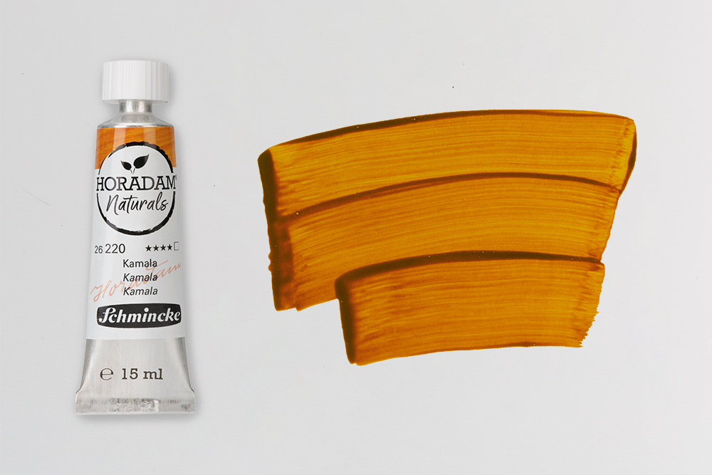
Pigment: NO2 | Lighfastness: Good Lightfastness | Opacity: Transparent
Kamala is a transparent golden orange with a radiant yellow undertone. Schmincke make this colour from NO2, a pigment derived from the Monkey Face Tree (Mallotus Philippensis). Sometimes also known as the Kamala Tree, this plant has been used for both dyeing and healing by generations of peoples throughout the Philippines, Arabia, Pakistan, China, New Guinea and Northern Australia. The fruits of the tree are held in bright red husks, and it’s these husks from which Kamala derives its brilliant colour. Straight from the tube this colour has a deep, earthy orange hue, but dilute it with a little water and you’ll bring out a brighter yellow undertone.
Curcuma
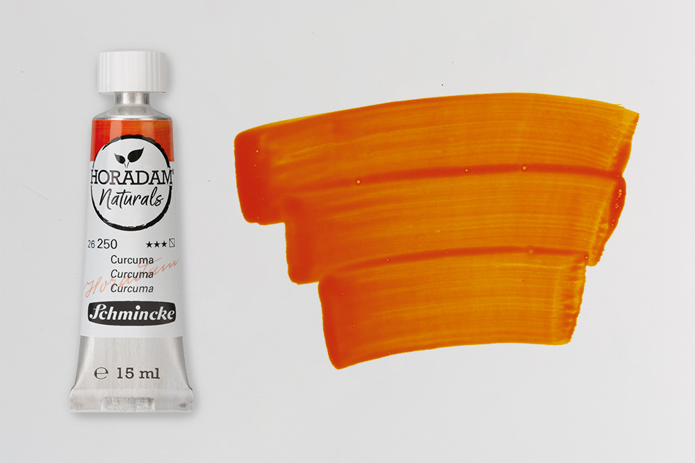
Pigment: NY3 | Lighfastness: Lightfast | Opacity: Semi-Transparent
If you’re a keen cook, you likely recognize the colour of Curcuma, as it derives its warm yellow hue from the Curcuma Longa (Turmeric) Plant. Turmeric is a member of the ginger family and its rhizomes are used to create powdered Turmeric – a common kitchen ingredient. Historically, it’s been a culturally important plant in the region of South Asia, where it has been used traditionally for generations. It was first used as a dye but then later used for its healing properties in Ayurvedic and folk medicine. Schmincke’s Curcuma carries many of the properties you’d expect of a colour derived from turmeric. It has an intense yellow tone that that’s beautiful for capturing warm light.
Dragon’s Blood
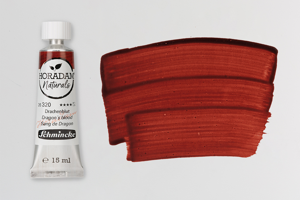
Pigment: NR31 | Lighfastness: Good Lightfastess | Opacity: Semi Transparent
Dragon’s Blood is a colour with an incredibly rich and interesting history. Despite its name, this colour doesn’t contain any blood at all. Instead, the name is a nod to its ancient origins. Mentioned in Pliny the Elder’s ‘Natural History’, it was once thought that the resinous, brown secretions of the Dragon’s Blood Tree were the result of an ancient, bloody battle between an Elephant and a Dragon. In the myth, the blood that was shed gave rise to the Dragon’s Blood Tree, and it’s thought that the sanguine resin derived its colour from the bloodshed.
Historically, Dragon’s Blood has had many uses including as a dye, medicine and incense. Despite its long use as an artists pigment it did fall out of favour due to its poor lightfastness. Schmincke’s Dragon’s Blood, however, offers very good lightfastness. This woody red paint has a brown-ish, slightly earthy tone that darkens as it dries. It also shows some fantastic granulation if you use it on textured paper.
Madder Lake
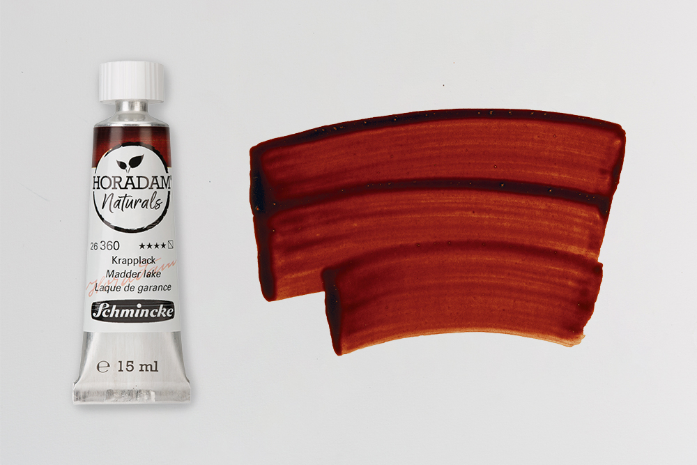
Pigment: NR9 | Lighfastness: Good Lightfastess | Opacity: Semi Transparent
Madder Lake is an historically important colour derived from the root of Rubia Tinctorum, otherwise known as the Madder plant. This lake colour was traditionally made by precipitating the dye of the Madder plant with a metallic salt. In fact, it was one of the very first examples of a dye being made into an artists pigment. Its use as a dye dates back thousands of years, with traces of Madder pigments discovered in fabrics from Ancient Greece and Rome, the ruins of Pompeii and even in Tutankhamun’s tomb. Typically, it is a very fugitive pigment. For this reason most madder-derived colours have been replaced with more permanent quinacridones. However, this version by Schmincke offers very good lightfastness. From the tube is has a rich, brownish hue but dilutes to form a rich red colour.
Indigofera
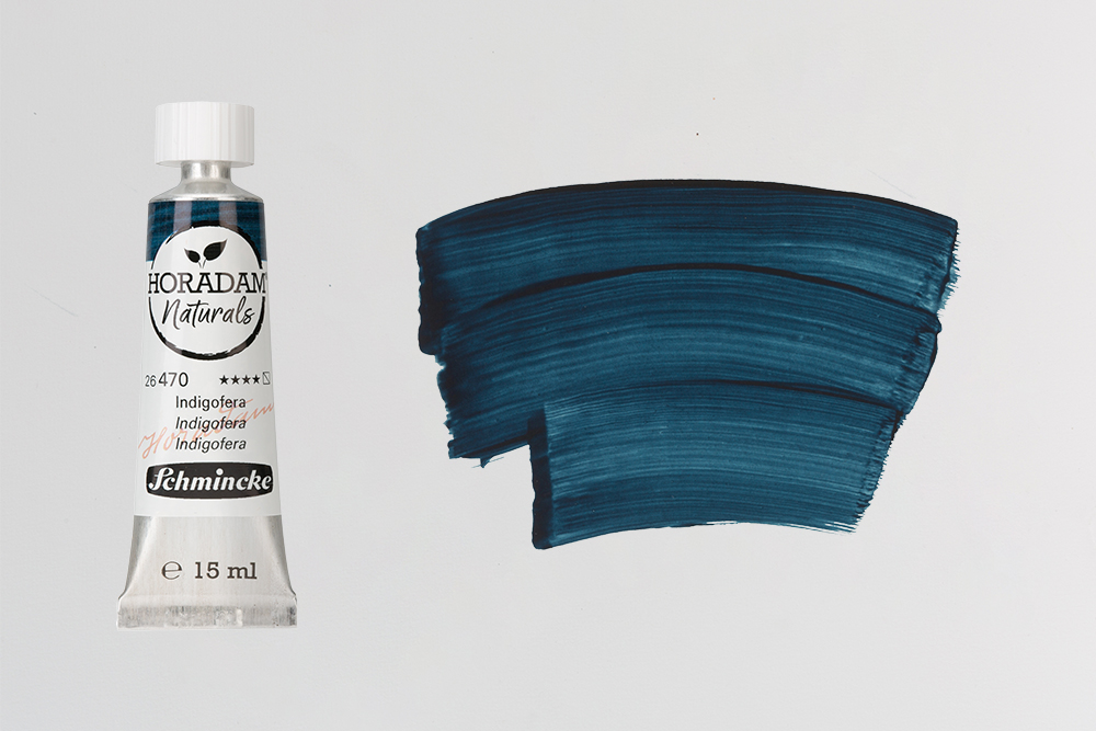
Pigment: NB1 | Lighfastness: Good Lightfastness | Opacity: Semi Transparent
Indigofera offers artists a denim-like, bluish-black shade. It’s made using natural indigo dye derived from the plant the paint species with which it shares a name. Indigo is one of the oldest dyes known to humans, and is the only natural blue dye. It has an incredibly rich history in art and culture – with evidence of its use in ancient Chinese, Indian, Mayan and Egyptian cultures. It was also used as a dye in the Roman period, has been found in early Medieval paintings and has a presence across virtually all periods of European art.
Most contemporary Indigo paints are made from synthetically produced indigo pigments, however for this colour Schmincke have worked to the traditional recipe – where Indigofera leaves are soaked in water and fermented. Depending on its dilution, Indigofera can be anything from a dark, dense indigo to a pale denim shade. It’s much more complex than modern synthetic indigo substitutes.
Dyers’ Green
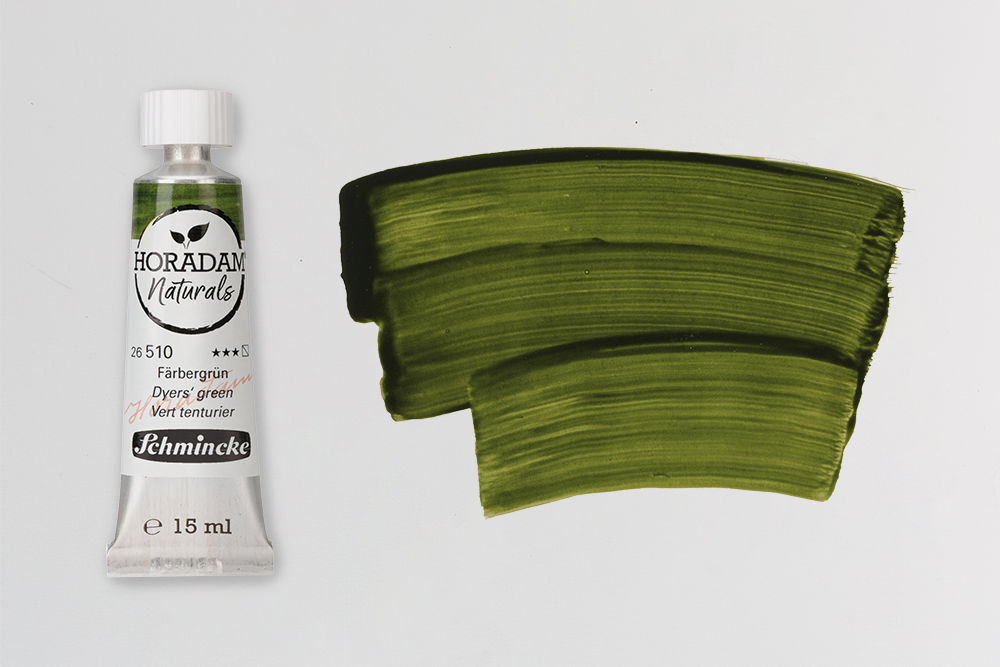
Pigment: NY3, NB1| Lighfastness: Lightfast | Opacity: Semi Transparent
Dyers’ Green is the only multi pigment colour in the Schmincke Naturals Range. It’s a combination of Curcuma (NY3) and Indigofera (NB1) – both of which have long been used as natural dyes. It’s a very natural looking green that would work brilliantly for artists looking to capture lifelike foliage, grassy fields, lush plant life and sprawling meadows. While Curcuma and Indigofera are both quite powerful colours, they combine to create a green hue that isn’t garish, but also isn’t muted and drab. If Dyers’ Green isn’t quite warm or cool enough for your painting it is possible to adjust it either way by mixing in a little Curcuma or Indigofera. In a palette of colours you could use Dyers’ Green in similar ways as you would use a sap or grass green.
Celadonite
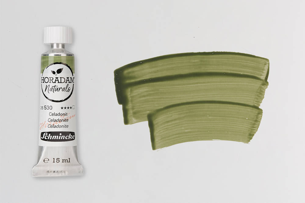
Pigment: PG23 | Lighfastness: Good Lightfastess | Opacity: Transparent
Celadonite takes its name from the French ‘Celadon’ meaning sea green. Like we see with many of the Naturals colours, Celadonite has been used in art since ancient times. The pigment it uses, PG23, might seem familiar as its the same pigment you’ll find in most colours under the name Terre Verte or Green Earth. Most contemporary Terre Verte utilizes synthetic alternatives to natural PG23, given the scarcity of naturally occurring green clay deposits. However, historically there have been large green clay deposits in central Europe, which would explain its prevalence in European art.
Like other earth hues, this colour has actually been used since prehistoric times. Because Celadonite is made with mineral rich, natural green clays, it has much more complexity than a synthetic Terre Verte. It’s a delicate grey-green with a very low tinting strength, and is also quite transparent. It granulates beautifully on textured papers and is great for painting natural subject matters but is quickly overpowered in mixes.
Stil De Grain
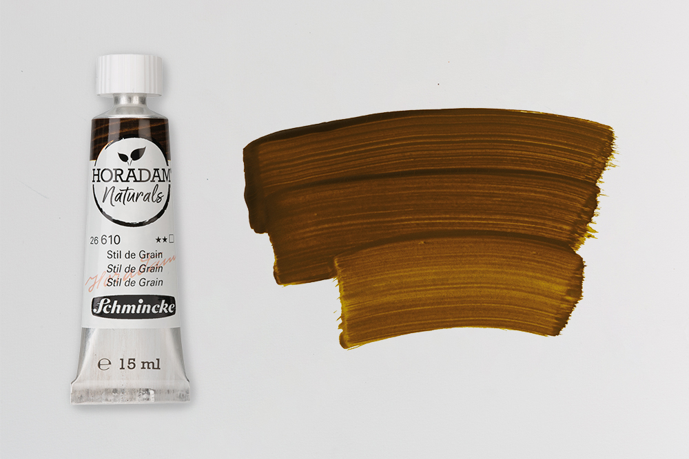
Pigment: NY13 | Lighfastness: Limited Lightfastness | Opacity: Transparent
Stil De Grain is a colour that artists have used since the Middle Ages. Traditionally, this colour comes from dye extracted from the unripe berries of the buckthorn plant. The dyes this process creates vary wildly from vivid yellows to deep browns, depending on the ripeness of the berries used. In fact, a number of the colours we use today were initially manufactured using this process – like Sap Green, for example.
Stil De Grain was a popular colour between the 16th and 19th Centuries, however its poor lightfastness meant that it fell out of favour shortly after this time. Though its usage declined with the advent of synthetic alternatives, it’s revival in the Schmincke Naturals collection celebrates the historic recipe. Unfortunately this colour still doesn’t offer excellent lightfastness, having been rated as 2 (satisfactory) on the blue wool scale. Despite that, it’s a fantastic colour to experiment with. It offers a yellow-green brown with a hint of mustard. It would work well in landscapes, especially as a mossy green.
Yellow Ochre
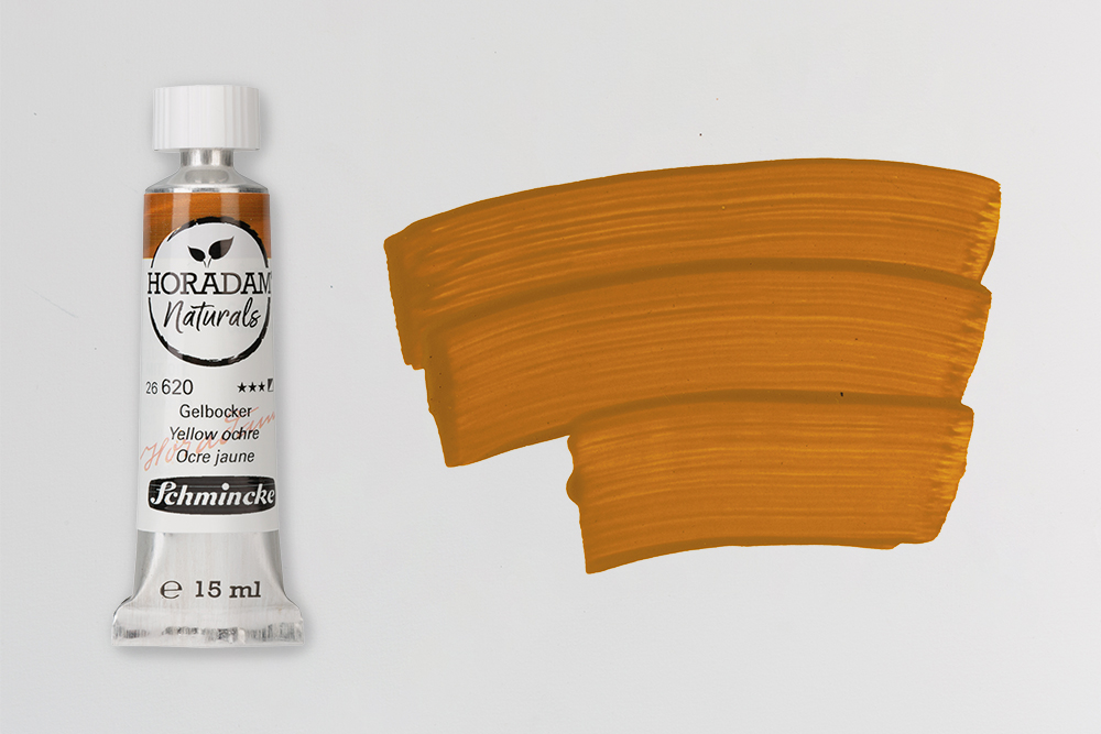
Pigment: NY43 | Lighfastness: Lightfast | Opacity: Semi Opaque
You might struggle to find an artist who doesn’t include Yellow Ochre on their palette. It’s such a classic colour and a mixing staple that most paint sets include it. The majority of Ochres you’ll find in today’s paint ranges actually get their rust-like colour from synthetic iron oxides. In the Naturals collection however, Yellow Ochre takes its colour from the natural deposits of iron oxides found in yellow earth. The use of Yellow Ochre dates back to prehistoric times, where it was used liberally in cave paintings. The natural oxides in this colour gives it a little more complexity than a synthetic Yellow Ochre. Compare them side by side and you’ll see that a standard Yellow Ochre looks a little more flat and monotone. Naturals Yellow Ochre has a warm orange-brown hue that shows slight variations in tone caused by the soils and clays.
Red Bolus
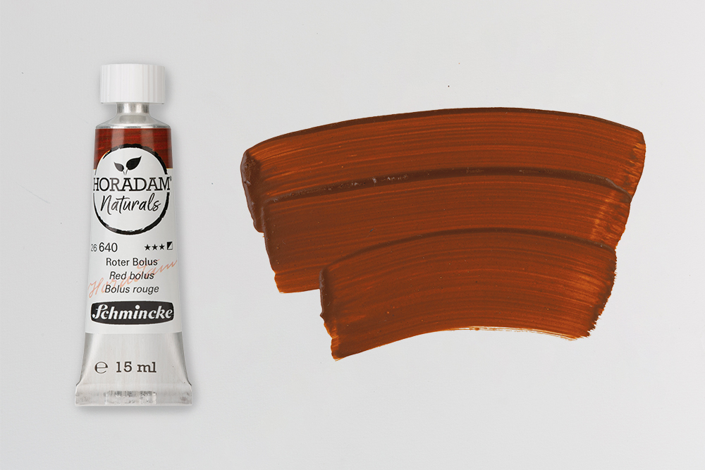
Pigment: PR102 | Lighfastness: Lightfast | Opacity: Semi Opaque
Red Bolus is a rich, reddish brown that derives its colour from red clay. Its name, Bolus, stems from the Greek ‘Bolos’, meaning ‘(earth) lump’, which alludes to the clays present in the pigment. Large deposits of this clay exist in the Upper Franconia region of Bavaria, and boast a high ferric oxide content which gives Red Bolus its distinctive colour. As is the case with Yellow Ochre, a lot of red earth colours are made with synthetic pigments. However, PR102 is still derived from natural red earths. The material that gives Red Bolus its colour is actually the same material that Renaissance artists would have found in their red drawing pencils. Commonly referred to as ‘sanguine’, their pencils had the same brownish colour of dried blood. Red Bolus offers a similar warm, red-brown hue to Burnt Sienna and granulates heavily on textured papers.
Lalvarit Violet
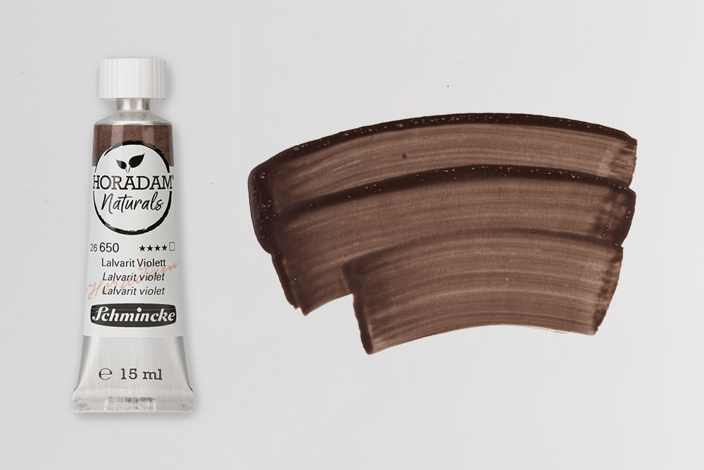
Pigment: – | Lighfastness: Good Lightfastness | Opacity: Transparent
Lalvarit Violet is a colour that’s unique to the Schmincke Horadam Naturals collection. It gets it’s complex colour from volcanic Andesite rock. The use of this rock as a colourant is actually so uncommon that it doesn’t actually have a pigment number. Although Andesite rock has an unremarkable grey colour, the traces of natural iron and manganese oxides present in it give Lalvarit Violet its complex colour. It offers artists a warm, muted violet-brown tone that blends into subtle hints of grey and brown. It’s a fantastic colour for painting rocky outcrops, capturing complex shadows and for adding depth and dimension. You could use it in place of other brown-grey earth colours and it’s definitely a colour to try if you’re looking to test unusual hues.
Caucasus Earth
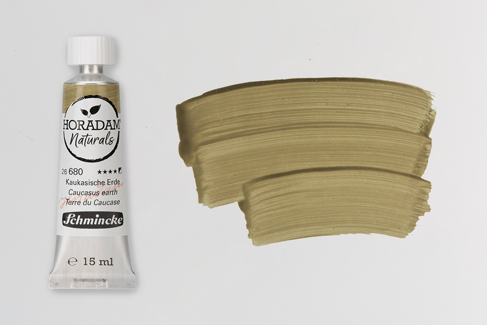
Pigment: PG23 | Lighfastness: Good Lightfastness | Opacity: Semi Opaque
Caucasus Earth is a cool olive green with a hint of pale, brown-ish grey. It takes its colour from PG23, the same green earth pigment present in Celadonite. As its name suggests, the green earth used in this colour is sourced from the Caucasus – a transcontinental region between the Black Sea and the Caspian Sea. It shares the same muted hue and granulation properties as Celadonite, however is has a slightly warmer tone. The hint of grey-brown in Caucasus Earth would make it an interesting choice for portraiture, as skin tones with subtle hints of green can be complex to mix. Its natural hue also lends itself well to landscape painting.
Green Slate
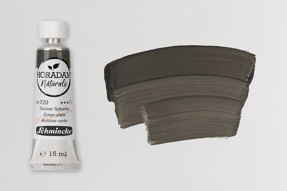
Pigment: PBk19 | Lighfastness: Lightfast | Opacity: Semi Transparent
Green Slate is a cool, semi-transparent light green grey that takes its colour from PBk19. This pigment is made from genuine ground slate, and this particular variant contains traces of minerals like epidote and actinolite. Whereas other PBk19 paints have more of a steel-grey finish, the minerals in this paint give it a cooler, more green hue. Green Slate is a fantastic colour for any artist looking to paint natural subjects. If you’re looking to tone down or mute brighter colours, then a touch of Green Slate should do the job.
Graphite Black
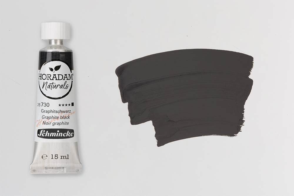
Pigment: PBk10 | Lighfastness: Good Lightfastness | Opacity: Opaque
Graphite Black is a deep, neutral, silvery-grey black. It derives its colour from PBk10, a pigment made from ground graphite. Graphite has been used by artists for thousands of years and is perhaps one of the most important art materials. It’s been the primary component of sketching pencils since the 16th Century and is still the material of choice for most pencils. Graphite actually derives from the Ancient Greek ‘Graphein’, meaning to scratch, write draw or paint. The appearance of Graphite Black varies depending on how much you dilute it. Paint it in thick applications and you’ll notice that the colour retains some of the reflective qualities of natural graphite. However, mix into a dilute wash and it’ll create some beautiful matt greys.
Vine Black
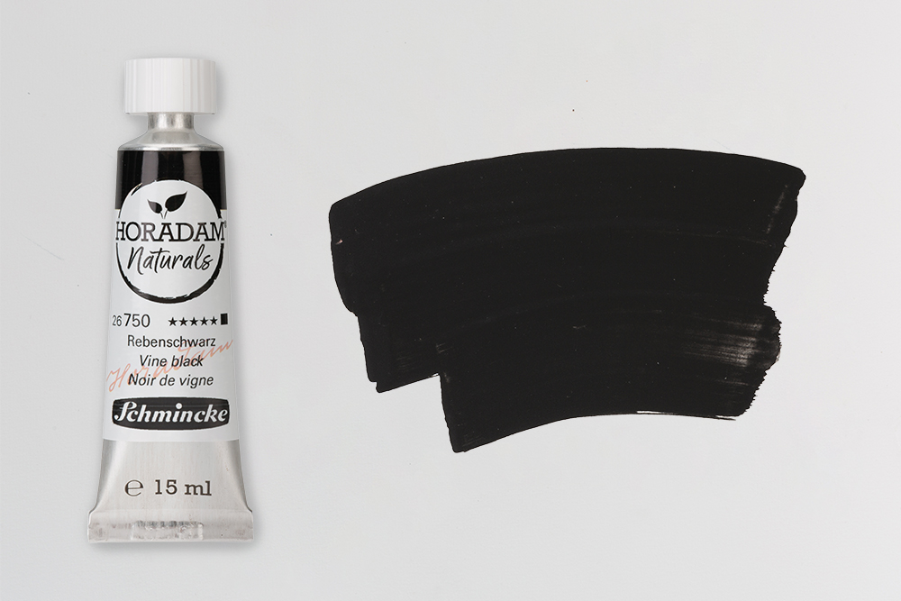
Pigment: PBk8 | Lighfastness: Extremely Lightfast | Opacity: Opaque
Vine Black is a deep, opaque anthracite black derived from charcoal. The pigment PBk8 forms after heating and charring grape vines without oxygen. In ancient times, people commonly used vine black as carbon black. You’ve likely come across Vine Charcoal sticks as they’re a common drawing material, but ground Vine Black pigment is also a component of many artists paints. It has a deep, dark masstone and takes on a bluish hue when mixed with white. It is quite overpowering in mixes so you’ll find that you only need a small amount to darken another colour.
Intrigued by the allure of Schmincke Horadam Naturals?
This collection of sixteen colours is undeniably fascinating and offers an interesting palette to explore. Whether you’re drawn in by the complex hues or are captivated by the rich history of these colours, they’re fantastic to experiment with whether you’re a watercolourist or a gouache painter. We’d love to know which colours you’re keen to try. Are you inspired by historic hues like Stil De Grain or Indigofera? Or are you looking forward to trying an exclusive colour like Lalvarit Violet? Let us know!
