
Watercolour Hummingbird Tutorial
One of my favourite subjects to paint is birds in watercolour. I grew up absolutely loving birds and for me, the medium of watercolour with its immediacy, freshness and vibrancy, is perfect for capturing the fleeting moments and flitting nature of birds. In this tutorial I will be painting a hummingbird.
The Reference
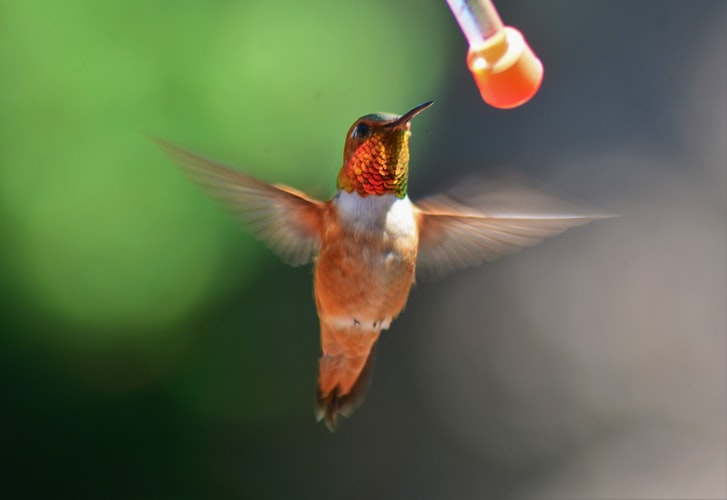
There are so many reasons we can be drawn to paint a particular subject. I chose this one of a hummingbird for three main reasons.
Number one
The hummingbird is in an interesting pose with a sense of movement. Ideally, I am looking for something that has a recognisable silhouette; so even if the bird was all filled in black, you will still have a sense of what it is. This is not a must for painting birds, but I certainly find it helps in creating an exciting painting.
Number two
The colours of this hummingbird are obviously wonderful and there’s a great opportunity to have fun with them in this painting.
Number there
The light! This has a lovely and very simple pattern of light and shadow.
Not only will this make for a more exciting final piece, it will also help to create form and give a sense of realism but without detail. And actually, it will make painting any subject much easier if there is a clear and strong pattern of light and shadow.
If we get our tonal values working, then we can do whatever we want with the colour and it will still “work”.
Really thinking about what it is that attracted you to a subject is so important. It keeps us on track, and in theory, it keeps us away from being distracted by detail and overworking.
So hold on to the that initial inspiration and use it as a guide whilst painting!
One final point is that we can be completely faithful to the reference or subject; or as in this case, we can simply use it as jumping off point and a spark of inspiration for the painting. As well as having it on hand to help us resolve tricky areas or for those little areas that need that little extra level of accuracy.
Art Materials
Paper – A3 size gummed block
A really fun size. Big enough to let loose with the paint but not too overwhelming. Gummed blocks are great for the simplicity of preparation!
I have a variety of papers I like. At the moment, I am particularly enjoying Winsor & Newton Professional Watercolour Paper. It stays damp for a good time for wet into wet work, but it also allows for finer detail if wanted.
Hahnemuhle papers are fairly new to me but I am really having fun with them. The Cornwall Paper, which this painting was done on, is proving to be excellent for letting to colours flow together, and it gives a real vibrancy to the colours.
I generally paint on rougher cold press papers for more broken brushstrokes and texture.
Brushes
My go to brushes are the Escoda Ultimo Mops of various sizes.
They hold a wonderful amount of water and pigment and have a very lively feel, but they also come to a nice fine point.
I have a size 18 and smaller size 12 mop. I always pair these with a smaller, more springy round brush for smaller areas and any details. In fact, the Alvaro Castagnet Escoda Ultimo set, is basically my brush set for almost all my paintings. All though I do really like the Pro-Arte Prolene brushes as the smaller one.
Colours
I generally prefer to work with transparent colours. The lovely luminosity they give is of course one of the joys of watercolour, they make mixing rich darks easier too.
Opaque colours are great, but I personally tend to reserve them for splattering into drying washes for texture, and for the odd cheeky dry brushstroke to lift little areas if needed.
This painting was done using:
- Cobalt Blue
- Phthalo Blue
- Quinacridone Red
- Permanent / Napthol Red
- New Gamboge Yellow
- Aussie Red Gold
The Drawing
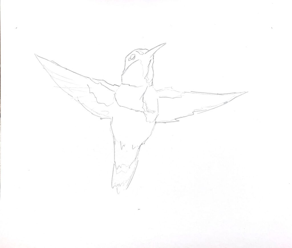
When constructing a drawing I always start with the biggest shapes first. In this case an oval for the body and the rectangle for the head.
Before I go any further, I make sure that that proportion of these shapes are correct in relation to each other, and I also give a lot of consideration to the tilt, or angle, of the shapes. These can change the whole character and movement of a bird more than anything else. I often exaggerate angles and shapes to give more of a feeling of movement, but in this case I like the reference as is.
Once the big shapes are established I affectively “stick on” the other smaller shapes i.e. wings, tail beak. Check proportions and angles. Then finally the smallest shapes of things like eyes and any marking if relevant.
Some of the lines represent different coloured areas of the birds, other lines represent the distinct boundary between light and shadow. I don’t spend much time with detail as I am more interested in the patterns of light and shadow.
And of course, we can totally paint outside the lines if we want!!!
One final point, which will be more obvious in the finished painting, is that I put the bird off centre on the page. I find leaving large areas of space can very much contribute to the feeling of how the bird is moving. In this case it accentuates the feeling of flying up and slightly into the painting.
The Painting
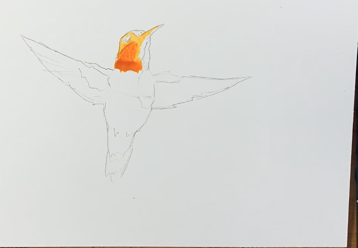
Step 1
I kick off with a watercolour wash of New Gamboge Yellow for the head, milky coffee consistency. Straight away I begin to drop in a slightly stronger consistency of Aussie Red Gold.
This initial stage is just about getting some colour down, keeping it watery and light and getting the paint to flow. We can always go darker if we need to.
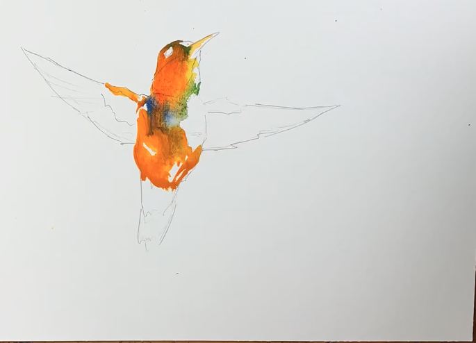
Step 2
Whilst this first wash is still fairly damp, I drop in a light mixture of Phthalo Blue and New Gamboge Yellow for that little shot of green; a touch of cobalt blue around the chest area, and then back to the New Gamboge and Aussie Red Gold mix as I move down the bird.
I am working on a tilt so that the pigment flows down the page creating a slight bead wherever I stop the wash. I can then pick up the wash and add more colour as I go.
I am trying very hard not to worry about the way the colours are running together, and simply try to let them do their thing. Much easier said than done!
It would be very easy to start comparing to the reference photo. Whilst I could separate the different colours more, I really want to get them flowing together. Using the photo only as a jumping off point and a guide for more accurate areas.
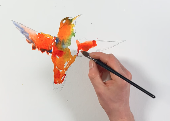
Step 3
I purposely leave strong whites of the page for light on the chest and side of the face, as well as more random ones left just to break up the shadow areas a little. The whites of the page don’t have to make sense necessarily, or even represent anything directly. They are more of a design element that can just liven up large areas of wash.
I extend the same colours on to the wings, watering the wash down and adding more cobalt blue as I move towards the wing tips.
For the first time I am starting to introduce the permanent red, as well as move up to full fat milk, maybe even single cream consistency. This gives a slightly darker tone, and whilst still very much “wet into wet”, the pigment will stay a little more in place because it’s thicker and the wash I’m working into is generally now damp, rather than wet.
I think paint consistency is one of the real secrets to watercolour. Getting a feel for the wetness of the wash on the page, along with the amount of water and pigment in your brush, will do great things for your watercolours.
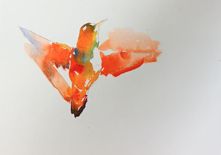
Step 4
At some point I really like to break out from the lines. It feels really fun and liberating to do so plus it loosens me up if I’m getting a bit too fiddly.
I think it really adds a sense of movement to the birds and we can start to play with different types of edges. I also introduced a slightly stronger, single cream consistency mix of red with a touch of Phthalo blue, at the bottom of the tail – then leave the paint to do the rest.
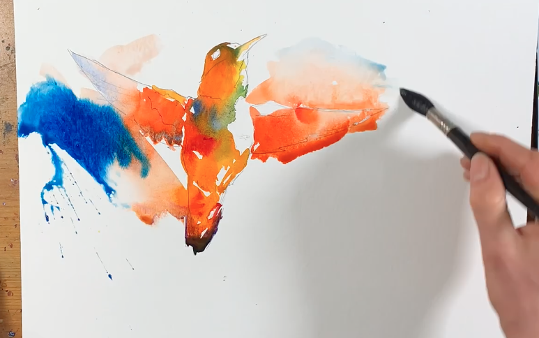
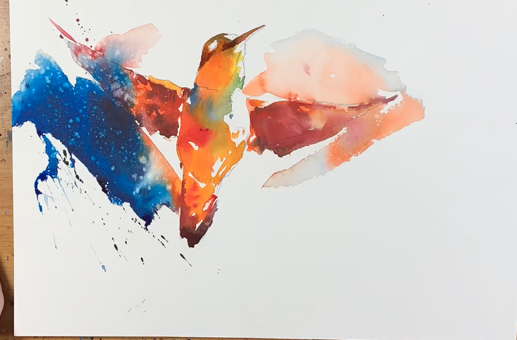
Step 5
I really want to start increasing the strength of tone now, so I decide to just go for it and drop some pure Pthalo blue, single full fat milk consistency, into the splashy wash to the left of the bird.
I’m committed now and the paint is completely out of control in this area. I know if I get too cautious and try and control it, I’ll probably make a mess…so I leave it alone! Let’s see what happens…
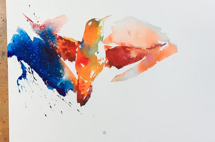
Step 6
I continue the wash orangey wash above and around the other wing to trap some light on the top of it. This is an attempt to create a variety of edges. Those being hard, soft and lost, but also different types of edge between the bird and the background splashes:
- Shadow against light – anywhere the bird is darker than the background
- Light against shadow – lighter tones of the bird against darker background
- Shadow against shadow – various spots where the wings meet the background
- and finally light against light – not much of this here, but the whites shapes of light on the bird meet the white page of the background
These different types of edge don’t have to complicated or overly thought out, but a consideration for all 4 types of edge and the way the bird interacts with it’s background can add a lot to a painting and can move us away from the feeling of a colourful bird simple stuck onto a white background; if that’s what we want of course.
As the washes in the wings are nearly dry, I add in a strong mix of Red with a touch of Phthalo blue. This produces a little more depth of shadow, but without going too dark, and we still get a soft wet into wet feel.
Notice how the Phthalo Blue on the left really shot into the wing. I really had to try very hard not to go in and try to control it; and I’m so glad I did as it’s actually one of my favourite parts of the painting.
As this dark wash was drying, I continued to drop increasingly stronger mixtures (double cream consistency) of Phthalo Blue and Permanent Red into it. This was to build a lovely rich dark.
Coming from an oil painting and acrylic background I really love texture, so for me splattering opaque paint or spraying water into drying dark washes is something I really love to do; and it’s what has given the almost “galaxy stars” effect in the left area and wing.
This is a great point to leave it alone. Let it dry. And asses the next stage, which will probably just be head details and shadow and a little more dark background on the other side of the bird.
Step 7
With everywhere completely dry I can come into the second layer to bring the head to life.
I start off with a simple mix of all the primaries, with a bias towards the Permanent Red. This gives nice muted red colour, which used at a single cream consistency gives a nice shadow colour.
I start simple, using the same colour and tone down the beak, and around the eye.
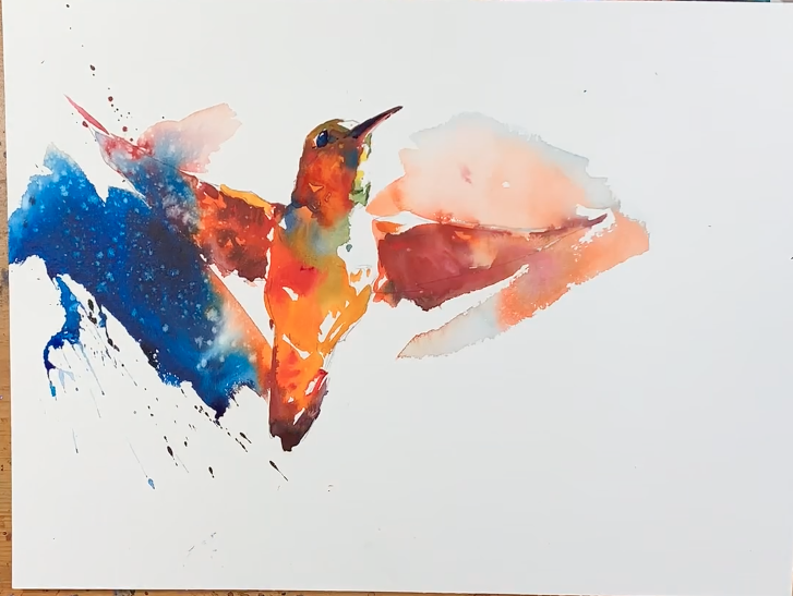
Step 8
I continue the wash down over the rest of the head, leaving a fairly sharp line between light and shadow on the side of the face, but using a clean damp brush to just hit the edge at the bottom of the wash to give a slightly softer transition into the chest area.
As this wash is drying, I drop in a slightly more concentrated mix, with more blue, into the base of the beak, the back of the head and also the beak itself.
The eye is the same dark mixture painted very simply but accurately, leaving a simple white highlight. When the eye wash is nearly dry, I come in with a clean dry brush and just pull out a little of the wash in the bottom half. It’s a neat trick to create a simple bit of form, interest and sheen on the eye.
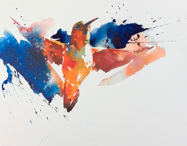
Step 9
To finish the whole piece off I go into the background with a mix of Phthalo Blue and Permanent Red.
I love this colour combo for mixing rich darks. The orangey red cancels out the dark greeny/blue, giving a very intense almost black colour; but because it’s been mixed from two opposing colours it seems to have more vibrancy and subtle variation than just black, and you can push it to be a little more reddy, or a little more bluey. I spend a bit of time trying to work out how dark to go and how far to take it.
I use this wash mainly to trap the light on the top of the wing and the side of the face. I then continue it around the back of the head and into that lovely little negative space where the back of the neck meets the body and wing.
By darkening this negative shape area, it really helps to accentuate this important meeting spot and to throw out the positive shape of the bird.
Here we have the final dried painting.
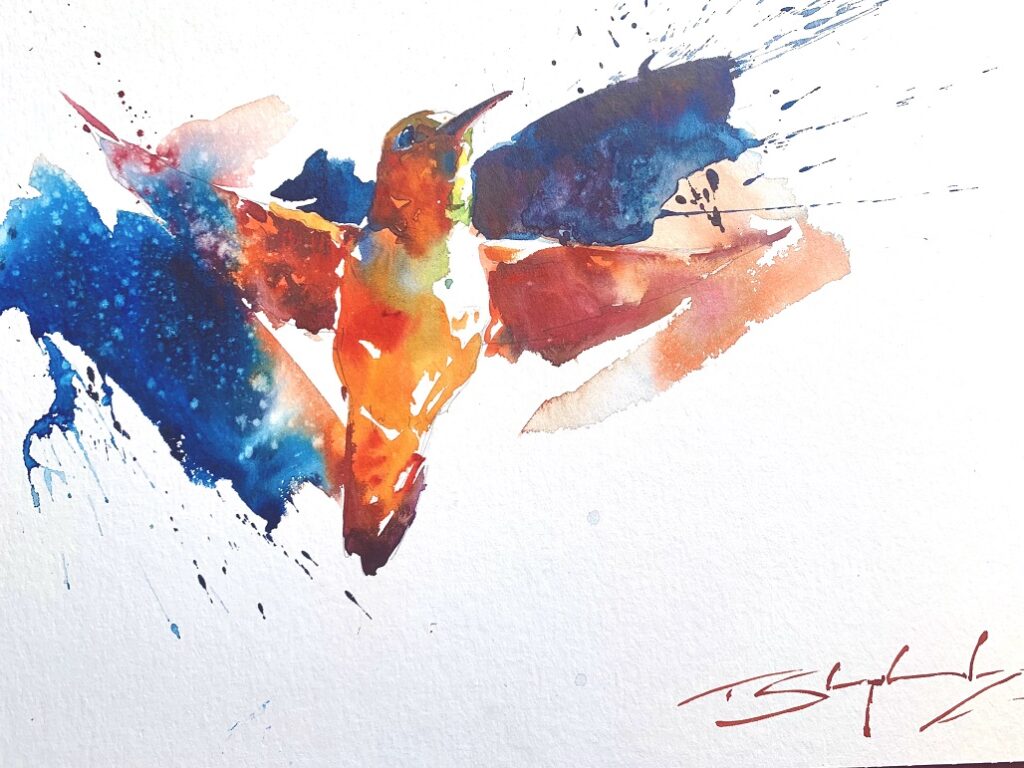
Conclusion and after thoughts
The initial drawing was very useful for accuracy of shape, but the movement and the real character of the bird is born out of the paint.
Trying to keep the washes fresh and light, then dropping darker bits into this I think really helps.
Not being afraid to leave plenty of areas unresolved, or at least not too well defined, keeps the eye moving around the painting and adds interest and movement.
I do try very hard to find some sort of connection between the background and foreground, with a real focus on a variety of edges. For me, this further gives a sense of movement and a fleeting moment.
Like so many watercolourists I do try to lay the paint down in “strokes” without overworking or fussing it. All the time I am looking for simple patterns of light and shadow, and for the most part, leaving the water and pigment to just do it’s thing! This is often when the magic can happen with watercolour, and it plays to it’s playful and joyous nature as a medium.
I hope you enjoyed this watercolour hummingbird tutorial and found it useful.


wonderful, I painted two ,one after the other, and am so pleased with them. Not bad for an old fart, whose art teacher told me years ago , that I couldn`t paint !!!! Thanks for your wonderful ,simple tutorial….
Love the loseness and feeling of motion, colours and technique and the way the colours have made the bird the hero, only one thin I would like to show movement with the wings, is that achievable ?
Great painting and tutoriall what is the alternative to Aussie gold? I have quinacrine gold is that similar
Regards
Jennifer
Hi Jennifer, the Aussie Red gold can be substituted with another colour, depending what you have, it is a bright orangey/yellow colour. I would say Quinacridone Gold is a bit dark/browney, but without knowing what other colours you have it is hard to suggest an alternative. Maybe a cadmium orange if you have one?
Beautiful loose and vibrant painting. Love it!