
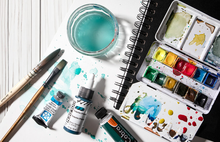
A Guide to Colour Mixing with Watercolour – Power to your Primaries!
If you are new to watercolour or just getting back into it after some time out, understanding how to mix the colour you want is a fundamental skill to practise. With so many colours available to choose from, it can all seem rather daunting, so where’s the best place to start?

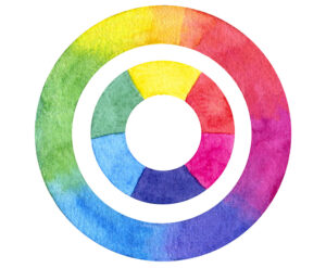
The Primary Colours
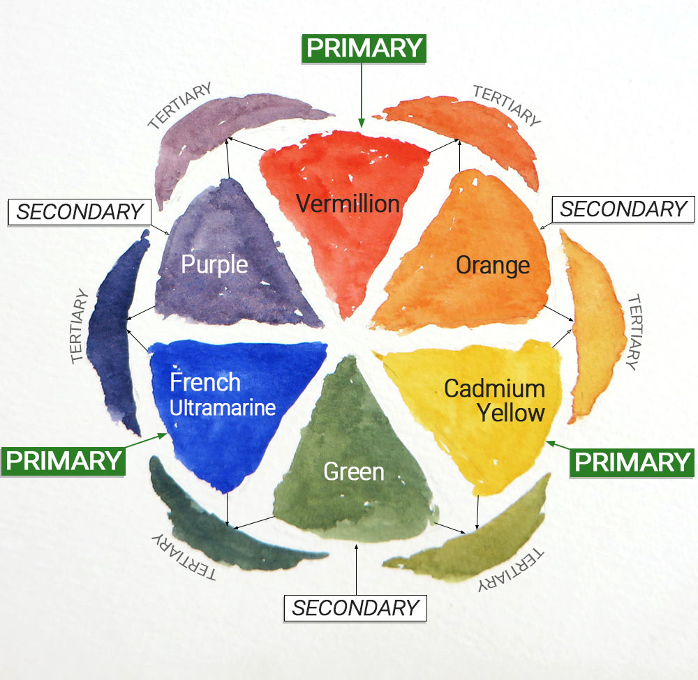
Students are often amazed to learn that most of the colours we require to produce an effective painting can be mixed with only 3 colours. These are Red, Yellow and Blue, commonly known as the primary colours. They are the foundation of colour mixing and are unique because as colours in their own right, they cannot be mixed.
Red, Yellow and Blue, commonly known as the primary colours. They are the foundation of colour mixing and are unique because as colours. They are the foundation of colour mixing and are unique because as colours in their own right, they cannot be mixed.
By starting with a limited palette of just 3 colours, we can learn the qualities of each one more easily, as well as the other colours that can be mixed with them. A limited palette of 3 colours creates unity in a painting. By repeating colours and their mixes throughout the work, they help to visually tie it together. With regular practice, the primary colours will become your best friends!
Secondary Colours
When we mix two primary colours together, we get what is known as a ‘Secondary Colour’. Red and yellow make orange, yellow and blue make green and red and blue make purple. With the original 3 primaries, we now have 6 colours to play with!
The variations of these 6 colours can be extended further by making stronger or weaker mixes, creating darker or lighter shades of the same colours.
Tertiary Colours
The final range of colours we can produce from our original 3 primaries are created by mixing a primary colour with a secondary colour, making what is known as a ‘Tertiary Colour’.
Going clockwise on our colour-wheel, by mixing red and orange we get a deeper, red orange, orange and yellow a more yellowy orange, yellow and green a yellowy green, green and blue a deeper, bluer green. Blue and purple makes a cooler purple and finally purple and red makes a warmer purple.
So including our original 3 primaries, we now have 12 colours at our disposal. Of course, when working in watercolour, these 12 colours can be extended further by diluting the colour or adding more pigment, making lighter or darker variations.
But it’s not over yet, there’s more…!
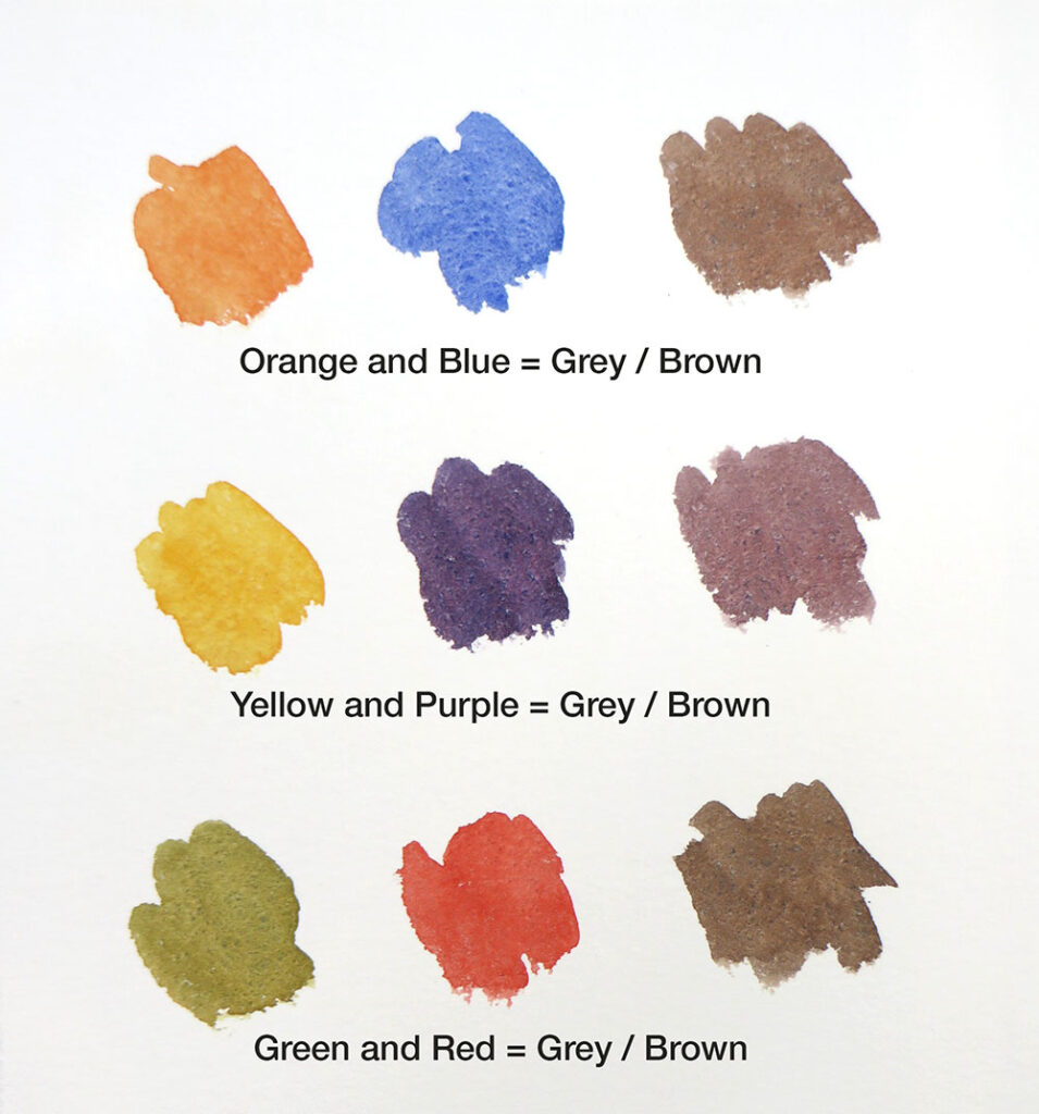
We can also make additional tertiaries by mixing the complementary pairs, creating a useful selection of greys and browns. The colour will be more grey or more brown depending on the ratios mixed. Complementary colours are across from each other on the colour wheel, so Orange + Blue, Yellow + Purple and Green + Red.
Tertiary greys / browns mixed with the complementary pairs
Which Primary Colours Should I Start With?
Unfortunately, choosing our primary colours presents us with another hurdle, as walking into any art shop highlights that there are many versions of our three primary colours! Bright, dark or earthy reds, pastel or deep rich blues and warm, sunny or acid lemon yellows. Each have their own qualities and will create subtle variables of the mixes discussed so far.
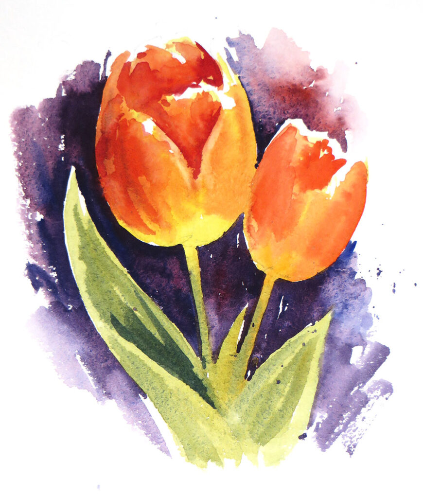
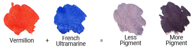
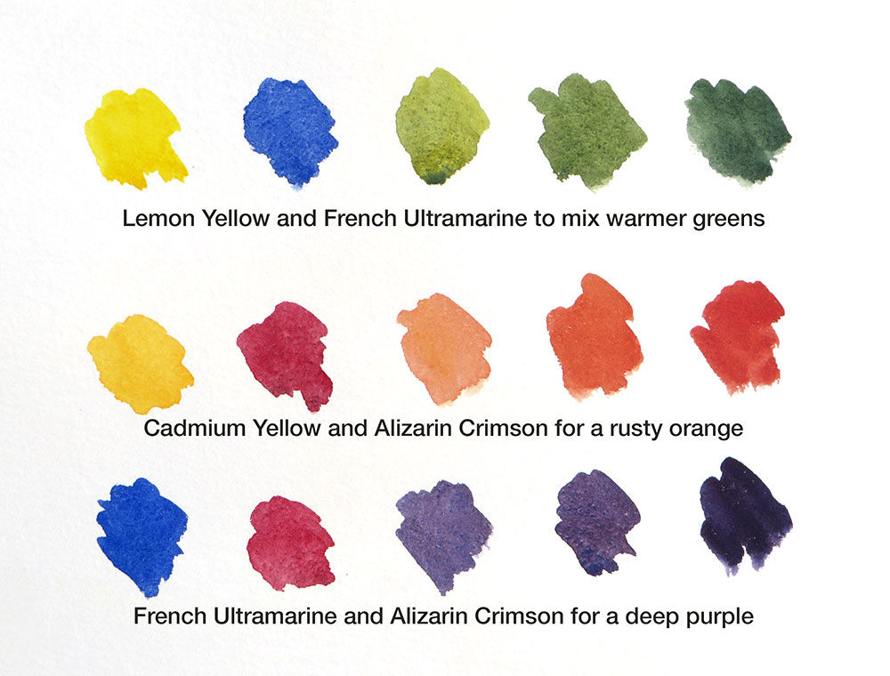
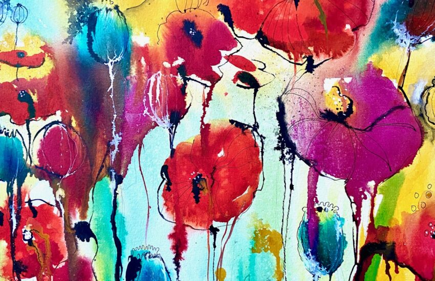
For instance, to paint these bright, orangey-red tulips, I used Lemon Yellow and Vermillion. Vermillion is a fiery, warm red, helping me achieve the warm colour of the petals. The leaves were mixed with French Ultramarine and Lemon Yellow. The background was mixed with Vermillion and French Ultramarine. An effective, colourful study using just 3 colours!
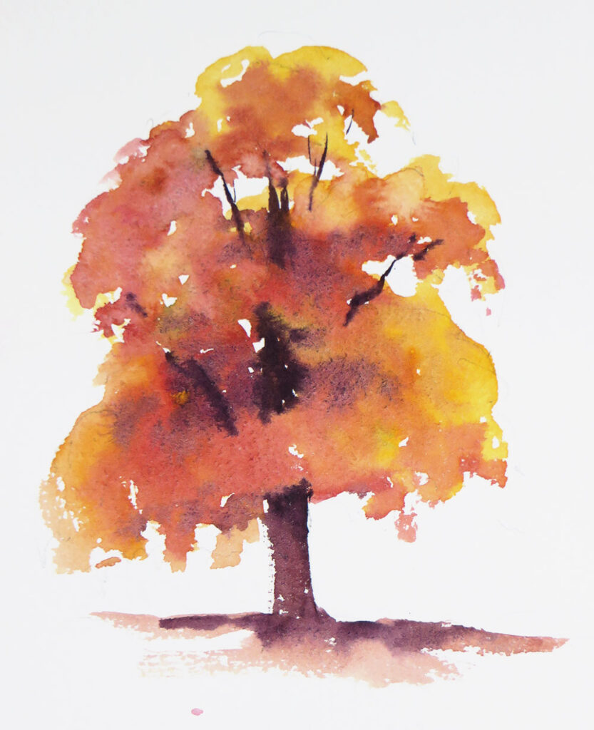
For the foliage of this autumn tree, I wanted a warm, rusty orange, so I used Cadmium Yellow (which has a warmer hue than Lemon) and Alizarin Crimson for my red. Alizarin is a deep, rich berry red, similar to the colour of claret. It is cooler than Vermillion or Cadmium Red and when mixed with yellow, makes an orange that isn’t vibrant but slightly grey, perfect for autumn foliage. The trunk and branches were mixed with the Alizarin and French Ultramarine.
Getting Started
Here are 2 variations of the primary palette I often use. One is more vibrant for bright or sunny subjects, the other more earthy for when I want colours to be more rustic and gentle on the eye. I suggest you try these colours to get started and really get to know the colours you can mix with them.
Practice making pale and strong versions of each primary colour by adding more water or less pigment, and then do the same with the colours you can mix with them. Then try swapping the colours for new ones to see how they behave and what you prefer for different subjects. For instance, try Cobalt Blue, Cerulean or Prussian Blue instead of French Ultramarine.
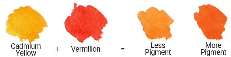
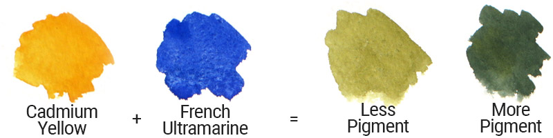
SET 1 – Cadmium Yellow, Vermilion and French Ultramarine
This set of colours creates a useful range of warm oranges, summer greens, purples and browns, perfect for summer landscapes and many other subjects. I favour French Ultramarine because it is a rich dark blue straight out of the tube, great for a strong dark when mixed with red, but can also be diluted to create a pale blue for skies. I have mixed 2 sets of secondary colours with these primaries, (orange, green and purple) making one set darker than the other by simply adding more pigment.
If I want the grass or foliage to be more vibrant, I will swap the Cadmium Yellow for Lemon Yellow. If I want the orange to be less vibrant or purple to be stronger or darker, I will swap the Vermilion for Alizarin Crimson.
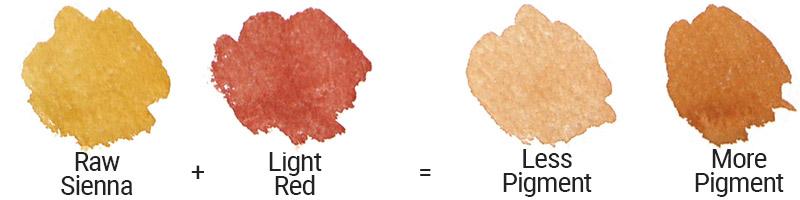
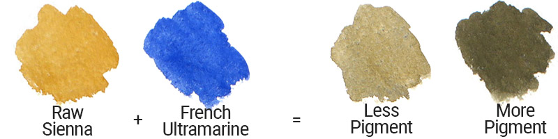
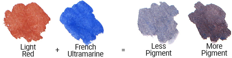
SET 2 – Raw Sienna, Light Red and French Ultramarine
Raw Sienna is an ‘Earth Yellow’. It is a warm, sandy colour, perfect for painting landscapes where the foliage and meadows are less vibrant, or for a sandy beach or estuary. Likewise, Light Red is an ‘Earth Red’, a brick red colour that creates subtle warm greys and rusty orange tones when mixed with the Raw Sienna or blue.
Late Summer Landscape using the Primary SET 2
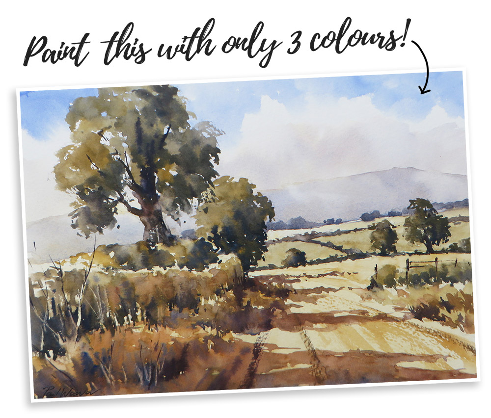
See part II of this blog post for a step by step tutorial on how to paint a Late Summer Landscape using only the colours in the Primary Set 2 – Raw Sienna, Light Red and French Ultramarine.
Summary
To summarise, getting to know your primary colours is the best place to start developing confidence with colour mixing. Try the colours suggested here and then explore a few of your own. Occasionally you might find it impossible to get the colour you want by mixing.
Certain colours of a more exotic hue such as Turquoise, Viridian or a very bright purple may be better straight from the tube or pan, but I recommend trying to get the most out of just a few colours first.
All work ©2020 Paul Weaver


Excellent. Is it possible to buy a copy of this simple article?
Hi Nicholas. So glad to hear you enjoyed the article. All our blog articles are completely free, however we don’t offer them as print copies. You should be able to save the page to your computer or print the web page if you’d prefer a hard copy.
Very clear and useful guide to painting with three colours – thanks
I have never thought of mixing two primaries – secondary with another primary to form a tertiary, I have probably done it on a pallet but without thinking about how or why, very useful article!
That’s something I never gave a thought about. Thank you for clearing it up for me.
At beginning of this article, there is a statement that I don’t understand; “Primary Colours are unique because as colours in their own right, they cannot be mixed.” Please clarify. Thank you. Carl
Hi Carl, it means that you can’t take other colours and mix them together to create Blue, Yellow or Red.
What it means is that you can get any colour by mixing the primary colours but can’t get ( create ) primary colours by mixing other colours.
Ex
You can create orange by mixing Red and Yellow
But you can’t create red or yellow by mixing other available colours
Yellow and magenta make a very vibrant red. Cyan and a touch of magenta make a very nice saturated blue. In general the gamut of saturated colors is much wider using cyan magenta and yellow for primaries. I didn’t believe it until I tried it.
Hi,
I had an email from you informing me of some of your products. I was an art student in the 60s and as part of the course we created our own colour circles. I was really impressed by Paul Weavers notes and advice on colour mixing! I shall look at the other subjects that you list.
Thank you
Russell Wild