
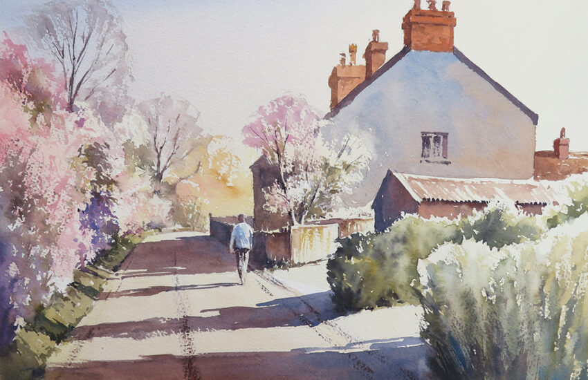
Late Summer Landscape Watercolour Tutorial Using Just 3 Colours
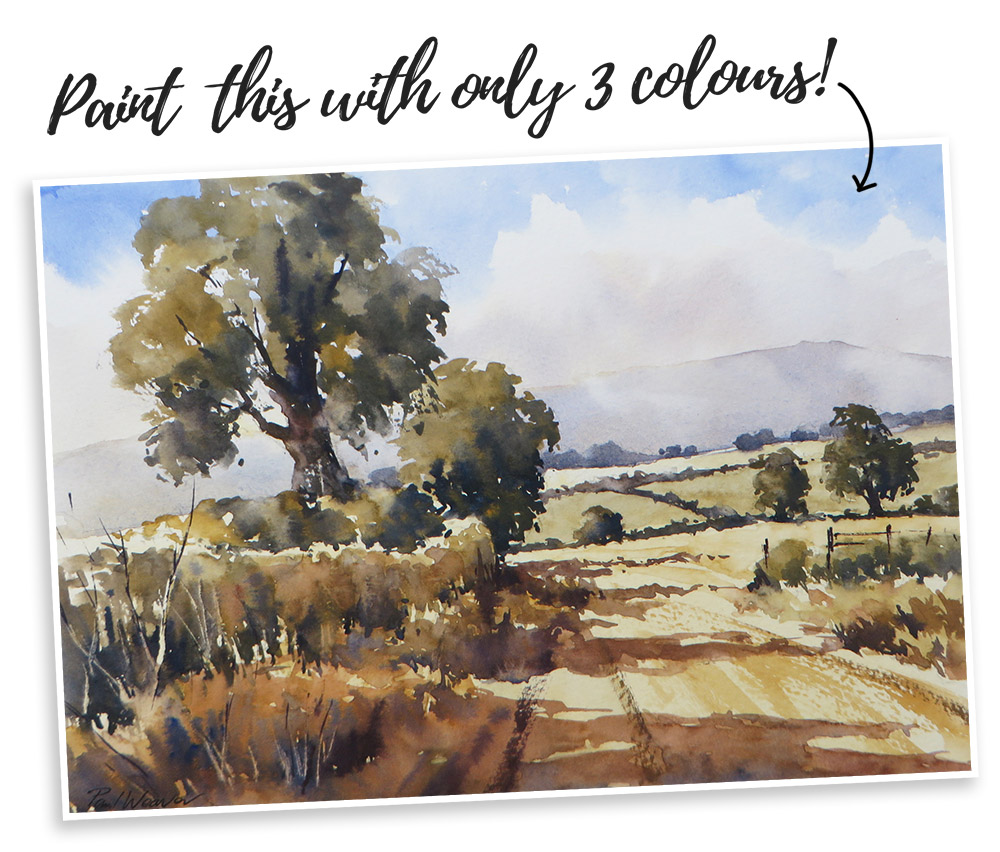
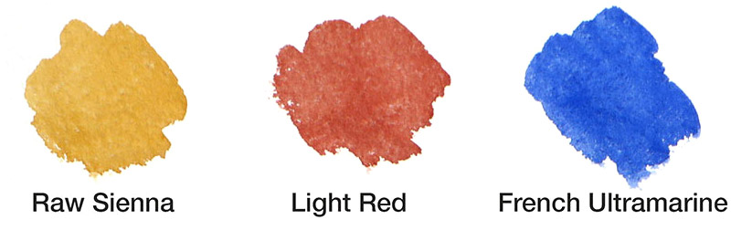
This simple landscape, featuring a distant hill, meadows and foreground hedges and trees, is a great subject to practise using just 3 colours. The Raw Sienna, Light Red and French Ultramarine are perfect for the late summer greens and warm tones of the stubble fields.
Materials used are Ken Bromley Artists’ Watercolours (Raw Sienna, Light Red and French Ultramarine) and Bockingford Rough 140lb/300gsm.
Get your free printable sketch here and use Transfer Paper to trace it on to your watercolour paper.
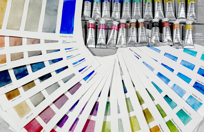
Make sure you check out part I of this blog post “Colour Mixing with Watercolour – Power to your Primaries!” to read all about colour mixing with primary colours and see the different colours you can achieve by mixing these three colours!
Tonal Sketch
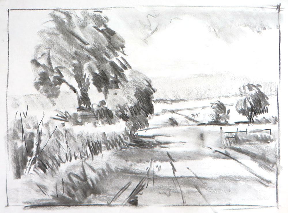
Planning the composition with a tonal sketch is highly recommended. I think of it as the ‘dress rehearsal’ before the main event!
When working in watercolour, it’s difficult to make major changes during the painting, so knowing how the composition is going to work and also what will be light or dark before starting to paint is very useful.
I used charcoal for this example, working on cartridge paper. Although the sketch is very rough, it connects me to the subject, confirming where all the major shapes will go and how the tones get lighter towards the horizon, as well as how the shadows are falling across the ground. With a clear idea of what I want to say, I am focused and ready to paint!
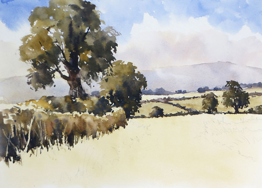
Step 1
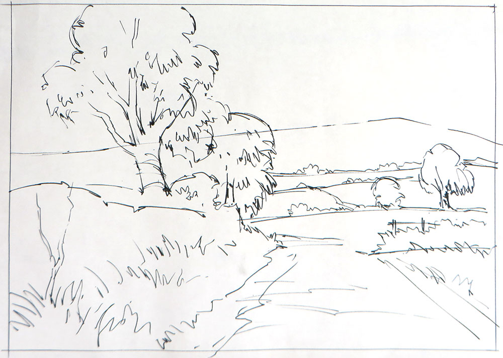
I lightly sketch the composition onto the watercolour paper using a 2B pencil. I kept all lines light so that they don’t show through the paint too much, especially the distant hill.
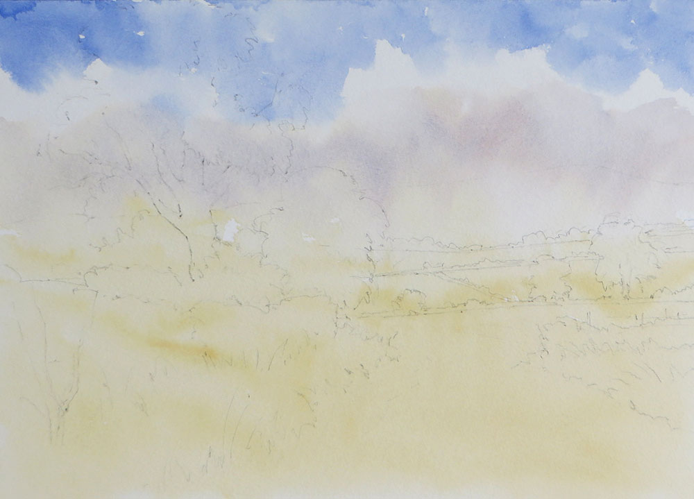
When painting any landscape, always work from the background to the foreground. Work from light to dark and complete the largest areas first before working up to the details.
The sky comes first and for this example, we have a blue sky with cumulus clouds. To create a variety of edges in the clouds, I just wet the cloud area with clear water. Then I add the blue with a pale wash of French Ultramarine. Working from the top, the blue is applied to DRY PAPER, gradually bringing it down to only touch the wet clouds in a few places. This creates a mix of sharp and soft edges.
While the clouds are still wet, I add a light wash of Raw Sienna to give them volume and shape, being careful to leave some white areas on top. I bring
this wash down to the horizon. While this is still wet, I mix a pale warm grey with Light Red and French Ultramarine, adding this to the base of the clouds to create shadows.
The challenge is not to make the grey wash too wet, so the cloud shadows are soft but don’t run out of control. Test the technique on a rough piece of
paper first! This first stage is completed with a wash of Raw Sienna over the entire foreground to tint the foliage and fields.
Step 2
Once everything is dry, I paint the distant hill, using the same mix from the cloud shadows earlier, only a little darker. I dampen a few places along the edge of the hill to give the impression of clouds drifting in front.
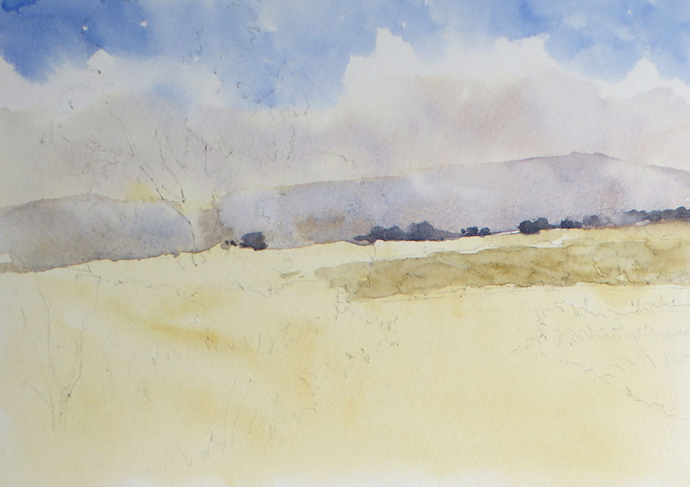
While the hill is still damp, I add the line of trees at the base, using the same mix for the hill only much stronger. By using a thicker mix, it will not spread too far in the damp wash, but will create soft edges here and there, adding to the illusion of distance. These trees are so far away, they will not register as green on the eye.
I then add the next line of fields, using Raw Sienna and a touch of French Ultramarine. This is allowed to dry.
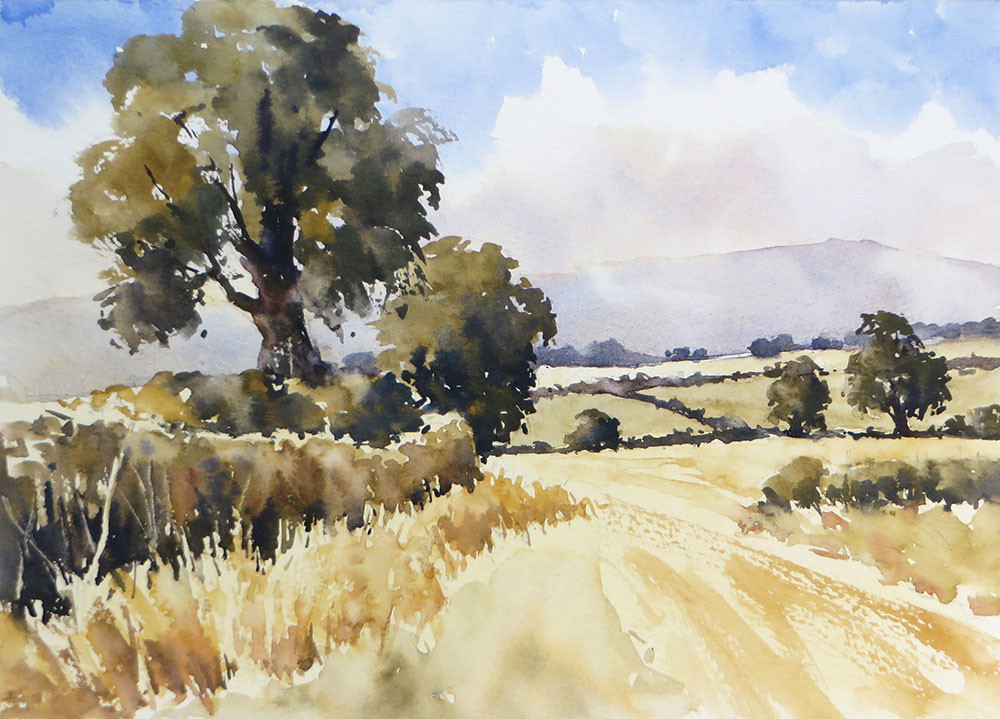
Step 3
With a darker mix of Raw Sienna and French Ultramarine, I add the hedges and trees of the middle distance. I mix Light Red and Ultramarine together for the tree trunks and dark shadows in the foliage. Note how these darker shapes push the distant hill back and begin to create the effect of the distant fields.
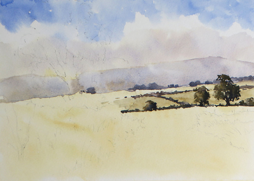
Step 4
Moving forward to the middle distance, I add the tree at the end of the hedge. This is painted wet into wet to create a soft, rounded form. Starting with a dull green mixed with Raw Sienna and a little blue, I paint the entire shape, creating rough edges by dragging the brush on its side.
The light is coming from the left, so before this first wash can dry I quickly add the dark shadows on the right hand side. I use a thick, dark mix of Raw Sienna and French Ultramarine so that it makes soft edges but doesn’t run out of control.
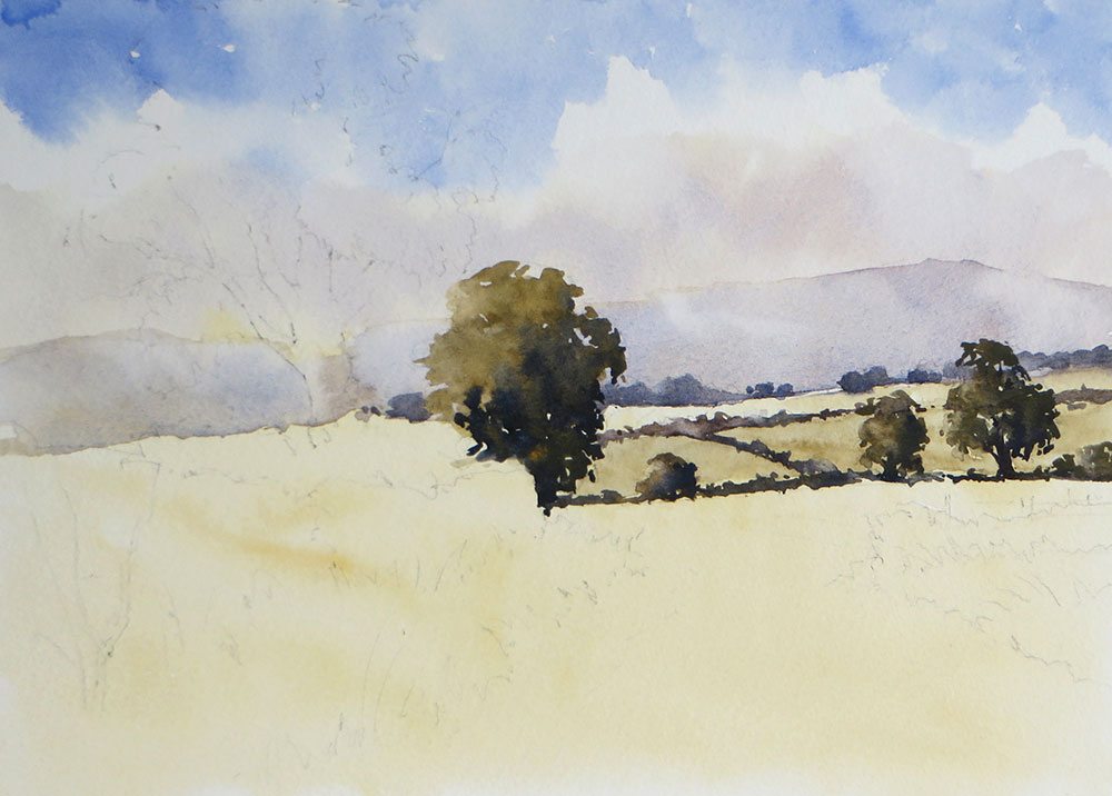
Step 5
The large tree comes next, working with the same process as before. For best results, this needs to be painted quickly, so you might prefer to have your mixes made up and ready to go. Paint the main mass of the foliage first in Raw Sienna and a little blue, then quickly add the darker colours on the right and anywhere else there may be shadows. I drag the brush across the rough paper to create broken edges, also adding the bushes at the base of the tree.
While the foliage is still damp, I add the trunk and branches using a thick, dark mix of Light Red and French Ultramarine. The damp paper helps the branches melt and soften lightly into the foliage.
Step 6
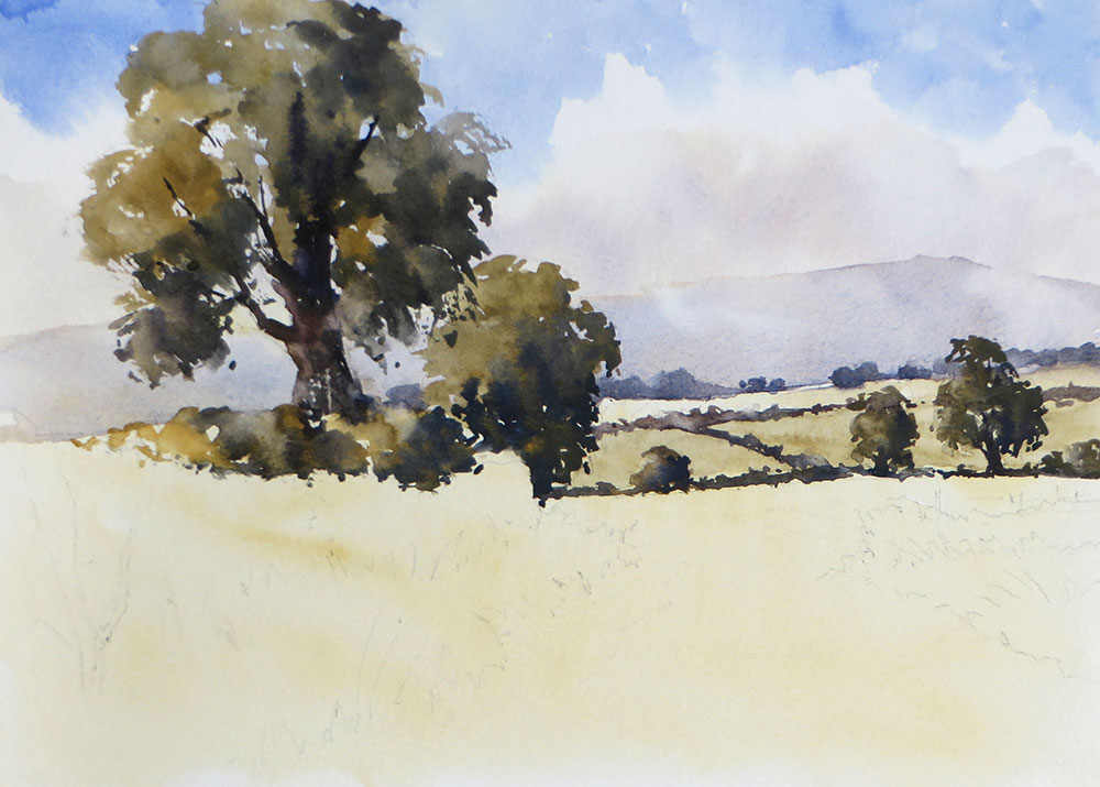
The foreground hedge is painted with Raw Sienna and a little blue, adding touches of Light Red and darker mixes towards the base. I create the effect of dry grass in front of the hedge by making a ragged edge at the bottom. Note how the first wash of Raw Sienna applied at the start of the work has now become grass and fields! While the hedge is still damp, I scratch lines into it to represent twigs.
Step 7
I develop the grass in front of the hedge further with a wash of Raw Sienna and Light Red. It’s important to leave some of the lighter colour showing through. Dragged brush work helps to add texture – make sure you pull the brush downwards in the direction the grass is growing. This in turn defines the edge of the track on the left.
I use the same mix to add a few darker tones to the track, being careful not to completely cover the under painting. The rough grass and small hedge on the right are added with mixes of green, adding more blue to the Raw Sienna to darken it.
Step 8
Once everything is dry, I add the shadows being cast by the hedge and trees on the left. This creates the effect of sunlight and helps to push the distance even further back. I am often asked what colour shadows are, as though they are all one colour!
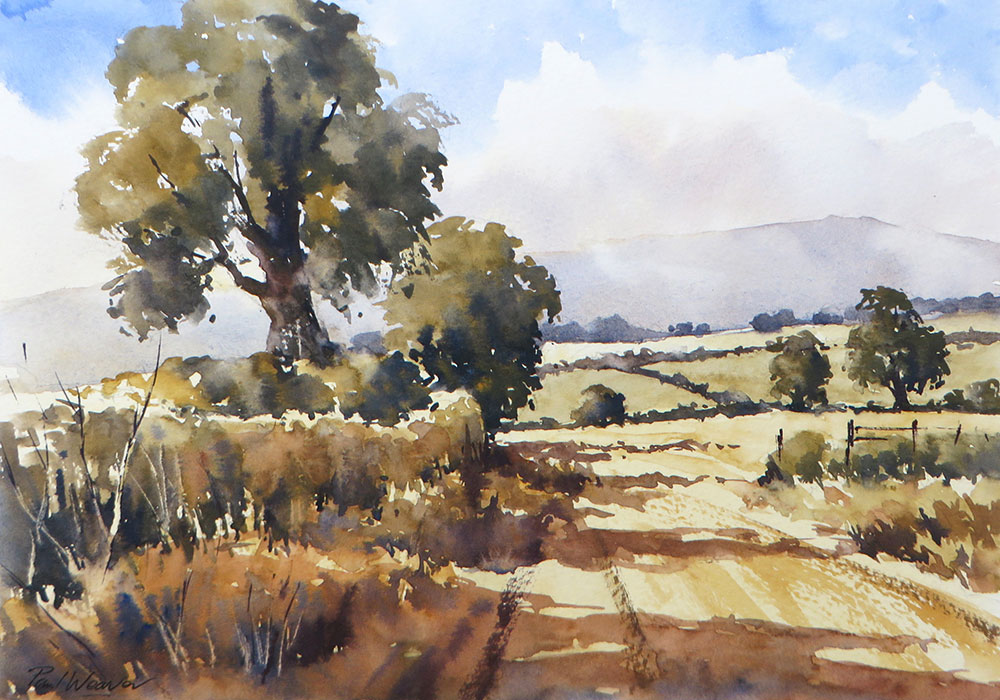
The important thing to remember is that the colour a shadow is will be influenced by the colour of the surface it is falling across. If the ground is a summer green, the shadow will be a darker green, if it’s a tarmac road, it might be a dark grey.
In this case, the shadows are falling across warm brown, dry grasses and stubble, so I mix a darker, warm, orangey brown for the shadow, adding darker accents here and there where the ground is darker.
Remember, the light is coming from the left, so the shadows run to the right. I paint the main shapes in quickly, starting beneath the hedge and then pulling the shadow out across the track. I’m careful not to fill everything in, leaving gaps here and there to suggest light getting through the foliage. The larger shadow at the front suggests another tree to the left that is out of the picture which helps frame the scene.
Finally, I add the details using Light Red and French Ultramarine, including the fence posts on the right, fine twigs and a few tractor ruts on the ground to help lead the eye into the scene. I use dry brush strokes for these elements to keep them subtle and suggest light and texture.
Summary
To summarise, getting to know your primary colours is the best place to start developing confidence with colour mixing. Try the colours suggested here and then explore a few of your own. Occasionally you might find it impossible to get the colour you want by mixing.
Certain colours of a more exotic hue such as Turquoise, Viridian or a very bright purple may be better straight from the tube or pan, but I recommend trying to get the most out of just a few colours first.
All work ©2020 Paul Weaver


It is always great to see how another artist uses water colour, even though I have been painting with them for over 60 years. Thank you.
A really helpful and inspiring tutorial – need to add 2 colours but they will be very useful and not ones I would have chosen before
Paul’s tutorials for watercolour painting are excellent. This latest tutorial on using only three colours is very helpful and does show you don’t need lots of different colours to produce colourful watercolour paintings. I have been lucky enough to attend several of Paul’s watercolour courses and he is an excellent tutor and his demonstration watercolour paintings are superb. These online tutorials have been invaluable during the lockdown. It would be nice to see more of these if possible please. Thank you Paul for your time and effort in creating them.
Although I have been dabbling in watercolours for many years I still found this tutorial worth watching. Paul’s tutorial on how to paint the scene made watercolour sound so simple! but his loose style is one I have tried to acquire.