
‘Winter Reflections’ – A Rainy Street Scene Watercolour Tutorial
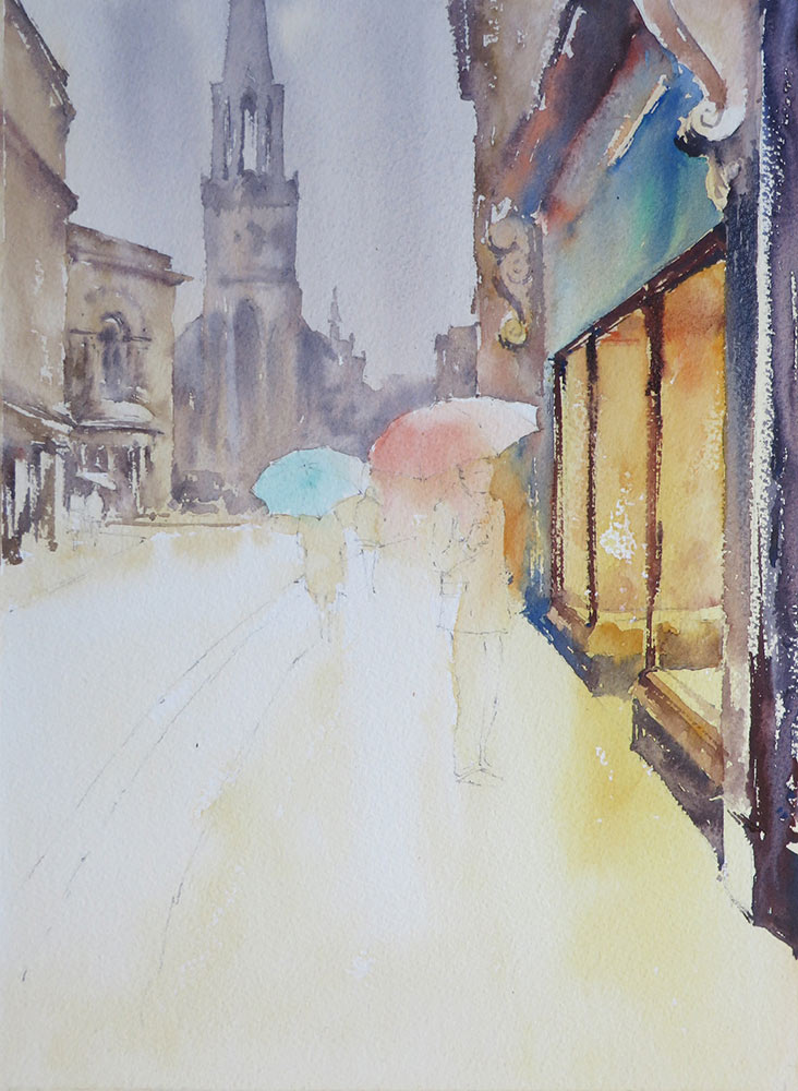
Watercolour is perfect for capturing the effects of wet surfaces and reflections, especially roads and pavements on a rainy day. This is a view I know well, looking towards St. Michael’s Church in Bath. It had been raining heavily, making a great subject to practise reflections.
As you can see, my original photograph is a landscape format and takes in a lot of information, including the left and right sides of the road. When using photographic reference, don’t fall into the trap of trying to copy everything, just because it’s there. I always ask myself, why did I take this picture in the first place? What exactly inspired me?
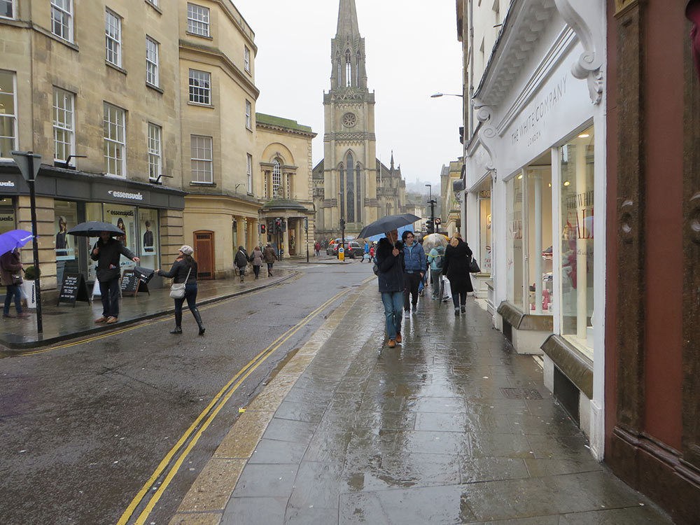
Thinking back to that moment, it was the reflections in the pavement on the right and the lights in the shop window that had caught my attention. The people with their umbrellas created movement, scale and atmosphere and the hazy form of the church in the rain added to the atmosphere and made an interesting skyline.
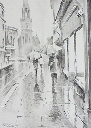
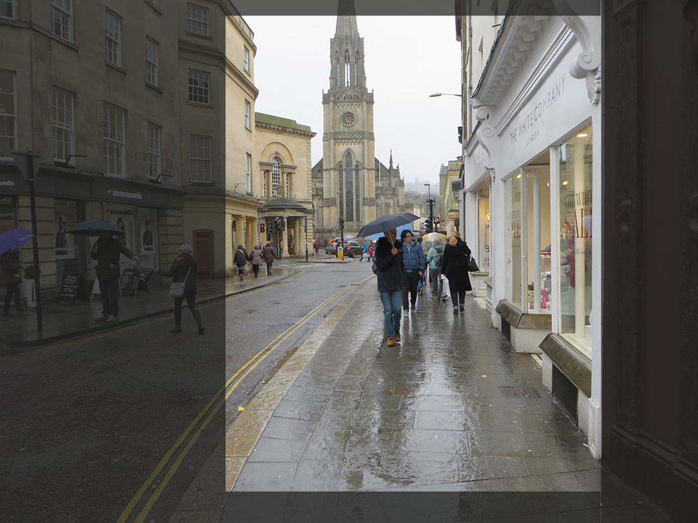
With these elements in mind, I cropped the area I wanted to focus on with some L-shaped pieces of cardboard and considered the subject further with a tonal sketch in charcoal. This is such an important step of the creative process for me, especially when working in watercolour. The mottos, ‘fail to plan, plan to fail’ and ‘plan like a tortoise, paint like a hare’ underline my reason and strategy!
By making a rough sketch first, it allows me to connect with the subject visually.
I planned where the figures were going and decided that I wanted to focus on the hazy atmosphere and reflections rather than any fine architectural detail. I decided to make a strong feature of the figures and the shop lights on the right, reflecting in the wet pavement.
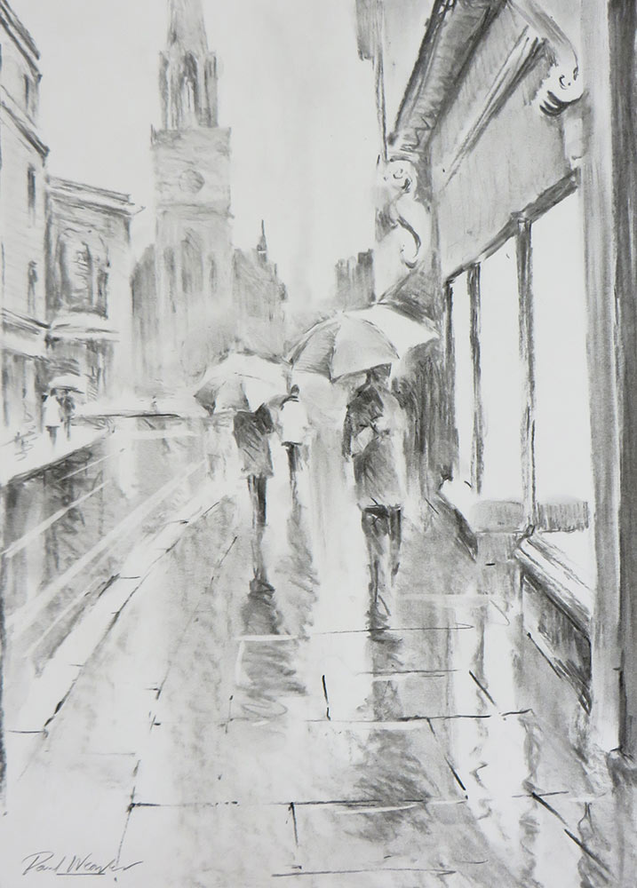
My photograph wasn’t quite giving me the drama that I wanted to create, so I applied a little imagination and artistic licence. The shop frontage was white, but during my sketching process I realised that by making it darker, I could create a stronger, brighter glow coming from within. This made a bolder focal point and a great opportunity to add a splash of bright colour!
It’s important to remember that there are often several ways of interpreting a subject, all of which are valid, depending on what inspires you. The important point I wanted to show in this demo is how the original photo is just a starting point and not something to blindly copy. I have tried to focus on the key elements that have inspired me.
With a clear direction in mind, I was now ready to paint!
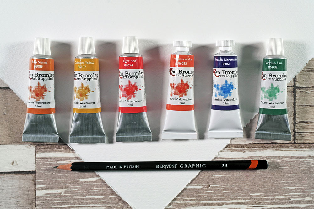
Materials used:
- Ken Bromley Artists’ Watercolours have now been discontinued, but choose from our wide range of watercolours.
- Raw Sienna
- Cadmium Yellow
- Light Red
- Vermilion Hue
- French Ultramarine
- Viridian Hue
- Saunders Waterford High White 140lb Rough
- 2B Pencil
Download a printable sketch if you prefer to trace rather than draw free hand..
Step 1 – Underpainting
I lightly sketched out the subject in 2B pencil, focussing on the main shapes rather than details. Working background to foreground, I first wet the sky and distant buildings with clear water and applied a wash of Raw Sienna. I let this run down the sheet to the road. While this is was still wet, I mixed a pale grey with French Ultramarine and Light Red and quickly added this to the sky at the top, allowing it to run down to suggest clouds and rain.
I was careful not to go over the umbrellas at this stage as I knew they would be lighter than the background.
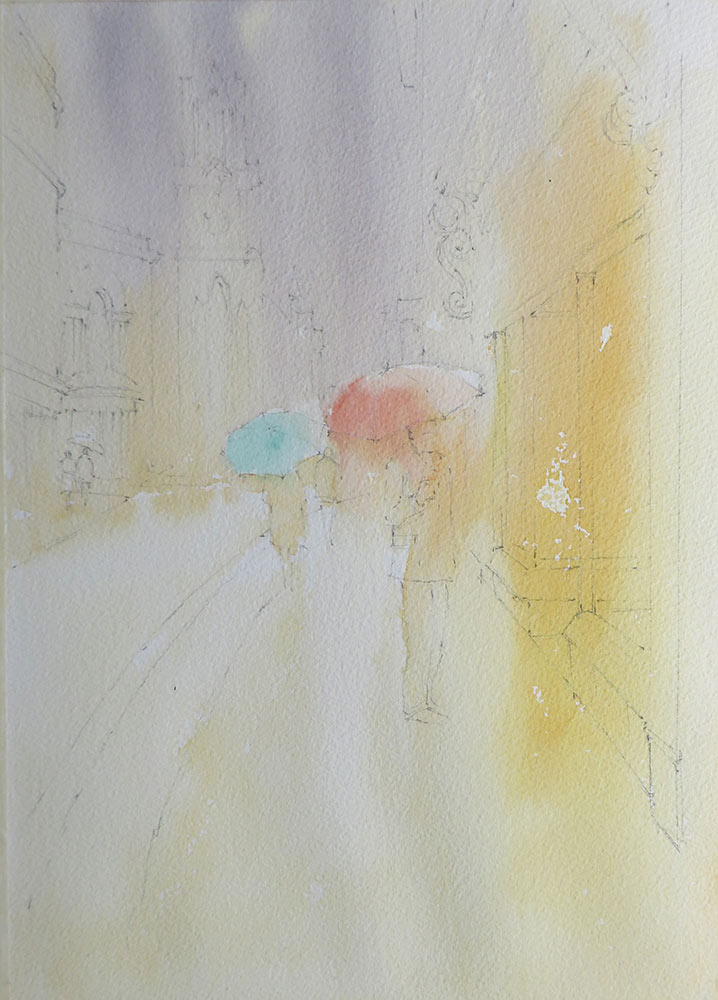
I continued the Raw Sienna wash across the road and shops on the right, adding Cadmium Yellow for the shop lights and letting the colours run.
I finally added a pale wash of colour for the umbrellas, using Vermilion and Viridian to create some bright accents. I then let everything dry thoroughly.
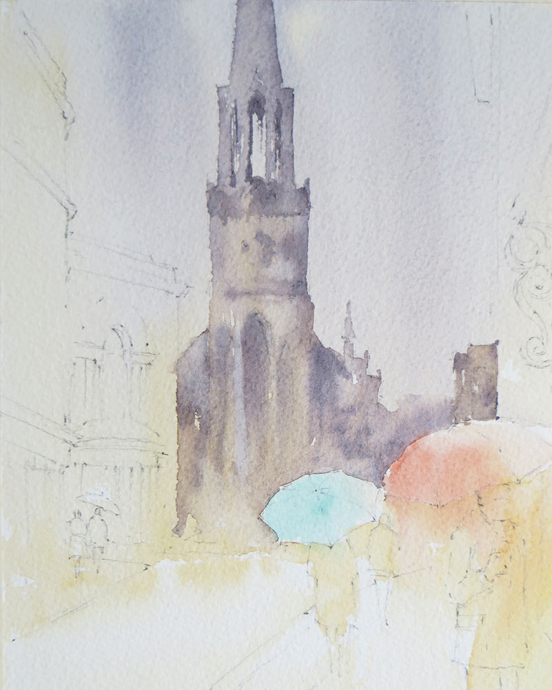
Step 2 – The church
The church was painted next, using the same grey as for the sky, only with more pigment to make it a little stronger. I focussed on the shape of the church rather than the details.
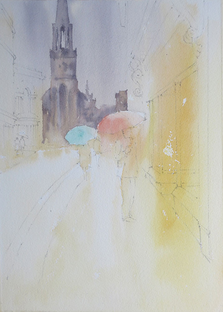
While this was wet, I added a suggestion of windows with darker grey, keeping it simple so it wouldn’t distract from the action in the foreground. Note how the darker shape of the church reveals the lighter tones of the umbrellas.
Step 3 – Buildings
Left side – I began the buildings on the left with Raw Sienna, adding a suggestion of detail while this was wet to keep edges soft and atmospheric. These details were added using the same grey mix I used for the church, only much stronger so it would hold and not run.
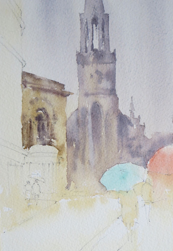
This technique is quite difficult, so I suggest practising first on a scrap of watercolour paper to get a feel for the timing and thickness of paint!
Step 4 – Buildings
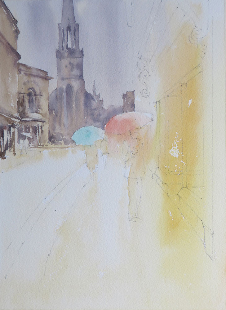
Left side continued – I continued with the buildings on the left, using dry brush work to suggest pillars and doorways at ground level. Note how I left some areas of the underpainting showing through to create highlights. I also painted around the distant figures.
Step 5 – Buildings
Right side – the shops on the right were next, starting at the top and working down. Note how I cut the wash around the figure with the red umbrella.
I started with a warm grey (French Ultramarine, Light Red and Raw Sienna), adding accents of Vermilion and Viridian around the shop frontage.
This is a departure from the photograph in terms of colour, but repeating the colours of the umbrellas in the buildings helps create unity and tonally it’s about the same. I aimed to keep this simple so as not to distract from the action below.
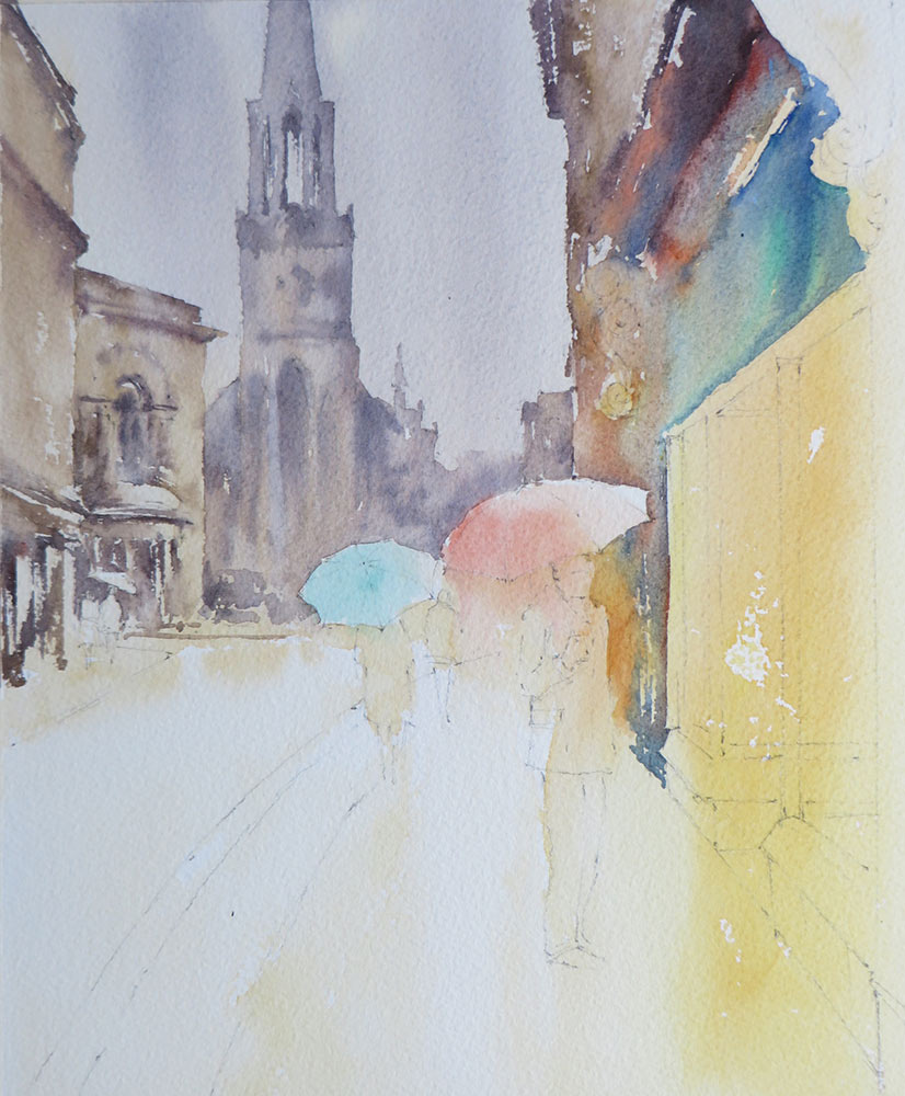
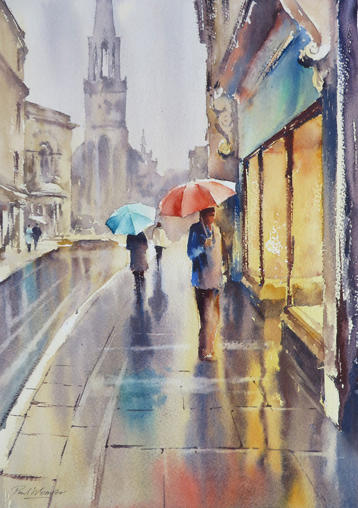
Step 6 – Shop window
The window interior was developed with a little more red and yellow. The dark window frame was added with dry brush strokes using a thick mix of French Ultramarine and Light Red, with more red than blue to warm it up. Note how these dark shapes create contrast and enhance the light effect. Dry brush strokes added sparkle and variety to these elements.
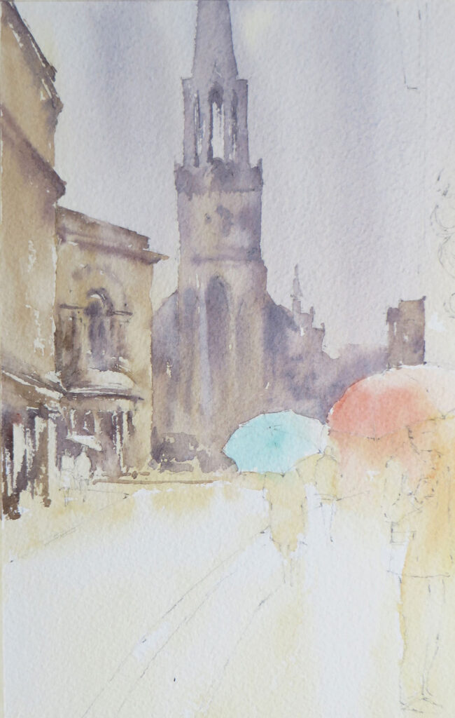
Step 7 – Figures
The figures are an important feature, creating a sense of scale and movement. By having figures in the distance and close up, it helps suggest depth and space as well. As with the rest of the painting, my approach is to suggest and simplify the figure. It’s the shape that
counts, not the stitching on the jacket!
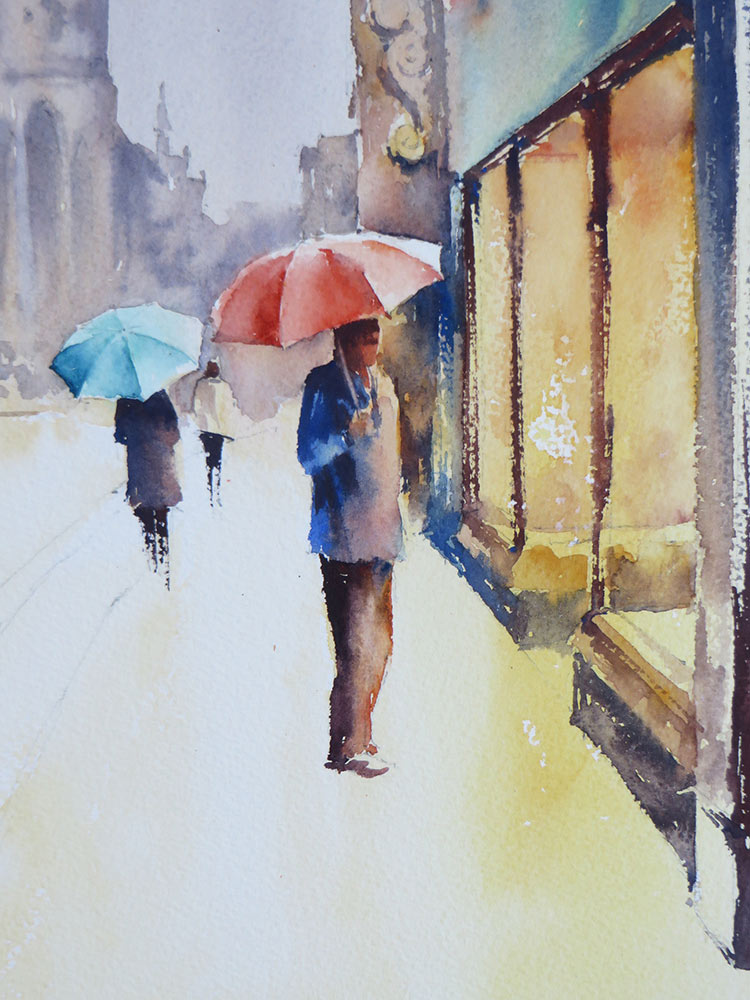
For the umbrellas, I painted each panel as a separate shape, blending from dark to light.
This helps create the illusion of a rounded, 3D surface. Stronger mixes of Vermilion were used for the red umbrella, while a little French Ultramarine was added to the Viridian for the darker side of the green umbrella.
The figures were painted with mixes of Light Red and French Ultramarine, varying the strength and mix for different tones. I used a dry brush stroke for the legs of the walking figures to suggest movement. The handle of the red umbrella was lifted out with a damp brush. I feel this is more subtle and convincing than using white paint or masking fluid.
Step 8 – Wet road
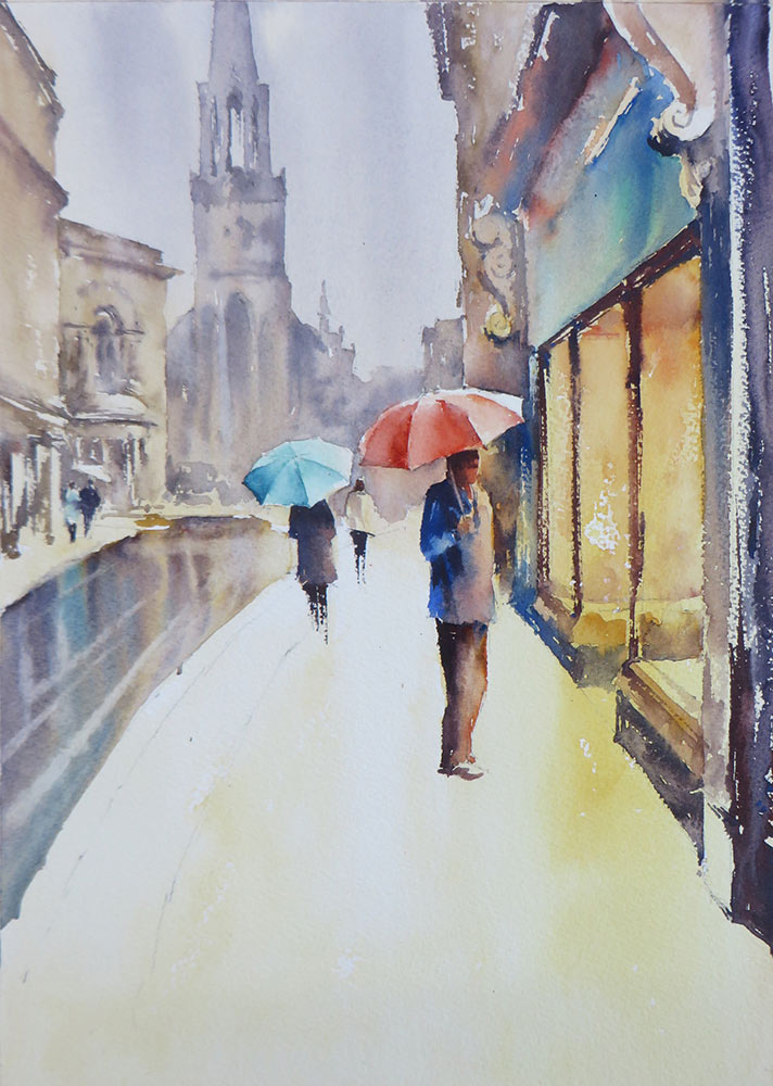
With all the buildings and figures completed, I finally added the reflections, starting with the road. I simply wet the road area first with clear water, then dropped the colours used for the buildings above onto the surface and let it run. Once I’m happy with the effect, I used a slightly damp, clean brush and pulled it slowly across the surface, lifting out lines to suggest highlights and tyre marks or passing traffic.
Step 9 – Wet pavement
The same process was applied to the pavement. I thoroughly wet the surface first, then dropped in the colours for shop lights, buildings and figures. Be careful not to churn the colours together, let them run out of control and mix on their own!
I used a thicker mix for the reflections of the figures and window frames, so the edges were soft but the shapes still defined. As with the road, I then lifted out a few highlights with a damp brush while everything was still wet. Timing is key for this technique, if the surface is too wet, the lines will fill back in, so practice beforehand.
Finally, I added some fine, dry-brushed lines to suggest the pavement structure. I kept this simple and only in the foreground. Reducing the details in the distance helps to create recession.
All work ©2021 Paul Weaver


I’ve done one or two like this in the last few months, copying the style from others. However, mine don’t match this, especially the reflections.
I know what I’m doing this weekend.
Thanks Paul Weaver!
muy buen tutorial , creo que es una entrega espectacular para poder lograr mas conocimiento practico de las técnicas de la acuarela
I always love Paul’s tutorials, superb artist and tutor.
First time I’ve looked at these tutorials and I will be looking at a lot more. Excellent way of explaining techniques I’ll definitely give it a try. Thank you.
I can’t wait to try this out. The tutorial is perfect for me as a beginner and inspires confidence that I could produce a reasonable likeness.
Just lovely, loose and beautiful,so atmospheric.
Great tutorial I love his style have his large Paul weaver brush which is my favourite
Thanks ken Bromley for sharing this
Another fine tutorial, I have enjoyed and learned much from them all. In particular it was good to see a reference photo and the reasoning for making changes, my thanks to the Ken Bromely site and Paul Weaver
This step-by-step tutorial is so much more effective than a video. It allows the viewer an opportunity to absorb the subject matter at their own pace. Thank you
Paul’s work captures the mood and the weather perfectly. A lot to take on board but I’m going to try out some of the techniques described.
Thank you.