
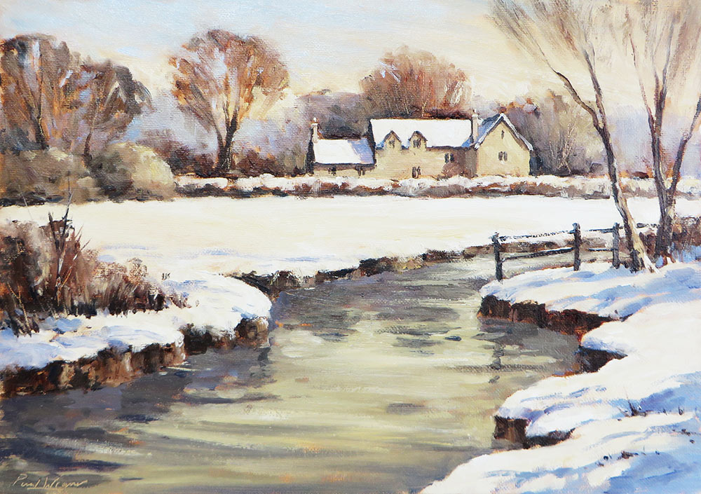
‘Cotswold Winter River’ – Alla Prima painting Tutorial in Water Soluble Oils
Snow scenes are great subjects to explore using oils and this view had everything I enjoy painting in a winter landscape. The dark river set against sunlit snow, leading the eye to the snow-capped building and distant trees, creates a nicely balanced composition and strong tonal pattern.
Alla Prima is the term used to describe paintings finished ‘in one go’. Oils offer a wide variety of techniques and interesting effects and are also very forgiving to use. Because of their opacity, mistakes and changes to the composition are easy to edit during the painting process. However, because of their slow drying time, if you want to paint something quickly (to capture a fleeting light effect for instance) it’s easy to end up with a mud pie rather than the image in mind!
Traditional oil painting processes involving multiple layered glazes can be very effective, but can also be labour intensive and may take a long time to dry in between stages. The Alla Prima process is direct and immediate, with the aim of capturing the subject in a free, expressive, painterly style, maintaining creative momentum and keeping colours fresh and clean.
The essential idea is to establish the basic composition and tonal pattern with a thin, dilute wash, then refine forms, tones and details in one more layer of thicker, more opaque colour on top, or ‘fat over lean’ as it’s often described.
I first began using water soluble oils when my children were born, the smell of turps in the house was simply no longer welcome. Aside from diluting the paint with water and fast drying medium and cleaning my brushes in washing up liquid (which I now regard as a benefit) I find the painting experience and finish of the final work to be no different to traditional oils. They behave as a true oil paint, with all the same qualities for glazing, impasto and other techniques and should certainly not be confused with watercolour or acrylic.
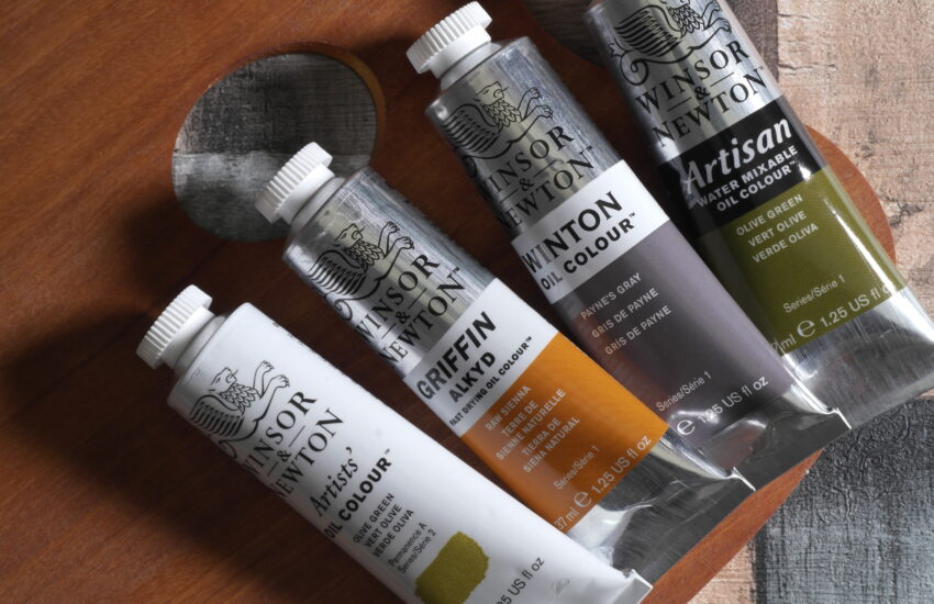
Materials Used
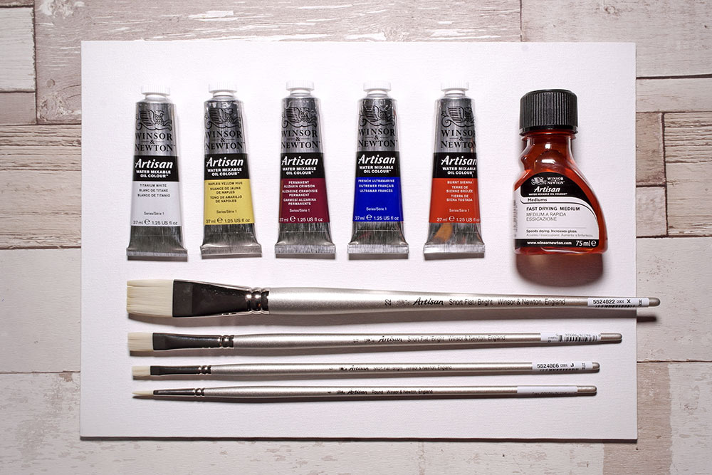
- WINSOR & NEWTON ARTISAN WATER SOLUBLE OILS
- Naples Yellow, Burnt Sienna, Alizarin Crimson, French Ultramarine, Titanium White
- Artisan Fast Drying Medium
- 10” x 14” LOXLEY CANVAS BOARD
- BRUSHES
- Artisan Range – Flat No.6, Flat No.12, Flat No.22, Round No.4
Download a printable sketch if you prefer to trace rather than draw free hand..
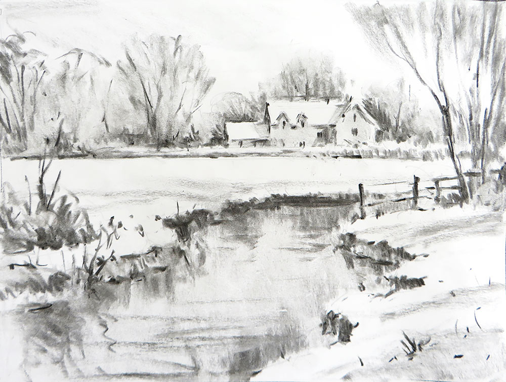
Tonal Sketch
Despite having a clear idea in mind of what I was going to paint, I start the creative process with a tonal sketch in charcoal on cartridge paper before reaching for my palette and brushes. A preliminary drawing helps me connect with what’s there in visual terms, to refine the composition and understand where the key light and dark tones are placed. Note how little detail is included, just the essential information for the subject to read.
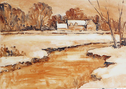
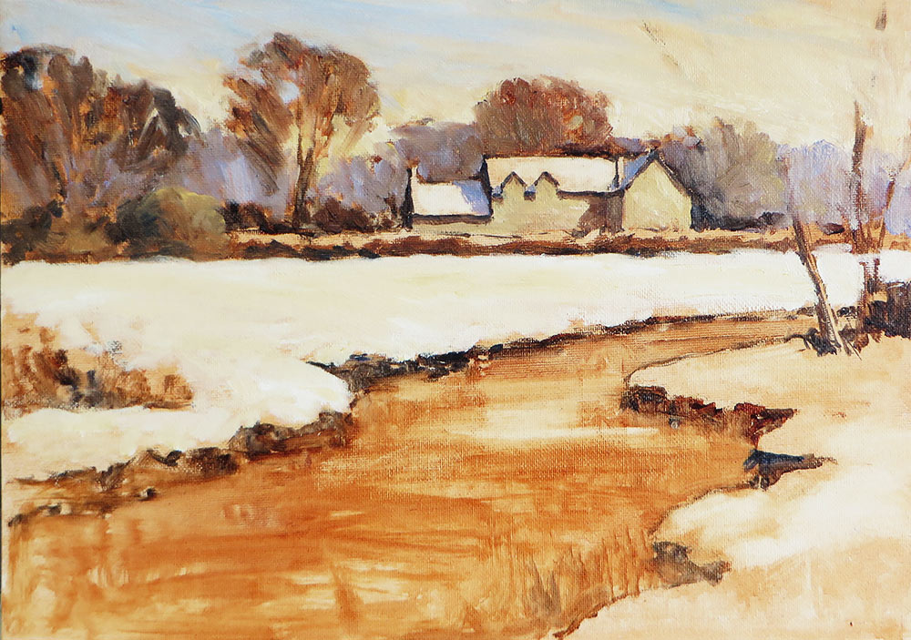
Step 1 – Underpainting
This first stage is very important – setting the foundation for all work to follow. This is the underpainting, establishing the composition and main tones in monochrome. I first apply a wash of thinned Burnt Sienna to get rid of the white surface of the board. I’m using water soluble oils, so I make my wash with a little water and a drop of fast drying medium. If you prefer traditional oils, then use your thinner and medium of choice for the same effect. Only use enough liquid to dilute the paint to a thin consistency – you don’t want to flood the surface and have it dripping off the board!
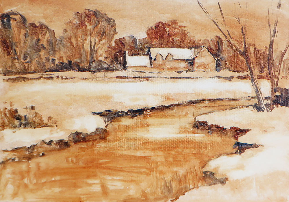
Working on a tinted ground helps me judge tone more accurately. If you try to paint correct tone against the white of the board, then of course you are going to try and make it look correct against white. But remember, as the painting progresses, it’s likely that other tones will be added to surround what you have spent so long refining, which may in turn reveal that it’s not as accurate as you thought! So, in my experience, it’s safer to judge tone against tone, not white. By working in monochrome, I can focus on the drawing and just worry about how light or dark things are.
Whether you are working with traditional or water soluble oils, this first wash of colour should be touch dry within 10 minutes. I then sketch out the composition with a mix of Burnt Sienna and Ultramarine Blue, using a pointed round No.4 brush. I use a light, lost and found line, trying to keep the line work delicate and not too heavy.
The mid tones for the trees and river are scrubbed in with a number 12 and 22, using a thin mix of Burnt Sienna and French Ultramarine. Darker tones for the tree trunks, shadows on the building and edge of the river bank use the same colours, just a little less water. Finally, I take some kitchen towel wrapped round my finger, dampen it with water and rub out the brightest areas of the snow and highlights on the water.
I now have a clear guide as to where the main shapes and tones are sitting, ready to apply colour on top. More importantly, I can see where each shape starts and stops, enabling me to place colour accurately and avoid muddying colours with neighbouring shapes more easily.
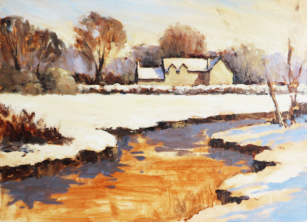
Step 2 – Sky
I like to start with the sky as it sets the mood and light for the rest of the painting. Working background to foreground is also a useful sequence to follow in a landscape. The sun is shining from the right, so I start with Naples Yellow and a little White, gradually working right to left. I carefully cut around the trees, keeping them dry and clear for their own colours later on.
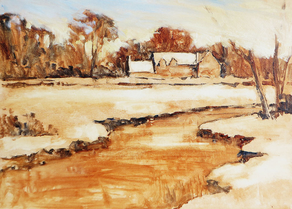
I add a touch of Alizarin Crimson to the mix to create a warm pink and fade this out into the top left corner. This prevents the blue which I add next from going green. I mix a little French Ultramarine with white and apply it with quick, light diagonal strokes to keep the sky fresh and clean.
Step 3 – Distant Trees
The distant trees are blocked in with loose brush work. No dabbing or stippling, this needs to be kept simple to help it recede. I used a mix of Alizarin Crimson, French Ultramarine and a touch of Naples Yellow to make a warm grey. The foreground trees use the same mix, adding a little Burnt Sienna to make it warmer.
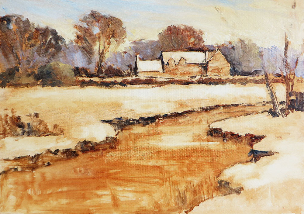
Step 4 – Building and Foreground Snow
The distant building is blocked in with a warm grey for the walls. This is the same mix as for the distant trees, but more Naples Yellow to lighten it. Shadows on the wall are Burnt Sienna, Ultramarine and Naples Yellow. Shadows on the snow are Ultramarine Blue, Alizarin Crimson and a touch of White. I leave any details such as windows and chimneys until the end.
The middle distant field is roughed in with White and a little Naples Yellow. Remember, snow reflects the colours of the sky and landscape around it; it is seldom just white. Note how I have cut around the tree trunks on the right and undergrowth on the left, allowing these areas to be developed while keeping the snow bright and clean.
Step 5 – Reflections and shadows
I rough in the foliage on the left and the edges of the river bank with Burnt Sienna and French Ultramarine, adding Naples Yellow for lighter tones where required. Touches of the underpainting are allowed to show through in places as well, creating further colour and texture.
The dark reflections in the water are blocked in with a blue grey, mixed with Burnt Sienna French Ultramarine and a little White. The cool shadows on the snow on the right are added with the same mix used for the shadows on the building roof – Ultramarine Blue, Alizarin Crimson and a touch of White.
Step 6 – Developing details, Reflections and Snow
I go back to the distant trees and scratch out a few twigs and highlights with the end of the brush handle, then add the snow to the top of the hedge in front of the building.
The sunlit snow on the right is blocked in with a thick mix of White and a little Naples Yellow, being careful not to cut into the shadows to keep colour clean. I allow small notes of the underpainting to show through here and there to suggest the ground beneath.
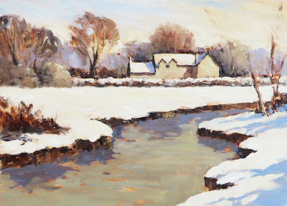
The water is blocked in using a warm grey, cutting round the reflections and snowy river bank. This is a pivotal stage in the painting process as everything has now been covered in paint, allowing me to relate everything to the whole. I can now assess more easily any tones or drawing that needs correcting, as well as what final details need to be added.
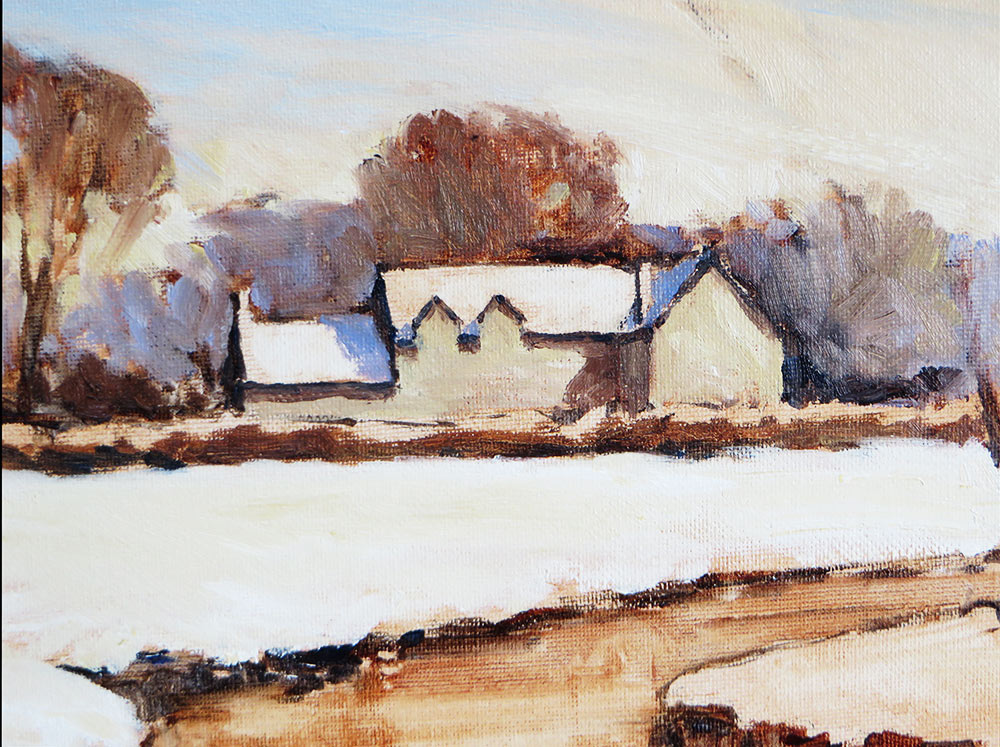
Step 7 – Detailing the House
With a fine brush I add the details to the distant building. Windows and shadows under the eves and on chimneys are added with Burnt Sienna and French Ultramarine. The snow on the roof, edges of the gable and tops of the chimney are also added with White and a little Naples Yellow.
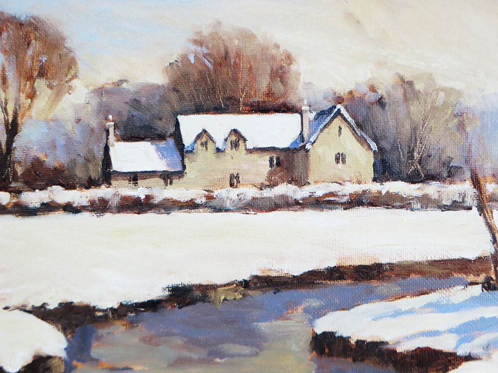
These details are being added on top of wet paint, so a light pressure and thick pigment is needed so as not to smudge the marks.
Step 8 – Refining the River and Final Details
Ripples and highlights are added to the river with a warm grey of Burnt Sienna, French Ultramarine and Naples Yellow. I use a flat brush and light, horizontal strokes to suggest the ripples on the surface. The trick is to be economical with each stroke, to keep colours clean and the surface lively. I add more White to the mix for highlights.
The trees and fencing on the right are added with mixes of blue and brown. I use a light, dry brush for the winter twigs across the sky. The sky is still wet, but a light pressure of the brush will minimise colour contamination, while enhancing the effect of the light showing through from behind. Accents of snow are added to the trunks and fencing.
Finally, I add a few grasses poking through the snow on the bottom right river bank and refine the edge of the snow against the foliage on the left. Some darker twigs and a little scratching out with the end of the brush enhance this area further, along with a suggestion of shadows on the left bank, being cast by the trees on the right.
All work ©2020 Paul Weaver


SO, YOU ARE SAYING WATER SOLUBLE OIL PAINTS ARE JUST AS GOOD AS OIL PAINTS AND LINSEED OIL? REALLY? WILL THE QUALITY OF PAINTING BE THE SAME?? DO YOU STILL START WITH GLAZING AND THEN ADD LAYERS? THIN ON THICK?
Hi Karen. Water Mixable Oils are a genuine oil paint, the only difference is that they’re made with a modified water-soluble oil binder. They’ll still perform like your favourite traditional oils. The quality of the paint depends on the type of paint you buy, as we sell both student and artist grade colours. You’ll need to follow the same rules as painting with traditional oils. We do have a few blog posts about water mixable oils here if you want to learn more!
I absolutely love this piece.
Your tutorial Cotswold River, arrived via a friend just in time for me to use my Christmas present of some tubes of water based oil paint. From someone who is ‘happy’ to be confined to the house during the current restrictions