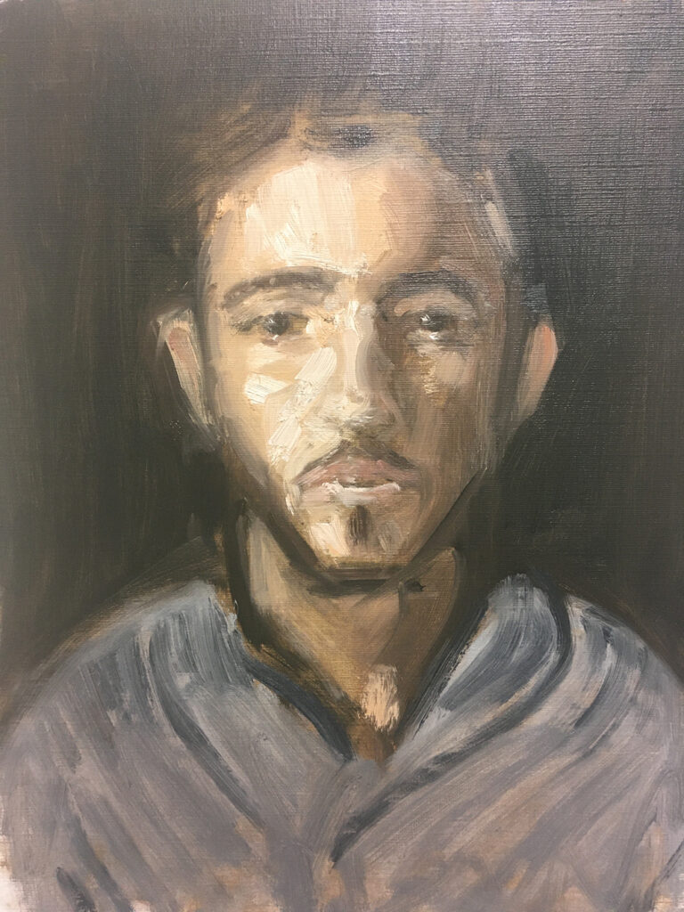
Loosely Painting an Oil Portrait Using a Limited Palette
In this tutorial I will share with you some techniques for loosely painting a portrait in oils. I have used a limited palette named after the Swedish artist Anders Zorn (1860-1920). He was known for his exceptional portrait and figure paintings and popularized the use of this palette. With just these four colours, you can mix a surprisingly broad spectrum of colours, including various flesh tones, greys and browns suitable for portraiture.
The limited nature of the Zorn palette encourages artists to focus on colour mixing and value control. This helps develop a deeper understanding of colour theory and how to achieve a harmonious colour balance in their work.
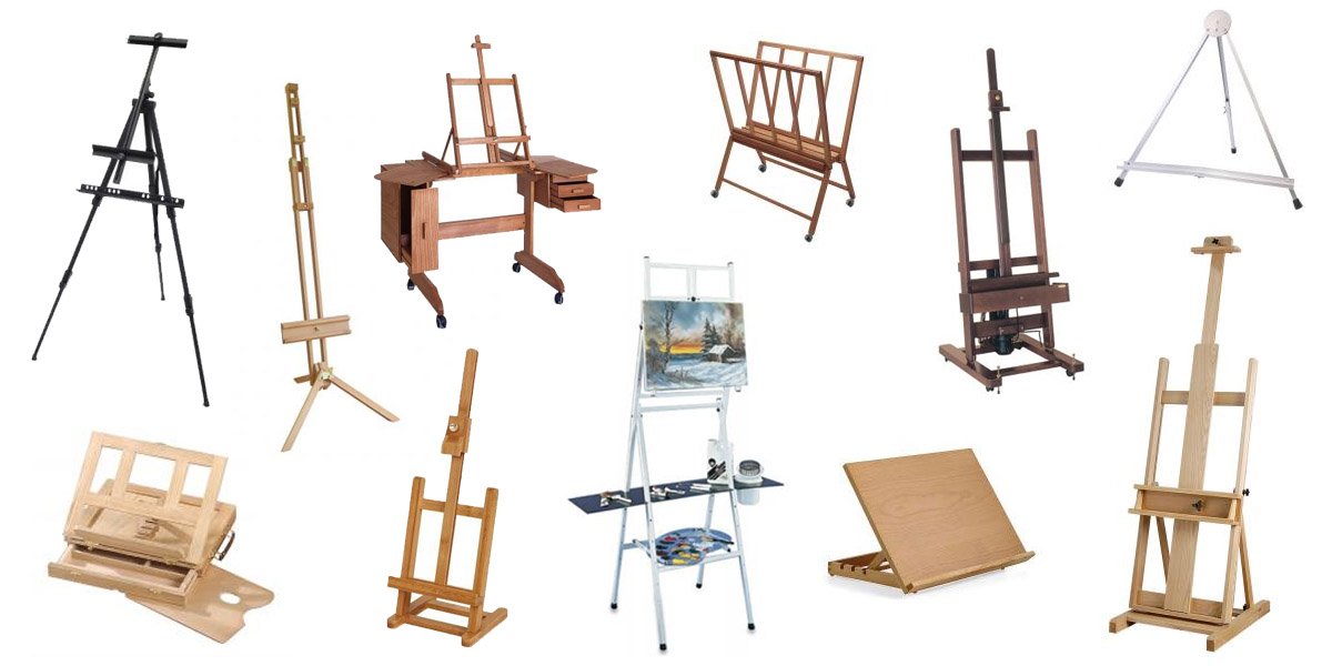
Materials needed for this tutorial
Oil colours used:
- Titanium white
- Yellow – yellow ochre or yellow brown equivalent
- Red – vermillion, cadmium red, scarlet lake
- Black – ivory or mars black
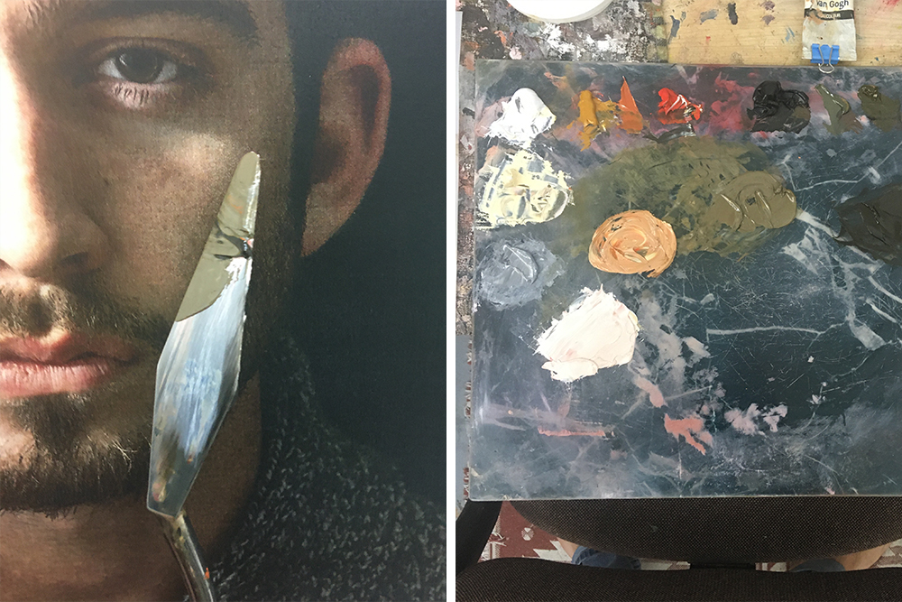
Brushes: I have a preference for stiff bristled hog hair brushes, normally in the filbert shape and of various sizes. I like them because they can pick up a lot of paint and due to their stiffness can move the paint around easily. With softer brushes it is not possible to paint in a thick, impasto style such as this one.
Surface: for this portrait, I used a piece of canvas paper available in a variety of formats.
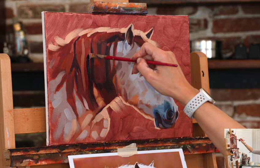
Reference photo: I found this photo online. It caught my eye because of the dark background and the good light source meant the shadows and light were well defined.
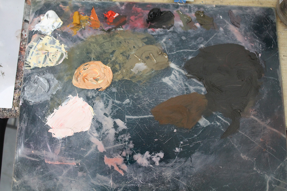
Step 1: Setting up the palette and preparation
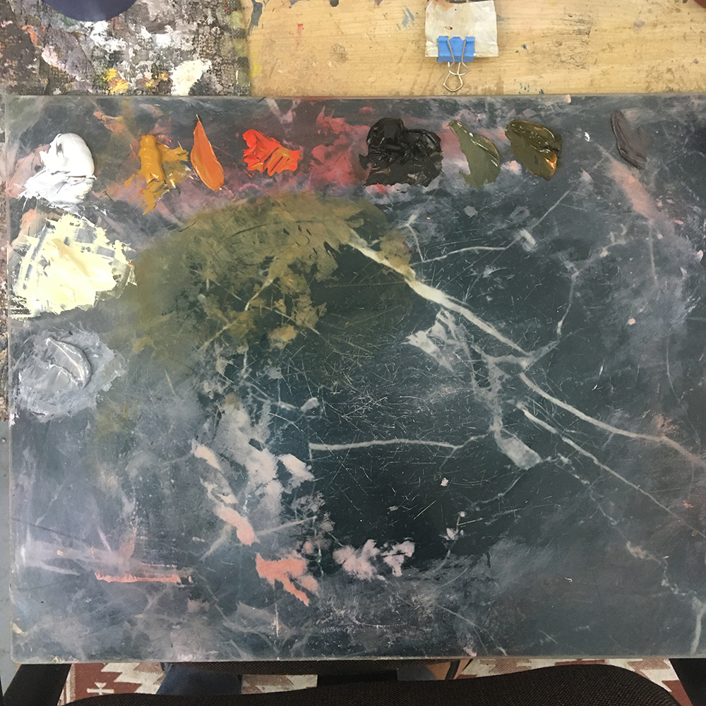
The beauty of this palette is its simplicity.
It’s useful to mix a few secondary colours and other colours, such as an orange, very pale yellow (titanium white + ochre) and grey-blue (black and white) before we get started.
Using a colour wheel is helpful if you need a hand with figuring out how to mix colours.
Because skin is mostly warm, the grey-blue created by mixing black and white is more than sufficient for creating cooler tones.
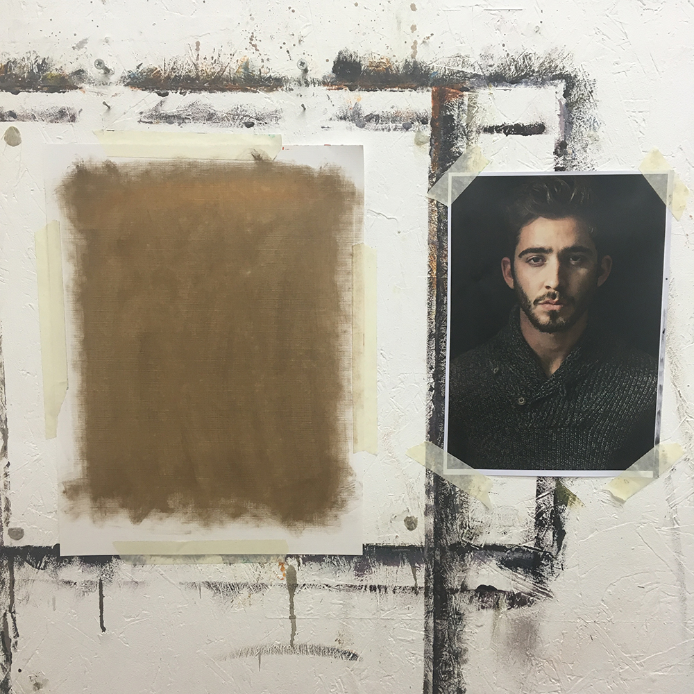
I always like to thinly cover the surface I am working on in a neutral grey or brown colour. This makes it much easier to judge the darkness and lightness of the other colours we will be putting on top of it at a later stage. If our surface is completely white, everything will look dark.
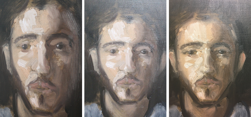
2. Colour mixing, sketching the portrait and block in shadows
Using the photograph as reference, I like to mix 4 skin tones that will be useful.
The 4 tones will be – shadow, light colour, mid tone and highlight. They don’t have to be perfect. Try testing your mixture next to the photograph and seeing how it compares if you want to match exactly.
An easy way to mix skin tones with this palette is as follows:
Yellow + red = orange
Orange + black = brown
With this warm brown mixture, we can add white (cool) or yellow (warm) to lighten or add black (cool) or red (warm) to darken.
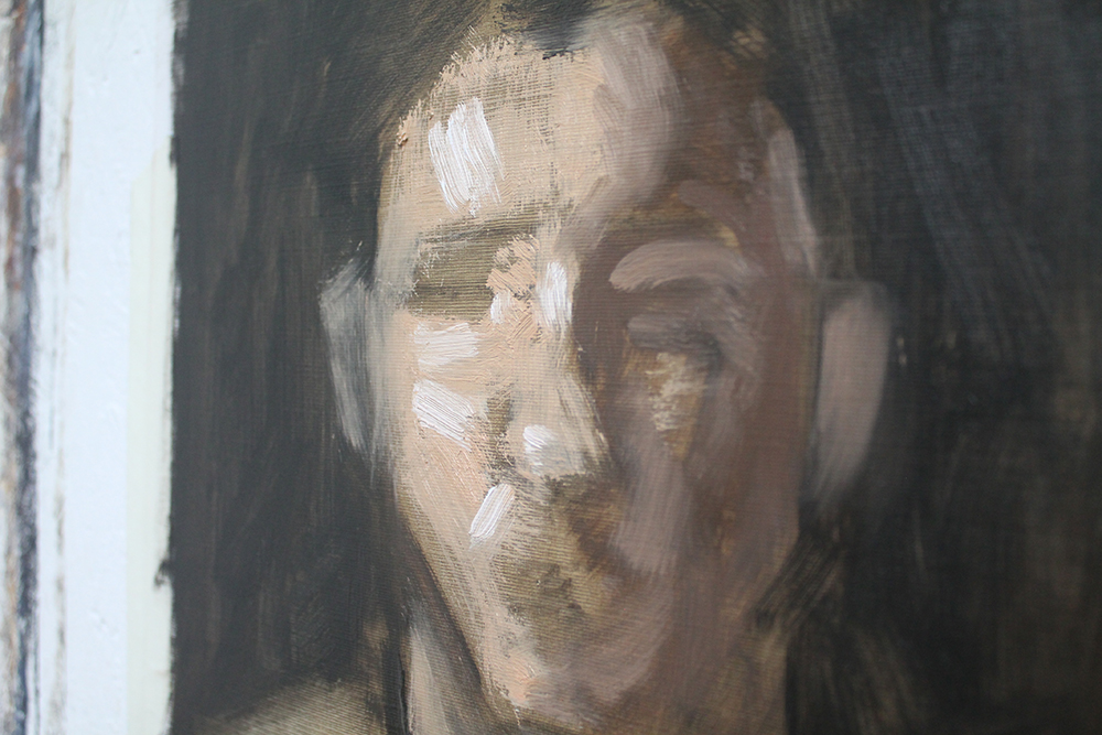
I like to sketch in paint, roughly plotting the height of the eyes, the shape of the face, position of the nose etc. Painting in this way is much more like sculpture than we realise: we start with a large mass, and we gradually carve out smaller and smaller areas until we reach a point where we can add details.
I always block in the shadows first, with a thin dark mixture. I will rub them out if necessary and play around until the general shape is sufficient.
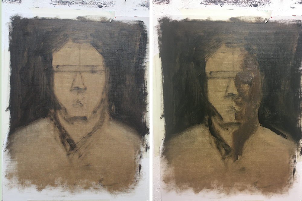
It’s important not to obsess over details at this stage.
I like to block in the background early as I can use this to carve out the shape of the head.

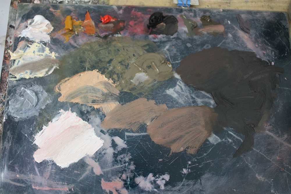
3. Adding more values and mixing new colours
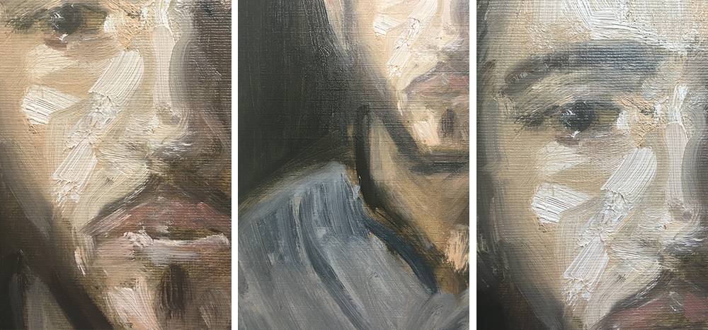
I don’t like to blend my brushstrokes: I put down colours and try my best to leave them alone. This is why it’s important to be able to match colours well, so that we can be confident and have faith in them when they are put down.
Be bold with your brush marks, use large brushes and a lot of paint – we can always scrape it off and start again if necessary.
After adding the shadow colour, I will add the base skin colour so we have the face in 2 halves roughly. Next, it’s nice to add some highlighted accents with some thick paint. It’s good practice to keep our shadows thin and transparent and our lighter colours thick and opaque – this helps with the illusion of the face appearing real and lifelike and adds depth.
4. Adding structure and turning the form
Adding another value between the shadow and the light parts of the face will do wonders to help with the illusion of our portrait appearing real.
We started with large, simple shapes and now we are starting to ‘carve out’ smaller areas – the eyelids, the nostrils, the areas around the mouth. Simplicity is still key. Use the largest brush possible. Try not to dab or blend the marks too much. If you want to change something, scrape it off with a palette knife and attack the area again with thick, confident marks. There are times when I have to rework areas again and again, but because I keep the marks strong and juicy the end result is fresh and exciting.
Once we have ‘built’ the eye socket, the eyelids and have created the general structure of the eye we can add the pupils. A well placed, single blob of paint will do – no need to fuss over eyelashes.
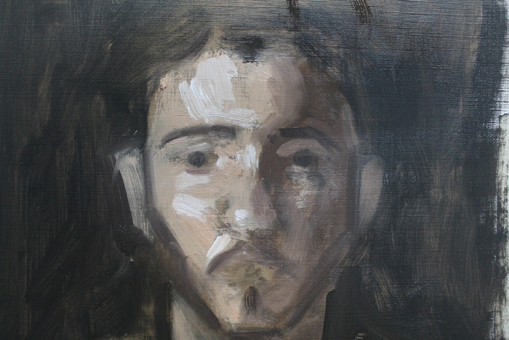
When painting in this style, it’s much more effective to suggest things instead of meticulously painting them. A pupil is one blob of paint, a nose is nothing more than a slight change in colour or value. Mouths, in particular, I am very hesitant to paint with any detail. More often than not, I will complete them in a couple of marks and leave them like that.
5. Pulling everything together
Adding a couple of highlights in the pupils of the eyes will make the portrait pop. Be careful not to overdo it. Things are not often pure white in reality.
If your image is looking a bit flat, add some slightly cooler colours to the areas in the face that recede – the sides of the nose, the area going back towards the ears. Cool colours recede and warm ones advance – this can make a big difference in the effect your painting has.
My palette at the end of the portrait is not much different to the beginning – I have mainly used the 4 colours we pre-mixed at the beginning of the portrait. Any other colours (apart from the lips, for example), are made from mixtures and alterations of them.