
Watercolour Robin Tutorial
The classic British Robin. Another iconic bird that is instantly recognisable. Whilst they might be many people’s favourite and a “cute little bird”, don’t be fooled. I have always found them extremely tricky to paint in watercolour, and I know I’m not the only one. Let’s take a look.
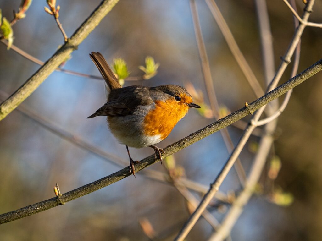
The Reference
As is often the case when I paint birds and wildlife, I am really looking for two main things:
Number one is a good and interesting pose. In this case the Robin is fairly side on, but it also has a nice little twist to it. Plus, I like the upright tail and the wing tip pointing out. Basically it makes an interesting and recognisable silhouette, which in turn is instantly making our job as the painter much easier!
The second is of course the light. A nice definition between light and shadow makes painting anything much easier. In this case it also gives form and drama to the rounded shapes of the bird. I think this can help move things away from something that dare I say feels to “cutsie” (nothing wrong with that if it’s what you are aiming for of course!)
It is all too easy to make them look like homogeneous rounded blobs with very little form (I think one reason why painting Robins is hard). The light and shadow, plus the overall shape can really help us move away from this.
It is this shape and the light that I will hold at the forefront of my mind as I move through the painting. Hopefully this dominant idea and focus will keep me on track and stop me from fussing about and overworking.
Whilst I like the bird itself a lot, and probably will not change much, I plan to make the background more expressive and feel more like the time of year it is when I painted this, i.e. late summer. So lots of intense greens with plenty of warmer yellowy greens, and nice strong, cool darks to balance.
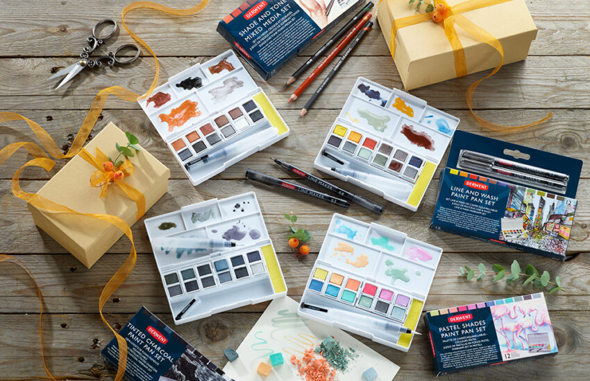
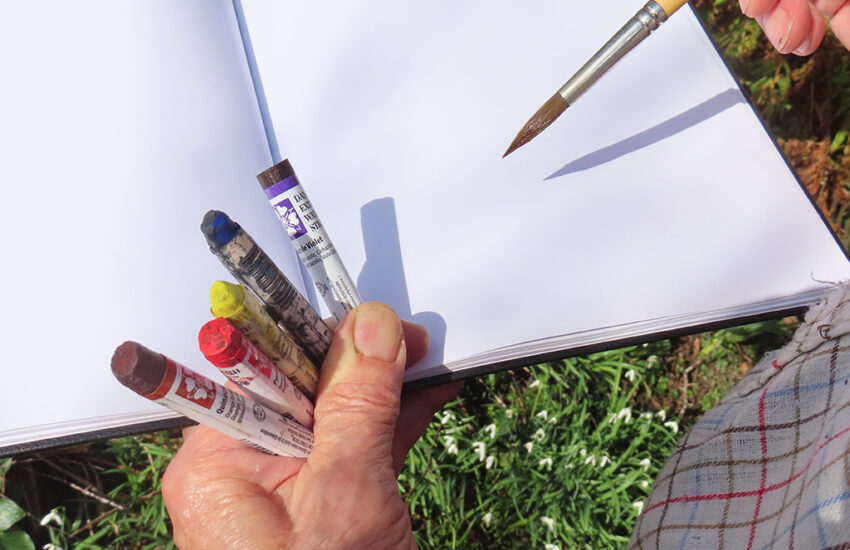
Materials
Paper – 37 x 37cm single sheet (cut to size)
I fancied going a little bigger with this one. In fact, the painted robin is larger than life. I find it all to easy to make delicate little British garden birds too heavy and overworked. Painting them at a small scale is one way to keep them simple and light; but I just fancied giving a larger one a go! This whole process would certainly work much smaller too.
I chose my current favourite paper (amongst maybe 3 brands) – This being Winsor & Newton Professional Watercolour Paper. It stays damp for a good time for wet into wet work, but it also allows for finer detail if wanted. I also use the rougher texture as I like broken brushstrokes. I used the 300gsm weight, but I did not stretch it first.
Brushes
For this demo I am using Winsor & Newton’s new synthetic range. Whilst I use exclusively synthetic hair brushes made to emulate natural hairs, and have done for some years, this is only the second time I have tried this particular range; and I have to say I think they are fantastic!
I used the Synthetic Squirrel medium size quill for larger areas:
Beautifully soft, holds a great amount of water and pigment, and it had a very lively and expressive feel to it.
It is a little springier and tighter than my usual Escoda Ultimo Mops of similar sizes (also faux squirrel), but I actually really like this property. The combination of soft liveliness that can come to fine point, with a bit of spring making it extremely controllable (and forgiving), I thought worked wonderfully. I can see this is a very versatile and expressive brush. An instant favourite.
Alongside this I used a Size 8 & size 10 round. Both synthetic sable:
My usual brushes at this size and shape are the Pro Arte Prolene brushes. Which I love. By emulating sable these were noticeably softer and also held more water and pigment. It took me a moment to get used to this, but once I had a feel for them, total winners!
They are lively and expressive for large areas and more bravura brushwork, but they also come to an incredibly fine and very controllable point, with plenty of pigment in the body to call upon when needed.
When scaling down in size and tackling small areas and details I have always favoured very stiff brushes that hold less water and pigment, because they are so controllable. However, I am totally converted to throwing these Winsor & Newton synthetic sables in there too, and can see them becoming a firm favourite, if not taking over the number one spot!
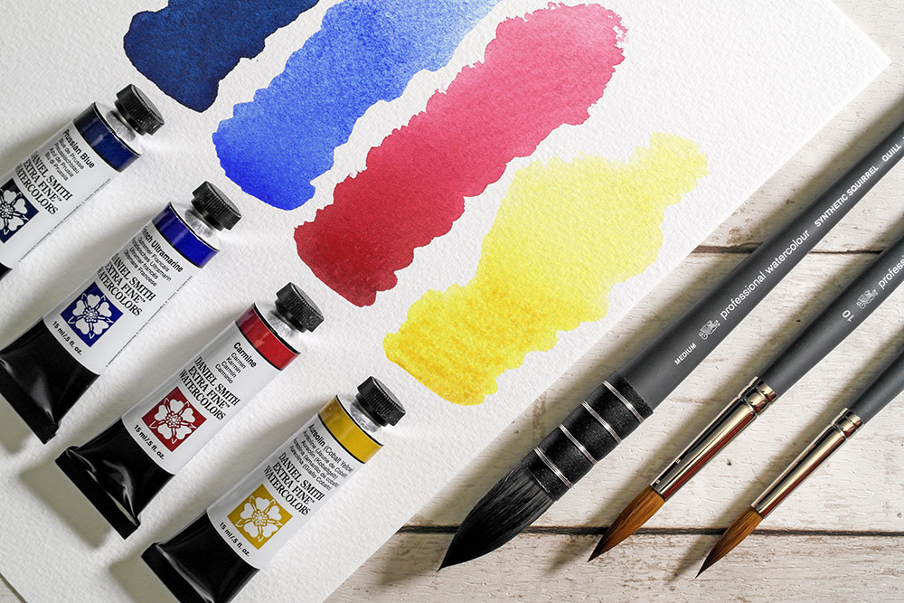
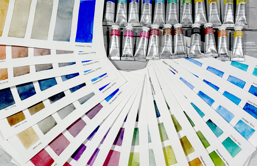
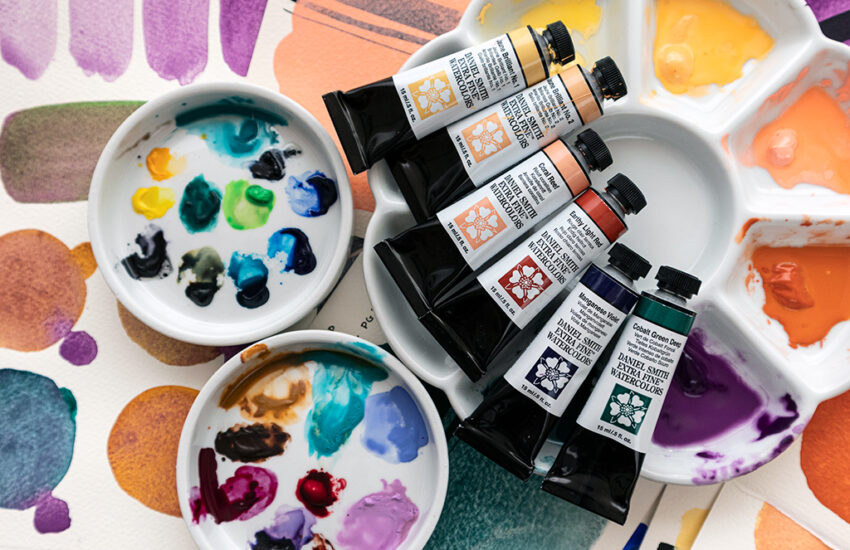
Colours
I generally prefer to work with transparent colours. The lovely luminosity they give is of course one of the joys of watercolour, and they make mixing rich darks easier too.
Opaque colours are great, but I personally tend to reserve them for extra shots of colour intensity, splattering into drying washes for texture, and for the odd cheeky dry brushstroke to lift little areas if needed.
There are a few brands I like to choose from for my watercolour paints, although Daniel Smith Watercolours and Holbein are my go to favourites.
Don’t be fooled by the name “Robin Red Breast”. When you really look we have bright yellows and oranges in sunlight, strong oranges in the mid-tones, and even the dark feathers and shadow areas have more of soft orangey reddy-ness to them.
So believe it or not I don’t actually have a bright red out – all though if you wanted to just use primaries to keep things simple, I think a nice clean, bright, warmer (or neutral) red like Pyrole would help get the bright oranges.
I used 4 colours in total. I often like to use as few colours as possible as it makes colour mixing so much easier. Whilst I could have probably tackled this painting using just one of each primary, I wanted strong clean greens plus bright oranges, so I chose the colours below:
- French Ultramarine (warm) – a nice soft blue, great for soft shadows and making the muted greys and browns of the back. It wouldn’t give particularly vibrant greens because of it’s warmth – Ultramarine Red Shade or Cobalt would be fine alternatives
- Prussian Blue (cool) – really only on the palette to provide the vibrant lush greens and also to create a nice easy deep dark – Pthalo blue would be a good alternative
- Carmine Red (cool) – very similar to Alizarin Crimson. Bright enough to subdue the yellows and oranges without muddying them (especially as transparent). Really useful for variety of browny colours, and an easy dark when used with Prussian – Alizarin Crimson or Quinacridone Red would work very well too
- Permanent Yellow Orange – because of the yellow bias, this has beautiful bright and clean clarity to it, but it can still be really intense when used with less water – any orange could work, or even a warmer brighter red in combo with the below yellow
- Aureolin Yellow – A lovely cool yellow that will give the wonderful vibrant greens I am after. But, because of it’s lovely brightness and clarity it will still give wonderful bright colours when combined with the oranges (even though it’s cool) – lemon and cadmium yellows could work ok, although the opaqueness of these I find harder to use for this particular need.
The Drawing
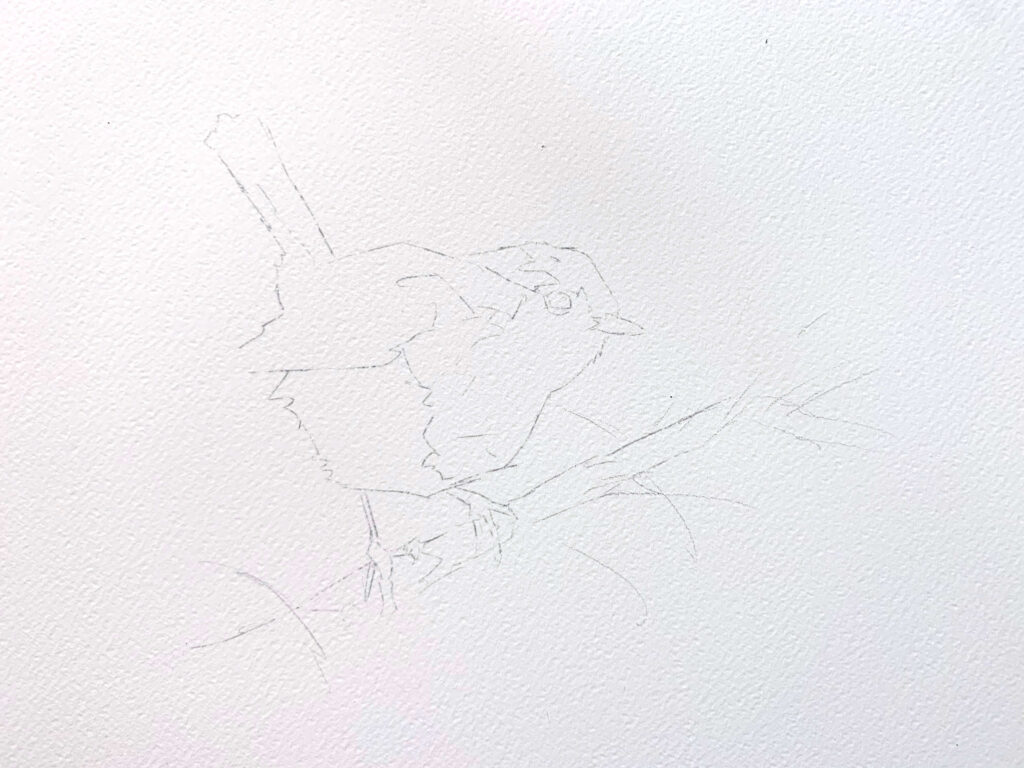
As I plan to make up a lot of the background the actual drawing is fairly simple. I start with the two big shapes of the body and head. What proportion these are in relation to each other being the most important point.
I “stick on” the wing and tail once I’m happy. I pay careful attention the size of the these shapes and their angle. It is these angles that give the gesture or the character of the bird. By all means change them to suit, but make sure it is a conscious decision, not an accident.
I place the eyes and the beak. Here the important thing is to check the angle that runs through both, as again this give the character. Feet are kept incredibly simple and tuck on the bottom, then I place the branch in relation to the feet.
Very finally I break up the large shapes into any notable areas of light and shadow.
Everything is up for grabs and change during the painting process, however I feel much more confident going in with a solid drawing. For me it doesn’t have to be detailed, or even well worked out everywhere, but an accuracy of the dominant shapes is my safety net that allows me to free up and have fun whilst painting.
The Painting
Step 1
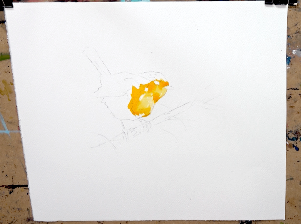
I choose to start by laying in the basics of the bird. The yellows are the lighter colours so I start there with the Aureolin at a milky coffee consistency. Whilst still wet I drop in similar mixes with a touch of orange in too. I try to keep some whites of the page in places, and overall I am attempting to create some feeling of gentle form by having lighter and darker areas – although nothing too dark yet.
Step 2
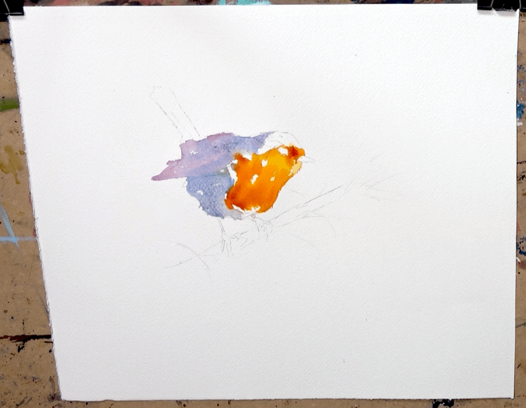
As the first lighter colours dry I drop in increasingly stronger mixes (less water) of orange mixed with a touch of the Carmine red. This just darkens it a little but keeps it clean, and I use it sparingly in only a few spots. The colours are starting to flow together now, all though I leave it this long as I do want to make sure there are at least a couple of areas of the lighter yellowy orange.
Whilst damp I create a soft blue mix using Ultramarine, plus a touch of carmine as I move up onto the back. The idea here is that I may just catch the still damp reds and oranges and get a little bit of colour run, but I don’t want too much.
I simply leave the beak and eye white for now.
Step 3
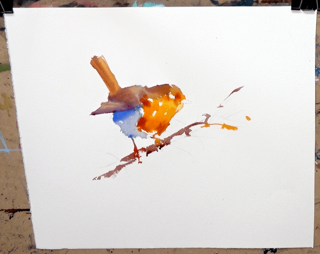
I mix all the primaries together with a bias towards the red and this gives us some beautiful muted greys and browns for the back. At about full fat milk to single cream strength (consistency, not colour) I drop these mixes into the bluey and purple areas of the back from the previous stage.
Because all the colours are transparent and are mixed out of a max of 3 colours, we see all of this wonderful variation and muted but luminous colour appear. This is all down to the properties of watercolour, these transparent pigments, and just leaving it alone to do it’s thing!
The legs are painted very, very simply as just simple mid-tone shapes of warmish colour. If some colour from the body runs into the legs, great! I continue the leg and foot wash into the branch and just let all the colours run and flow.
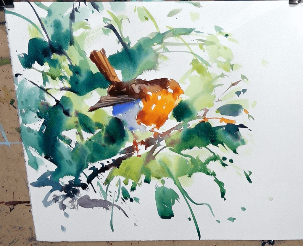
Step 4
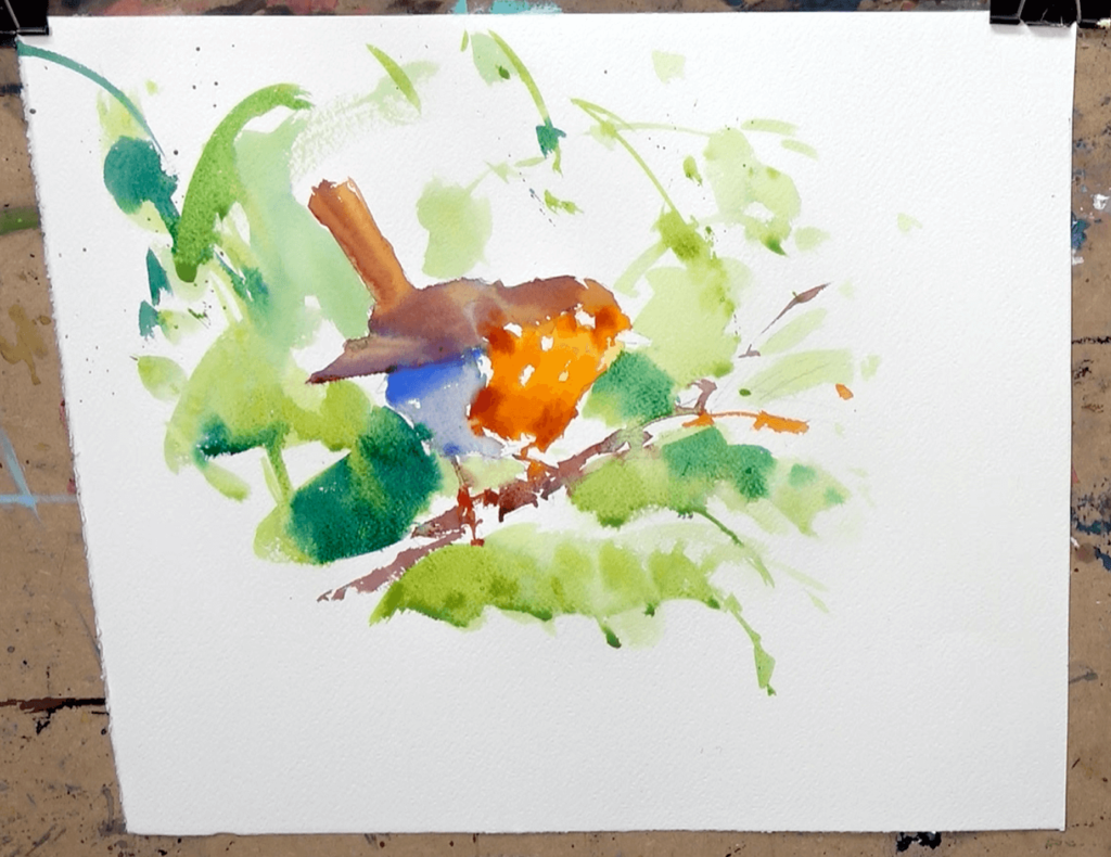
When the branch and bird are as good as dry in most places I start on the background.
I start light and watery with just Aureolin, but quickly add the tiniest touch of Prussian (it is very powerful!!) This gives me the exact bright and vibrant greens I was hoping for. This part of the painting is very free-form and improvised. I have a rough idea that I want – to keep it light towards the top and right hand-side – but aside form that I have no definite plan.
I use some big bold brushstrokes with the quill (I have only used the size 10 round to this point) to lay down the basic composition. When I am happy and I like the feel, I start to use more Prussian in the mix to commit to some deeper colours and darker tones. I start to use the tip of the brush to create quick and decisive marks. These give the illusion and hints of branches and leaves.
I am very much after an impression rather than a literal representation. I have no reference for this background, which can feel scary, but it does mean we can’t get bogged down in copying! We are simply playing and creating.
When doing this style of painting in an area, I think starting light and not being afraid to take your time is important; but also balancing this with a sense of urgency and some quick decisive brushstrokes when needed (usually for wet in wet work) is the key! Maybe, take you time to think, to mix colour, but then be quick and decisive with your brush might be a good way to explain it?
It takes a bit of getting used too as you have to make decisions based purely on what you are thinking and feeling. As opposed to what the reference is telling you to do. However, I love working like this, and if you just trust the paint to do its thing, don’t go too dark too quickly; not only will you be fine, you’ll have a lot of fun doing it!!
Step 5
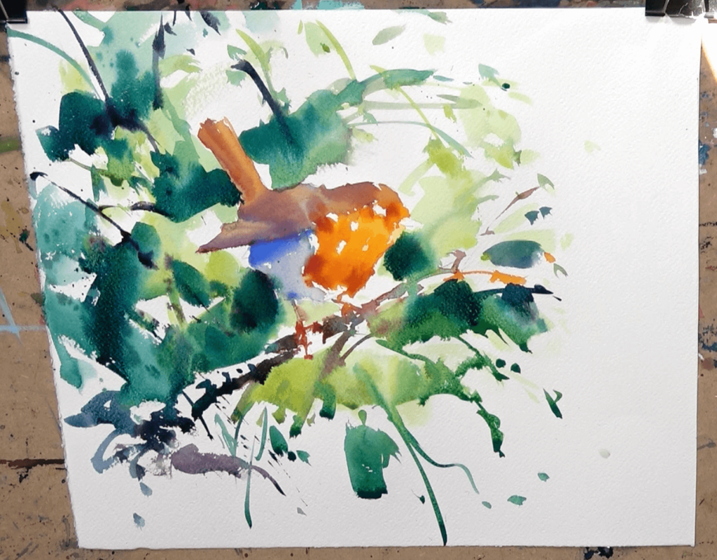
I leave the bird well alone and just focus on building up the darker tones of the background. I want the feel of an explosion of foliage, as well as something that tonally supports the bird. By this I mean where the background meets the bird is a mixture of darks, mid-tones and lights. This variety of tone creates variety and a natural feeling to the setting; rather than the bird simply being light against a dark background, or vice versa. Which can have a bit of a “stuck on” feel to it.
For example, I used a negative deep dark shape under the chin to carve out the shape of, and trap the light on, the chest. I’ve used a similar approach behind the lower blueish part of the bird, even thought it’s in shadow, as this creates the positive shape of the bird. But in neither case have I just painted a dark all the way around that area. I have left some of the lighter areas on the bird to sit against some lighter areas of the background – we don’t have to perfectly delineate every single edge with strong tonal contrast.
Step 6
As well as having a huge amount of fun, at this point I have felt my way into the painting. Everything is setup for the finish. And assuming I don’t go in and over fuss areas, which is still very likely and do-able, I should be home and dry! I am just thinking to myself, “keep it simple!”….”Just remember, pose & light is what I want to capture, everything else is secondary”
I mix a lovely rich shadow by starting with mostly Carmine Red, a touch of yellow and a touch of blue. The consistency dictates the tone. I am using at about single cream paint consistency. I use the Size 10 synthetic sable’s lively and responsive nature to flick in this darker mix on the back. I am looking for simple patterns of shadow that I can link together quickly to give the illusion of the shadow on the back and the details on the feathers. Always remembering that I want the impression of the subject – not the literal copy.
I use the same colour on the tail for a few quick strokes of shadow – but nothing more!
The really dark accents are done with almost dry buttery paint.
At this stage I think all of the whites of the page left of the top of the branch, the light catching the legs and feet, and some of the whites on the bird itself, are really starting to sparkle. For me these keep a watercolour painting lively and fresh, and I am always amazed by how seemingly abstract shapes of the whit of the page can read as the subject when we look at the whole!
Step 7
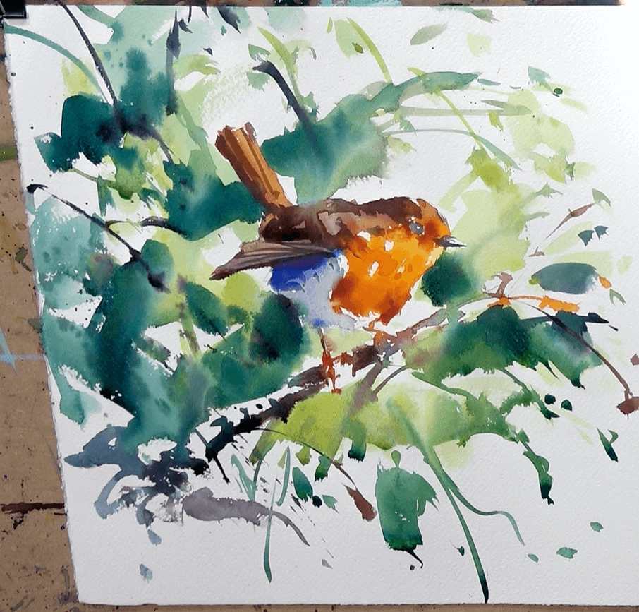
I brush in a quick dark blue cast shadow under the wing. Using the size 8 round I block in the basic shapes of the eye (leaving a white circle for a highlight) and the beak (leaving a line of white on the top for the light)
I then use a darker mix of Orange with a touch of Carmine Red to create shadowy orange. I use the full fat milk to single cream mix to just dot in a few little darker (not dark) accents on the orange breast. This gives a little more shape and form to the area and helps define the feathers around the eye a little more.
I use the size 10, holding the handle right at the very end, to flick in some expressive and decisive final brushstrokes that further accentuate that feeling I am after of an explosion of foliage out from the bird. As I find in most subjects, these little flicks at the end can really bring a piece to life or help take it up that extra level. All though be warned, it is very easy to go overboard, and I often do!!
Step 8 & Finish
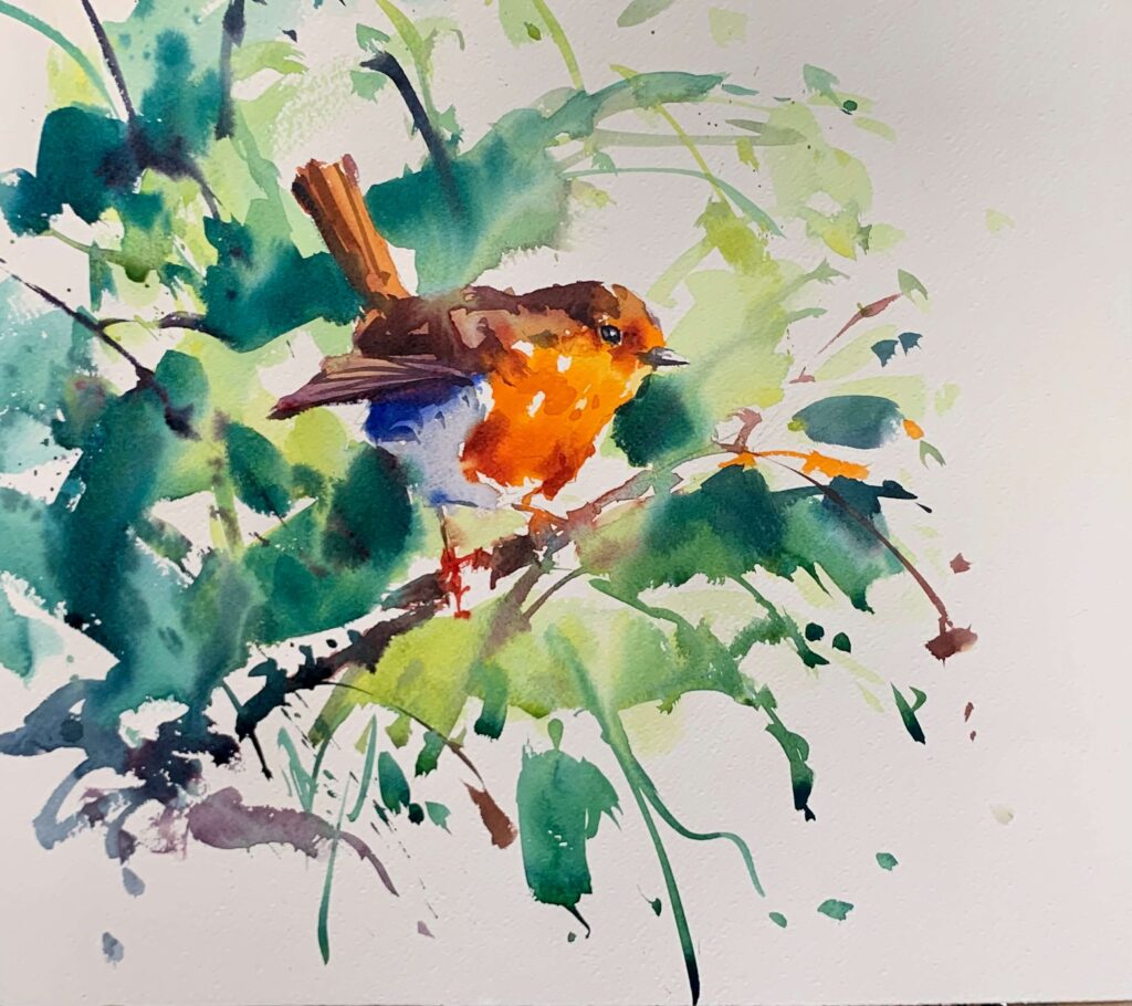
The very final touches are just a few strong darks that finish off the eye and the odd extra dark accent in a couple of places on the body to make the piece “pop”… and we have it!
Conclusion and after thoughts
I feel this was a fun example of a nice process in painting small birds in a loose setting. Of course there are many ways to tackle the same subject. We could have easily gone in and done a lighter wash over the whole page, letting all the colours run together. Then come over the top with the shadows to provide definition and bring it to life.
However, I often enjoy this process of blocking in the bird first, then naturally expanding out into the background around the bird, pretty much bringing it to a finish, then back to the bird to finish. It has a nice rhythm to it as a process. I also find I have a good feel for how little I can get away with doing to create a finished piece.
Often the amount of finishing or detail on the bird is really not that much. Especially if we pay special attention to tonal values and shapes above all else. It is the tonal values that give the form and the light, and as a result the realism.
It is the accuracy of the shapes, both small and large, which give us specifically the robin.
The colours and the flourishes with the brushes, the wet in wet passages etc… these are the excitement and the decoration on-top. Ultimately they are the little bits of unique flavouring that make it our painting!
As I’ve said in previous articles, don’t be afraid to make the subject and therefore the painting your own. I promise you will be much happier watercolourist as a result!
I hope you enjoyed this article and found it useful. If you did, you could also take a look at my Hummingbird Watercolour Tutorial and Kingfisher Watercolour Tutorial from earlier in the year.


gerekli buldum
Nice, easy to follow tutorial and a smashing painting at the end .Was very pleased with my result.