
Watercolour Kingfisher Tutorial
The kingfisher is such an iconic bird here in the UK. Those colours and of course it’s elusive nature fascinate me. A subject made for watercolour? Who knows; but certainly a bird I love painting and a subject I keep coming back to. So let’s take a look.
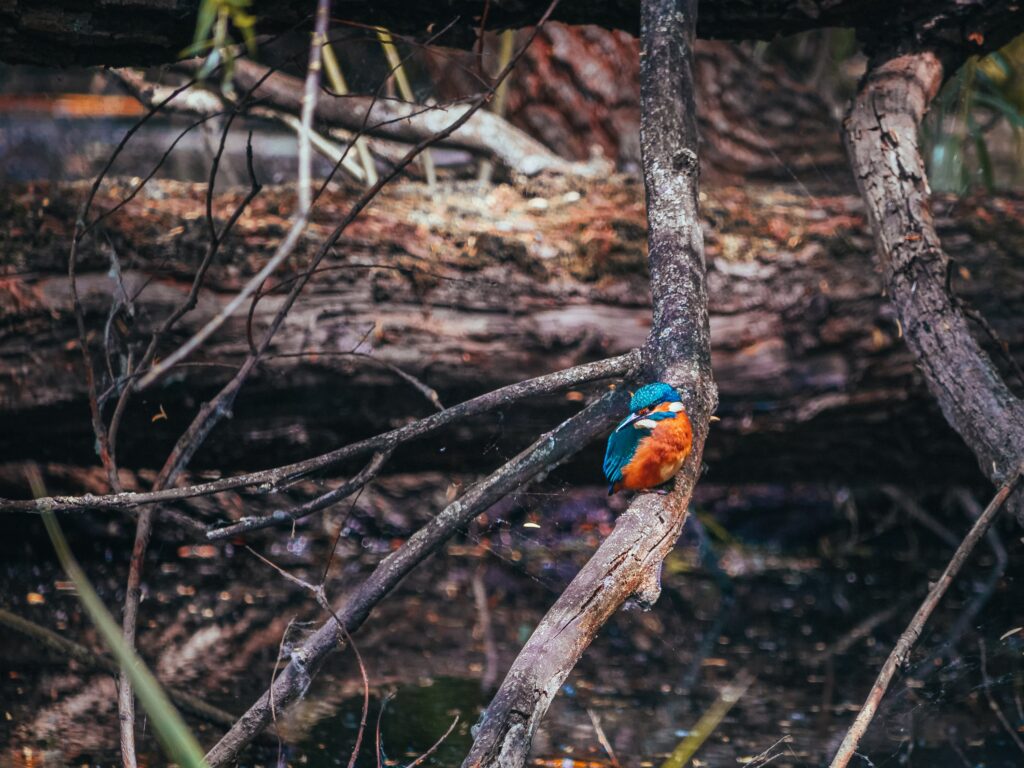
The Reference
The photo is copyright free from a Public Domain image site. Please feel free to download and use as you wish.
The reason I chose this was mainly due to the position of the bird. I found the the way the head is turned back around from the body much more interesting than if body and head where facing in the same direction.
I also liked the beautifully lit bright orange front and the top of the head, and the way the contrasted with the much deeper, darker colours of the back and wing. In amongst all of that, those beautiful pops of bright white on the face I feel would really keep that area fresh and lively.
Really thinking about what it is that attracted you to a subject is so important. It keeps us on track, and in theory away from being distracted by detail and overworking.
I do my absolute best to hold on to these initial ideas and the spark of inspiration whilst painting!
One final point is that we can be completely faithful to the reference or subject; or as in this case, we can simply use it as jumping off point for the painting. As you will see a lot of the final painting is created, rather than copied. This is fun! The picture is always there to fall back on or to turn to for details or to help resolve areas.
Materials
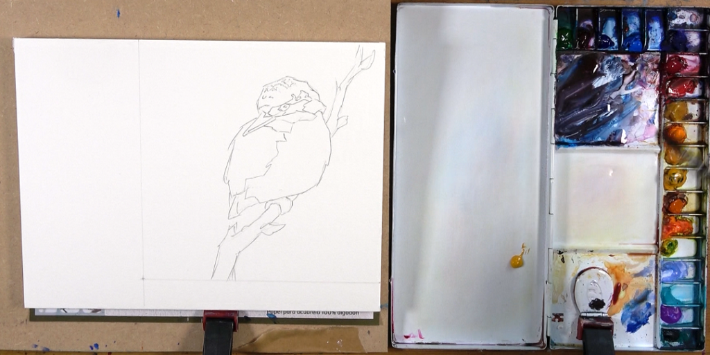
Paper – A4 size gummed block
A really fun size. Big enough to let loose with the paint but not too overwhelming. Gummed blocks are great for the simplicity of preparation!
I have a variety of papers I like. At the moment, I am particularly enjoying Winsor & Newton Professional Watercolour Paper. It stays damp for a good time for wet into wet work, but it also allows for finer detail if wanted.
However, in this particular painting I use one of my other favourite papers which is Canson’s, Moulin Du Roy Watercolour Paper. It takes the colours really well and they also look beautifully clean and vibrant.
In this particular one I have sectioned off a portion to work on as I wanted a square format.
Brushes
My go to brushes are the Escoda Ultimo Mops of various sizes.
They hold a wonderful amount of water and pigment and have a very lively feel, but they also come to a nice fine point.
I have a size 18 and smaller size 12 mop. I always pair these with a smaller, more springy round brush for smaller areas and any details. In fact, the Alvaro Castagnet Escoda Ultimo set, is basically my brush set for almost all my paintings. All though I do really like the Pro-Arte Prolene brushes as the smaller one.
Colours
I generally prefer to work with transparent colours. The lovely luminosity they give is of course one of the joys of watercolour, and they make mixing rich darks easier too.
Opaque colours are great, but I personally tend to reserve them for splattering into drying washes for texture, and for the odd cheeky dry brushstroke to lift little areas if needed.
There are a few brands I like, although Daniel Smith Watercolours and Holbein are my go to favourites
This painting was done using:
- Cobalt Blue (Ultramarine would be a good option too)
- Phthalo Blue (cool and slightly greeney, very strong, lovely and clear when light)
- Quinacridone Red
- Permanent / Napthol Red
- New Gamboge Yellow
- Aureolin Yellow
- Aussie Red Gold (Daniel Smith Colour)
- Bright Orange
- Turquoise
The Drawing
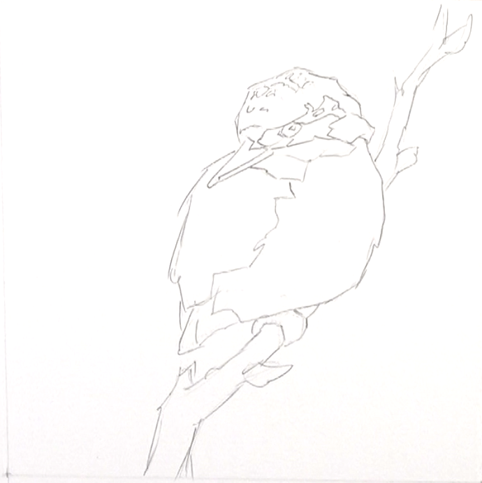
As always I start with the biggest shapes first. In this case the body and the head. I ask myself what is the overall shape. What proportion is the head relative to the body? What angle is the head and the body? I am aiming for simply yet accurate shapes.
Once happy with these I start to “stick on” the smaller shapes of the foot, branch, beak etc. Beyond this I start to break the larger shapes up into smaller shapes. All the time checking proportion and accuracy, and also the spatial relationship of each smaller shape by imaging horizontal and vertical lines from key landmark pints to see what else they line up with. For example a line straight up from the point where body meets front edge of the foot lines up neatly with the centre of the eye.
It is the angle of the big shapes and the small shapes that give the bird its character and gesture. For example, imagine the beak drawn more horizontal, less of and down angle. The whole character and feeling of the bird would change. Not necessarily for the worse, but it is always good to make these changes a conscious decision rather than an accident.
Very finally I may add in a few little details like the eyes and a few little markings.
The drawing is there as a guide and something to fall back on. I don’t feel that I have to stick rigidly to it.
The Painting
Step 1
I start on the orange of the bird with a tea consistency of warm New Gamboge Yellow. I always aim to leave a few abstract shapes of the white of the page showing as I find this makes things more interesting. They can represent light areas and highlights really well, but they don’t necessarily have to literally represent anything.
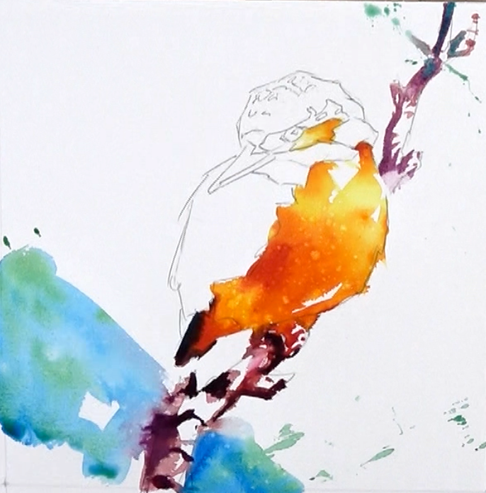
As the yellow dries I drop in a slightly thicker full fat milk consistency into the middle areas, followed by the same thickness of orange into the shadow areas. Very finally I add a touch of red and bring the consistency up to single cream thickness and drop that into a few of the darker areas.
The idea here is that I am trying to create some sort of rounded form by moving from a lighter area on the top of the chest, to a darker areas in the bottom right. Doing this wet in wet creates lovely flowing colours. If I can get this area in the first pass, all the better.
The dryer the wash on the page and/or the thicker the pigment and water mix in the brush, the less the colours will flow.
Step 2
Whilst the orange area is still damp I very finally put in few brushstrokes of thick double cream dark mixed from mostly Permanent red with a touch of Phthalo blue. Done whilst the orange is still wet just gives a slightly softer edge between the two but the dark doesn’t completely melt into the orange.
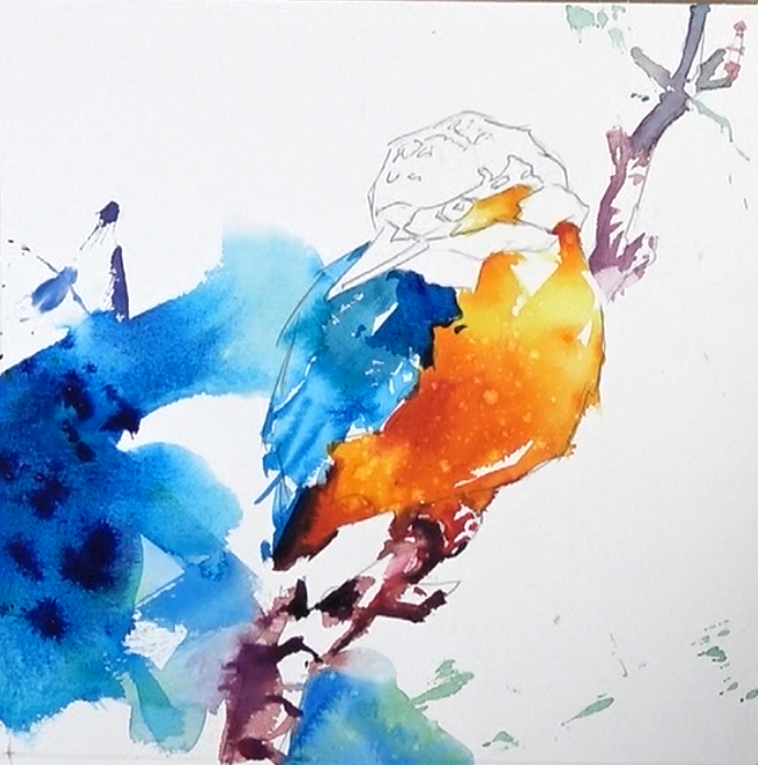
I bring a reddy mix of all the primaries down into the foot and branch. Nice simple abstract shapes with quick, almost signature like brushstrokes creates branch, with lots of whites of the page left to give a feeling of light.
Whilst the branch is still damp I wash in some bluey green background using Phthalo Blue and a touch of Aureolin. A few soft edges between branch and background is no bad thing.
Often I like to let colours run together, however with this kingfisher I wanted to keep the orange and the blues very separate and clean, so I wait until the orange is fully dry before going to the blue of the back and wings.
I start with light mix of Pthalo, lots of water. As it dries I drop in some darker mixes, even a touch of the cooler Aureolin yellow in places to help it have a more greeney feel. I leave the wash to dry to point where is brush in a few finer details of the feathers they will stay as they are put but also have a slight softness to them.
I break the colour out of the back and join it with the previous background wash. Whilst all this is still damp in the background I drop in increasingly stronger (less water) mixes o the blue. Eventually for some of the really dark splatters I add some red to the Pthalo.
The very green Pthalo and a warm orange red are so opposing on the colour wheel that they cancel each other out and give the most wonderfully deep, yet colourful and lively darks.
Step 3
Once the blue on the back is dry I also block in a simple abstract darker shape on the shoulder. This just gives a little more form but also creates a much needed sharper, harder shape over some of the softer flowing washes – nice contrast.
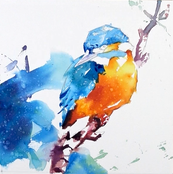
Moving on the head I take exactly the same process and colours from the back. Light and watery, as this dries slowly dropping in darker tones to create form.
I purposely use a couple of very quick brushstrokes on the head to try and get some broken brush marks that let plenty of the white of the paper show through. This helps with feeling of markings and also sparkling light hitting the feathers on the head. Basically a nice little variation of texture.
It is very easy to over fuss and over complicate the markings on the head, and at this scale the painting really won’t than you for it.
The simplest version of an areas is what I always aim for. How can I hint at or give an indication of what is happening; rather than feel I have to paint it literally exactly as the photo is, with all the details.
Squinting or blurring my eyes to remove all detail helps and then I try my best to paint the simple shapes as I see them. If I start simple I can always go more complex later if needed (it rarely is) but the other way round is very hard, if not impossible with watercolour in particular.
Step 4
As the head is very close to dry I use the smaller size 10 round to start popping in a few darker markings. More of these to come.
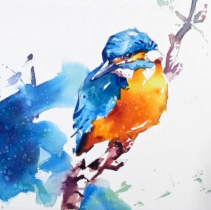
To finish of the blue of the head I mix a single cream consistency of Phthalo blue and I use very simple little hits of the brush to try and hint at the markings. I use this in the shadow areas only and aim for juts a few hints of stripe like markings. It is also important to consider how markings wrap around the form of any given area.
The orange areas in the face are done very simply by brushing in little yellow then once dried a little dropping in a touch of thicker, single cream thickness, or orange. This creates a little variety of tone and makes things a touch more interesting.
The face is clearly the focal point, so a little more detail, a little more variation of tone and some contrast in this area will not hurt. As always striking the balance between large more brushy areas and a couple of tighter more detailed areas is what I am aiming for here. I like the play and contrast of these sort of opposing areas.
The eye is done very simply. I mix a creamy dark colour (usually red and blue) and fill in the eye but leaving a simple white highlight. Whilst still moist I use a clean dry brush a pull out a little bit of pigment in the lower part of the eye. A quick and easy way to create a life like eye or certainly life like enough or this painting at this scale.
The blue of the face is washed in then left to dry. I then use the small round to pop in a few simple slightly darker shape to create the illusion of markings and some subtle tonal variation.
The white patches around the face have been completely left alone until this point. In order to create interest a little form a simply mix shadowy mid-tone with a little purple warmth to it, and place in just a handful of marks here and there.
The key to the face is to not go too heavy and dark too quickly. Really try and reserve plenty of very light colours, the oranges, blues and plenty of whites of the page. It keeps the area lively and freshness
The final piece of the puzzle is of course the beak.
I try very hard not too over fuss and complicate things here… easier said than done, and I have done exactly that on many an occasion.
If I blur my eyes, what is the simplest version of the beak? It’s split in half with a darker bottom half, and the bottom edge is darker than the blue behind it.
The top half I can leave as a clean white. I then add a little darker blue behind it to trap the light on the beak, as well as separating the back of the bird form the background a little.
Once separated, I simply just add in a few extra marks for the nostril, plus a softer grey into the light half to create a little more subtlety and gentle form.
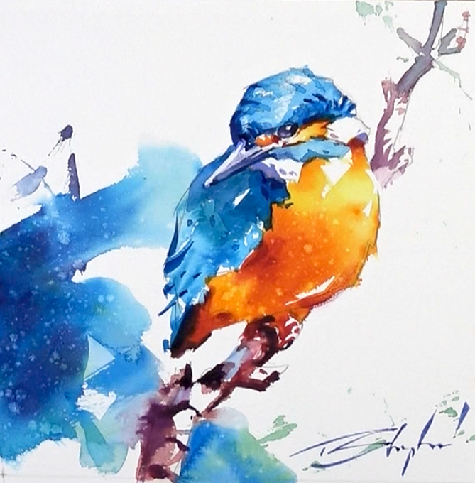
Pop on signature and there we have it.
Conclusion and after thoughts
My mission statement was to create a fun little watercolour with plenty of character to the bird. A nice feeling of light; and to try and keep the colours fresh, clean and lively.
All the time I am thinking, “How can I make this as simple as possible?”
I wanted to draw attention to the head so I knew I could make it a little more defined and refined; smaller shapes, more detail and also more contrast. In doing this I knew I could get away with leaving other areas much more suggested with more soft and lost edges.
So much of watercolour is about simply enjoying the medium, letting it do it’s thing and most of all having fun whilst you explore your subject. All the time not being afraid to step away from the reference photo and ask the question, “What does the painting want?”. Rather than obsessing over making it exactly like the photo of subject.
After all, one of my favourite watercolour quotes, from Joseph Zbukvic is:
“If you compete with your subject, you will loose every time”
Make the subject and the painting your own and I promise you will be much happier watercolourist as a result!
I hope you enjoyed this article and found it useful. If you did, you could also take a look at my Hummingbird Watercolour Tutorial from earlier in the year.


Your work is so graceful and beautiful.