
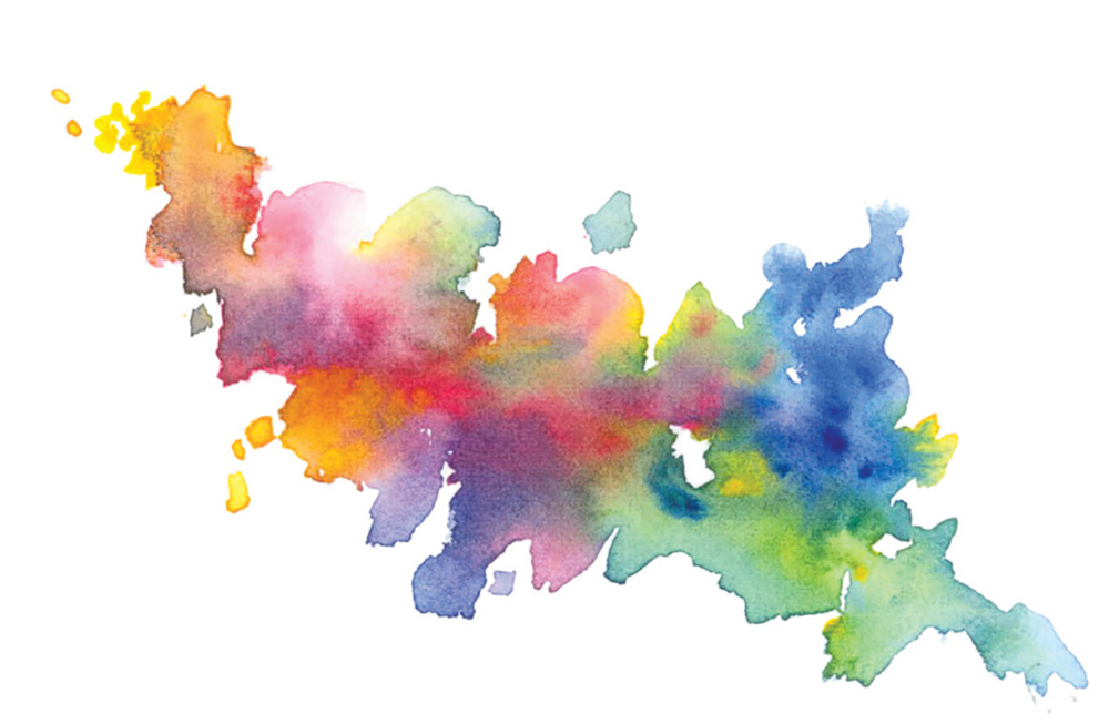
Mastering Colour Mixing: Training Your Eyes and Brain for Perfect Hues
As a botanical artist I have taught myself how to mix with primary watercolours to get the best effect for painting. It can be exciting but expensive when you start to invest in a palette of pigments without knowledge of what pigments would suit your style of work best. I have gradually eliminated many unnecessarily purchased pigments over the years!
In this article I am sharing with you some tips on training your brain & eyes to identify and mix colours to match your subject. Even if you are not a botanical artist I hope these tips will help you achieve more realistic paintings through more accurate colour mixing.
Pigments and colour wheels
“It is a known fact that there are many colours which never will admit of being mixed together: which are these: green and red, yellow and purple, blue and orange, but if the colours so mixed are possessed of all their powers, they then compose a deep black, as all opposites in either system or scheme will do……..therefore no colour or teint can be formed by a connection so unnatural…”
Moses Harris – ‘The Natural System of Colours’ (1766)
I am a very detailed botanical artist and colour is very important to me to ensure I achieve realism in my paintings. In my book I discuss a great deal about colour theory and pigment qualities to enable artists to make a more informed choices where pigments are concerned. I explain how to observe and use colour accurately, how to mix with primaries, values and contrast, ‘seeing’ colour, colour temperature and creating depth with shadow tones. There are step-by-step guides on application techniques, colour temperature and fine detailing, and much more.
One of the subjects discussed in my book is the colour wheel. The basic colour wheel only explains cool and warm sides but not a lot more. That’s why I chose to explore this subject more.
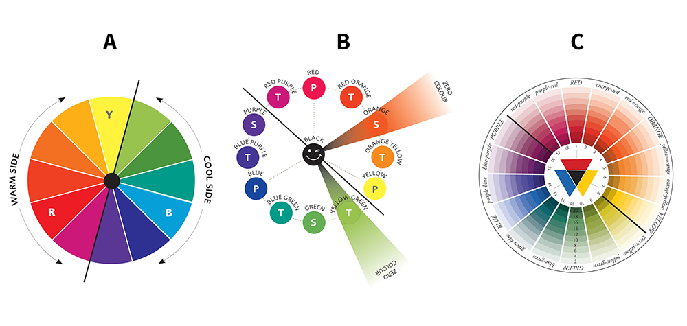
The images above show colour wheels from the basic one (A), a more detailed one with names of colours and an explanation of tint and shade (B). The Moses Harris wheel (C), from ‘The Natural System of Colours’ published 1769-1776, shows much, much more about where colours fall within the wheel. His wheel has 18 colours, primary, secondary, tertiary. From the centre he shows the shades (darker values) and the outer edge the tints (lighter values). I feel this is the wheel that explains colour origins and temperature best.
Colour mixing with primaries
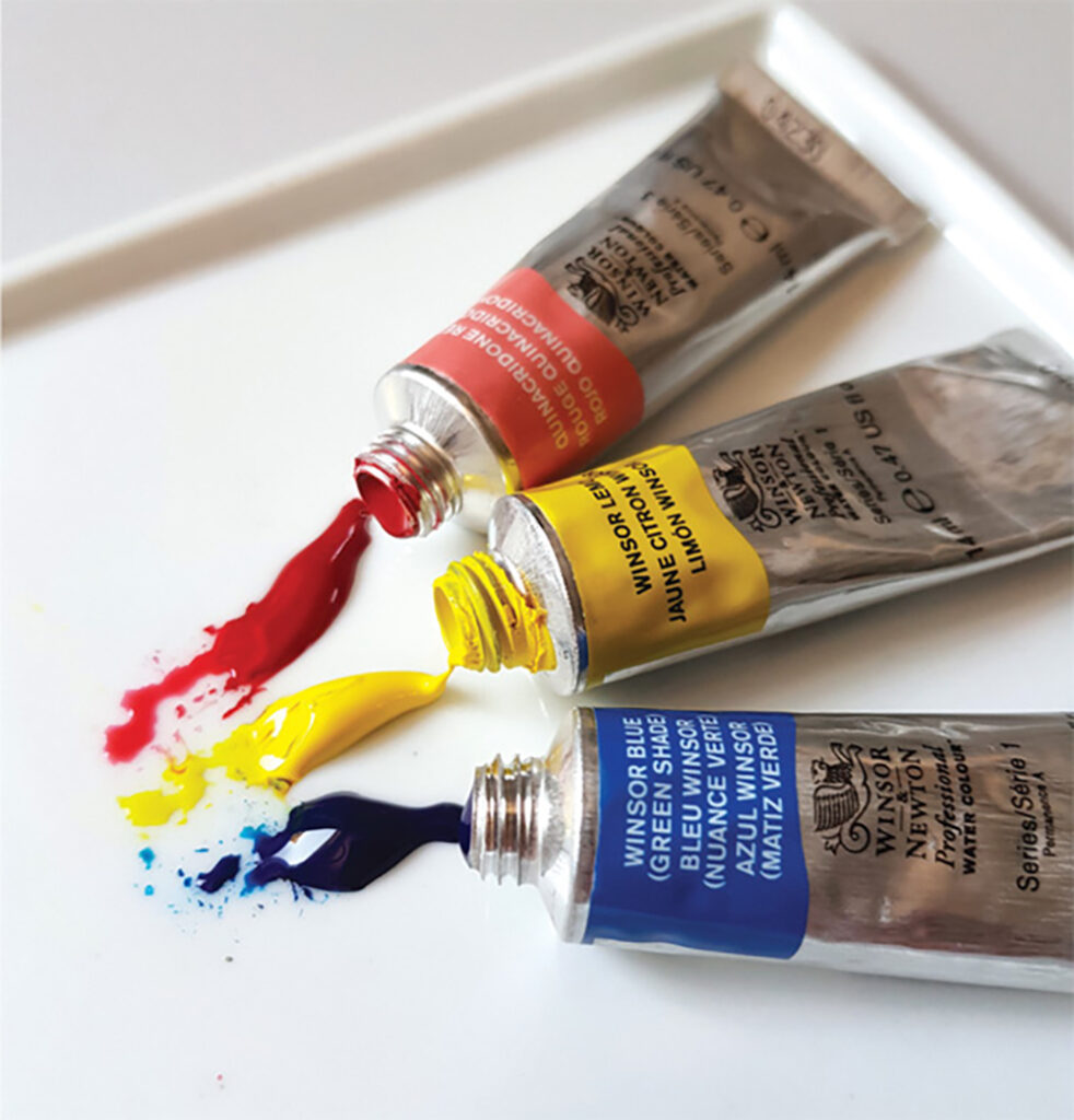
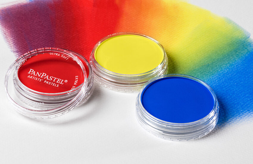
I use Winsor & Newton Professional transparent and semi-transparent watercolour pigments. I don’t use opaque pigments as I find that the effect flattens watercolour work. Opaque pigments are great for working on coloured paper, where white or a more solid effect may be needed. Transparent pigments have a wonderful see-through quality, which appeals to me, as my paintings look more translucent.
The best thing about mixing with primary pigments is that you can mix every single colour you need without the need to buy secondary or tertiary colours. I don’t just mean one red, one yellow and one blue. All sets of primaries behave differently creating warmer or cooler tones. It’s all about recognising which ones will achieve the result you require. This comes with practice.
Some pigments are more saturated or intense making brighter or stronger results. ‘Saturation’ means the measure of brilliance or purity of a colour, found in colours that are closer to the absolute primary. ‘Intensity’ is the strength, brightness or purity of a colour. If a pigments’ intensity is very high, less pigment is required. You can read more about pigment qualities in detail in my book.
With a three-way mix you can make the brightest, dullest, coolest and warmest of colours. There’s a fine balance for achieving all those many colours without turning the mix brown. The slightest tweak with a third pigment can often create just what you are looking for!
Mixing two pigments
If you only mix two pigments together you will get brighter mixes from all of these primary variations. Bright mixes come from cooler/lighter more saturated pigments.
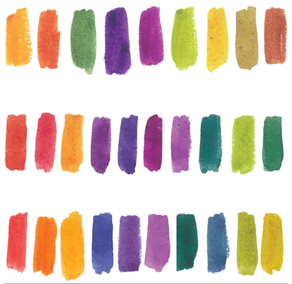
Mixing three pigments
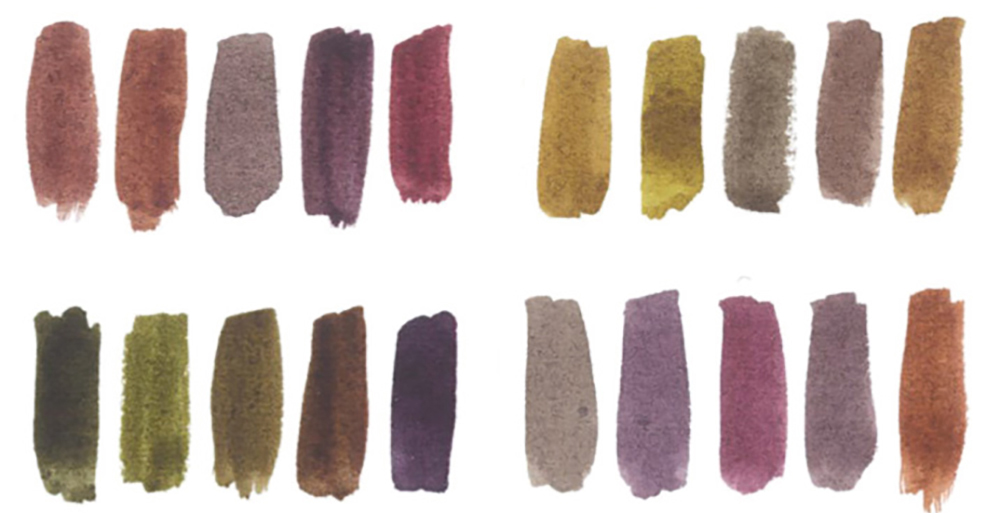
The images below show examples of mixes from three sets of primaries. Brighter and duller mixes are made depending on the balance of each mix. Brighter mixes are made from all options depending how much of the third primary you add. If you add a little of another primary the colours start to mute down as you can see in the swatches below.
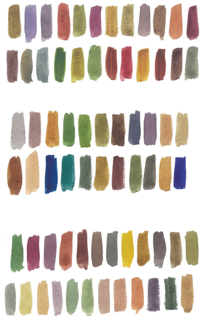
Earthy & darker colours mixed with three pigments
I mix earthy colours with warmer pigments. I achieve darker tones, with any primary mix, by adding a lot more pigment than water to the mix.

Tools and methods
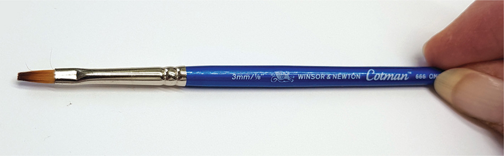
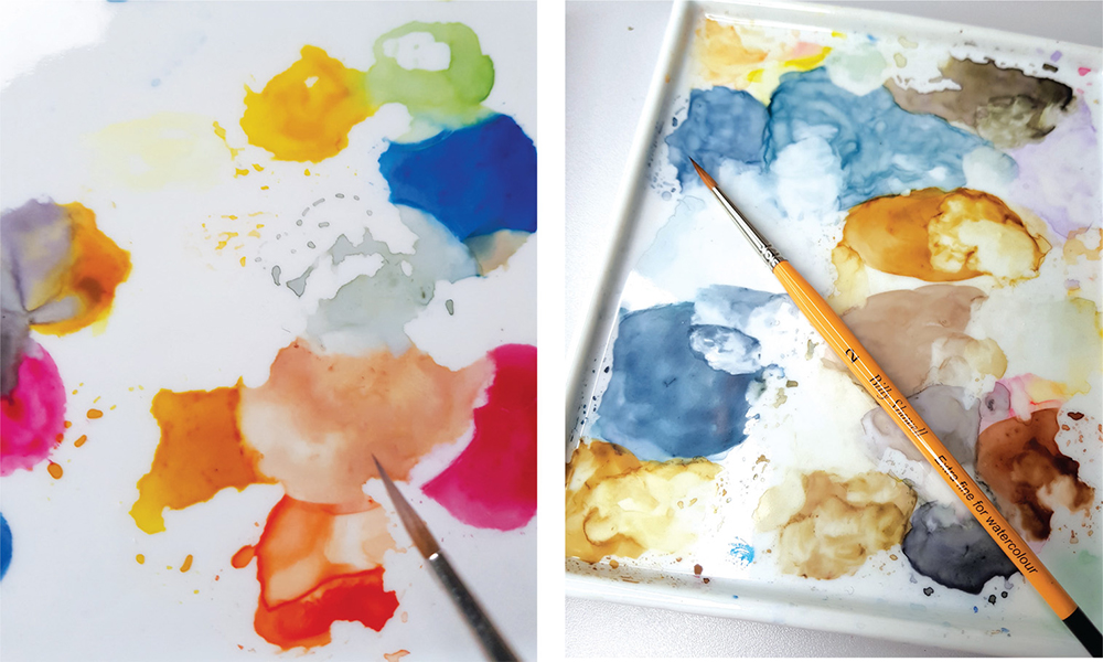
For mixing I use a Cotman One-stoke 666 series 1/8 inch flat brush. It is ideal, as it doesn’t suck up all your pigment as a round brush does. I use a ceramic palette as I find these don’t shrink up the mixes as a plastic palette would. When I am starting a new painting I place a squidge of my chosen primaries around the edge of the palette and drag them into the centre to make my mixes. Sometimes I will mix puddles of colour that match my subject, and then mix some of these together to create shadow tones or other slightly adjusted versions.
Training your brain
“There is a logic of colours, and it is with this alone, and not with the logic of the brain, that the painter should conform.”
PAUL CEZANNE
The human eye can see millions of colours, however, we don’t all see these colours in the same way. From childhood our brains are trained to see colour at face value, the artist has to train the brain to see all the colours available to him. As Betty Edwards states in her book ‘Color’: “Our brains ‘know’, for example, that skies are blue, clouds are white, blond hair is yellow and trees are green with brown trunks. These fixed ideas, largely formed in childhood, are very difficult to set aside, causing a person to look at a tree, for example, without really seeing it.”
Training your eyes
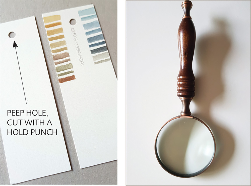
Before we start colour mixing it is important for a botanical artist to light their subject, this will enable them to see dark and light contrasts more easily. The subject is then studied carefully and this trains the eye to recognise all those individual tints, shades and tonal values. Using a magnifying glass or paper peephole are good tools for this. A peephole allows you to view small areas at a time and see the differences in colour tones.
I always test mixes on a swatch of watercolour paper and label them with the pigments I have used. This helps me to see whether I have achieved the right tones. It also acts as an aide memoire should I need to mix that colour again.
Finding the right combination of primaries to mix with starts by gauging temperature and making a mental description of what you are looking at. For instance, you may describe it as ‘muddy mauve/purple with a yellow bias’ – to create this you would need to use a yellow bias red and a warm blue with possibly, a little yellow added too. Or, you may describe it as ‘bright green’ – for this you would need a cool blue and a cool yellow.
Recognising values
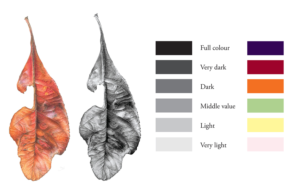
Value is the lightness or darkness of colour. The values of colour are important to create form and depth. If your values are not accurate then the painting will look flat and lifeless. Assess values by comparing them to a grey scale. To check if your tonal values are working change a photograph of your painting or a scan to black and white. This will give you a clear view of where you may need to adjust things. For some reason we tend to see values more easily in black and white!
Colour enhancement
“When the colour achieves richness, the form attains its fullness also.”
Paul Cezanne
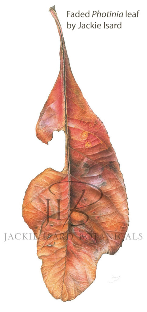
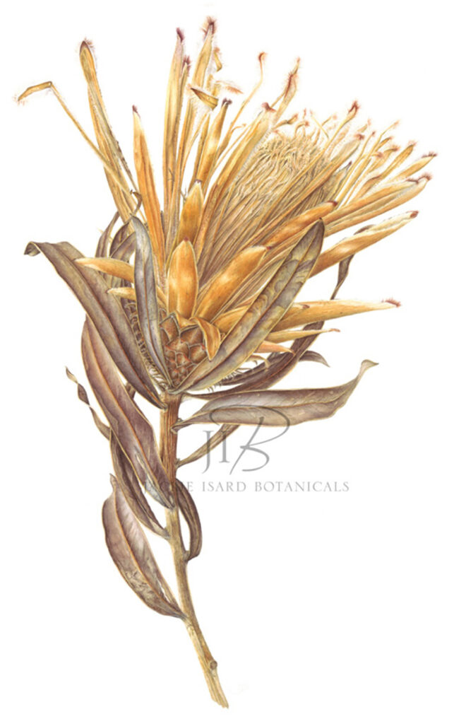
This is a painting of a Photinia (Red Robin) autumn leaf I painted a couple of years ago. I used eight cool and warm primaries to paint it. The techniques I use of underlaying and overlaying colour to enhance my paintings helps me achieve good depth of colour. It also aids translucence, vibrancy and form. I add thin layers of colour over one another to reach full tone. You need patience as each layer can take a long time to dry! Transparent/semi transparent pigments are perfect for this technique.
The Photinia leaf was mostly warm in tone so I chose the following Winsor & Newton pigments to work with:
- Winsor Blue (Red Shade) – Warm
- Winsor Blue (Green Shade) – Cool
- Indanthrene Blue – Cool to warm darker blue
- Quinacridone Red – Warm
- Permanent Rose – Cool to Warm
- Scarlet Lake – Warm
- Transparent Yellow – Cool to Warm
- Indian Yellow – Warm
- Winsor Violet – Cool
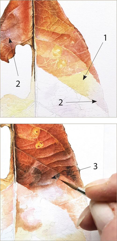
I paint underlayers of colour to create shadows and add richness to the layers above and cool or warm areas. The layers beneath shine through.
To warm areas on my Photinia leaf I used Transparent Yellow (1).
To cool down an area I used a very thin Winsor violet glaze (2).
I also used Winsor Violet glaze to exaggerate the highlight areas too (3).
Paint overlays of colour to bring up vibrancy, control temperature and also add richness and depth. I used a thin glaze of Scarlet Lake to punch up the redder areas.
Colour toning overlays
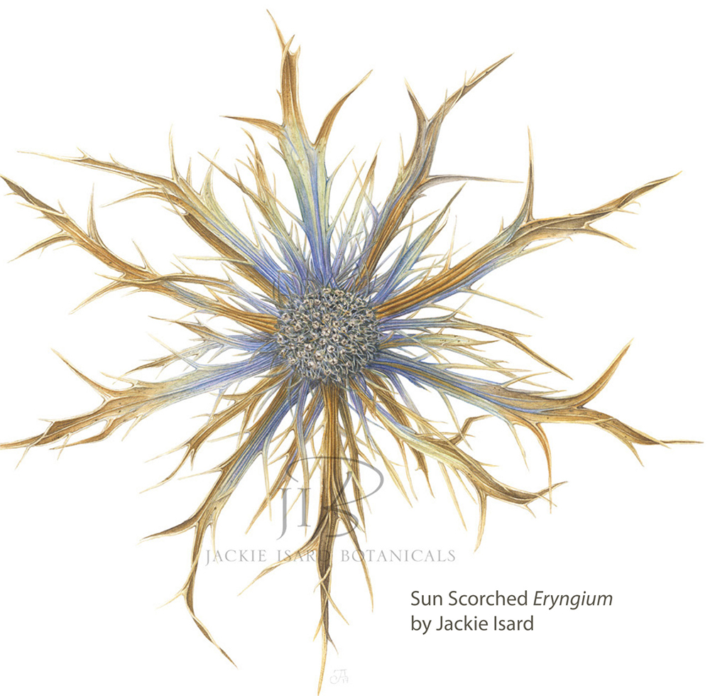
Overlays are be applied with watered down tints. When I finish a painting I assess whether I need to colour enhance any parts. This can only be done over very dry paint, which has been layered, not thick paint. For my Eryngium painting here I very carefully overlaid thin glazes of three colours. These are only added to the areas I feel it is necessary, not all over.
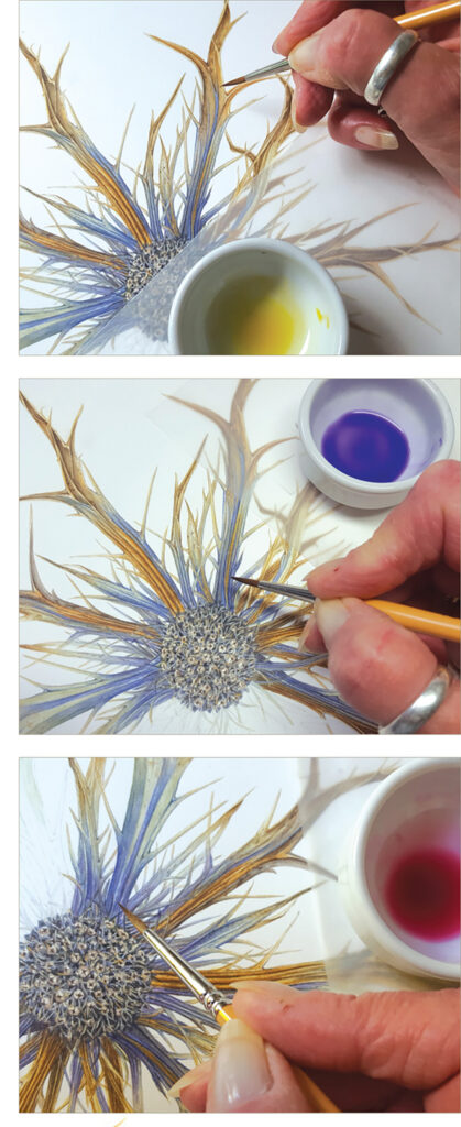
To boost the warmth and vibrancy on some of the golden brown areas, I added a very thin glaze of Transparent Yellow.
I applied a thin glaze of Winsor Violet to darken the warm blue on the some areas of the bracts.
To warm up a few areas of the blue bracts, I used a thin glaze of Permanent Rose to give a more violet appearance.
I do hope you enjoyed this blog post. There is much more explanation in my book.


It’s always good to go back to basics with a limited palette as you learn so much more and godbecause it’s easier to get your tonal values right it’s also good to take a black&white as well as colour then you have an approximate value guide the black & white photo and the approximate colour tones and lighting this is good when time is short to make a detailed sketch also thumb nail sketches are good and better than no sketch when you first going out plein air sketching and painting how ever little something is better than nothing it’s only a sketchbook to tryout your ideas and build you skills each time you go out or sketch at home
Wow, what a helpful blog! Thanks so much.