
Elephant Watercolour Tutorial
There is something about elephants that make a great subject. Aside from what wonderful animals they are, for me it is all of those wonderful shapes and the way the light catches them. In this tutorial I will show you how to take the reference photograph and build a sketch and then produce completed watercolour painting.
The reference photo
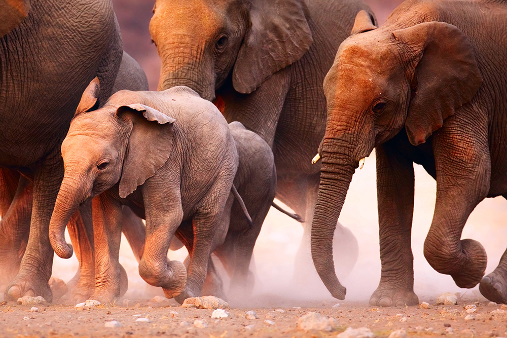
What grabbed me about this reference photo in particular (taken from a subscription site*), was the quality of the very warm light versus the much cooler and more muted shadows. Plus the real feeling of movement and the tight crop giving the feeling of the animals running through the image. If I can capture all of these elements in a fun a playful way, using the natural characteristics of the medium – that being flowing washes and lovely transparent colours – then I will be a happy painter at the end!
Materials needed for this tutorial
- Winsor & Newton Medium Size Quill Brush – faux squirrel
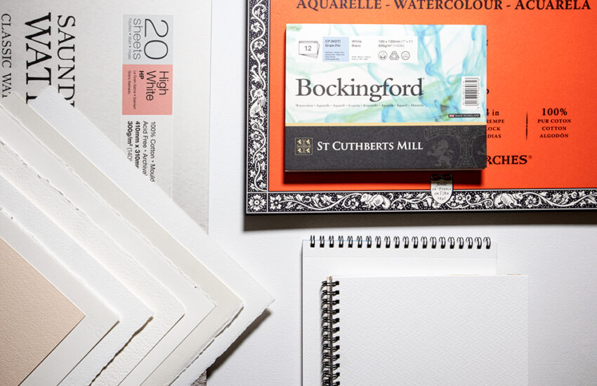
- Winsor & Newton Professional Watercolour paper. Full imperial size single sheet (22” x 30”). 100% cotton, rough grain
- Small Mop, – faux squirrel
- Winsor & Newton Rounds, size 8 & 10 – faux sable
Watercolour paints (alternative colours in brackets), I use Daniel Smith but you can use other brands
- French Ultramarine (Ultramarine, Cobalt)
- Prussian Blue (Phthalo)
- Quinacridone Red (Alizarin Crimson, Rose Madder, Carmine)
- Indian yellow (any vibrant yellow i.e. Aureolin, New Gamboge, Winsor, as well as Cadmium or Lemon – remembering the latter are both a little more opaque)
- Quinacridone Gold (which is almost identical to Burnt Sienna)
- Yellow Ochre (you could mix something close with the above colours)
A few pointers on images with multiple animals
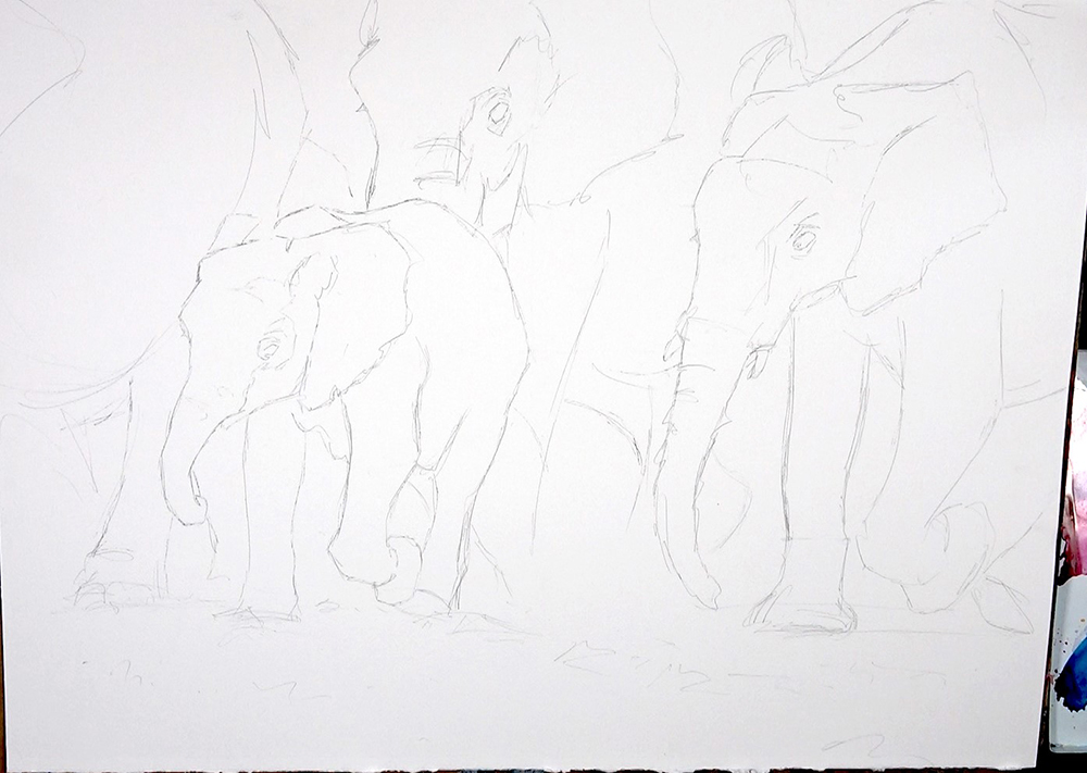
It is important to consider and aim for accuracy of the proportions of different animals in relationship to each other.
Also pay attention to where exactly all the feet are in relation to each other in terms of horizontal alignment. If we are not careful it is very easy to make one animal appear to be in front of another if the feet are slightly lower down in the painting.
Using the key features of one animal to see that they align horizontally with other animals is a great way to help with placement. You can use existing shapes in your drawing as units of measurement too. For example, how many heads across is it from one animal to another etc.
It is unlikely with a group of animals that they will all be perfectly placed. Don’t be afraid to move animals around, take ones out, even use multiple photos. However, this makes the above 3 points especially important though!
Don’t obsess too much about having an odd or even number. Go with what feels right. Try not to evenly space animals the same distance apart; make sure they overlap if possible. Don’t be afraid to cut off tops and backs of animals with the edge of the page. Cropping can emphasise a feeling of movement in, out, and through a painting.
Really take time to consider the composition and also the proportion of the animals within the page. Take your time getting things setup well and feeling good!
Look for the light and shadow to simplify your image
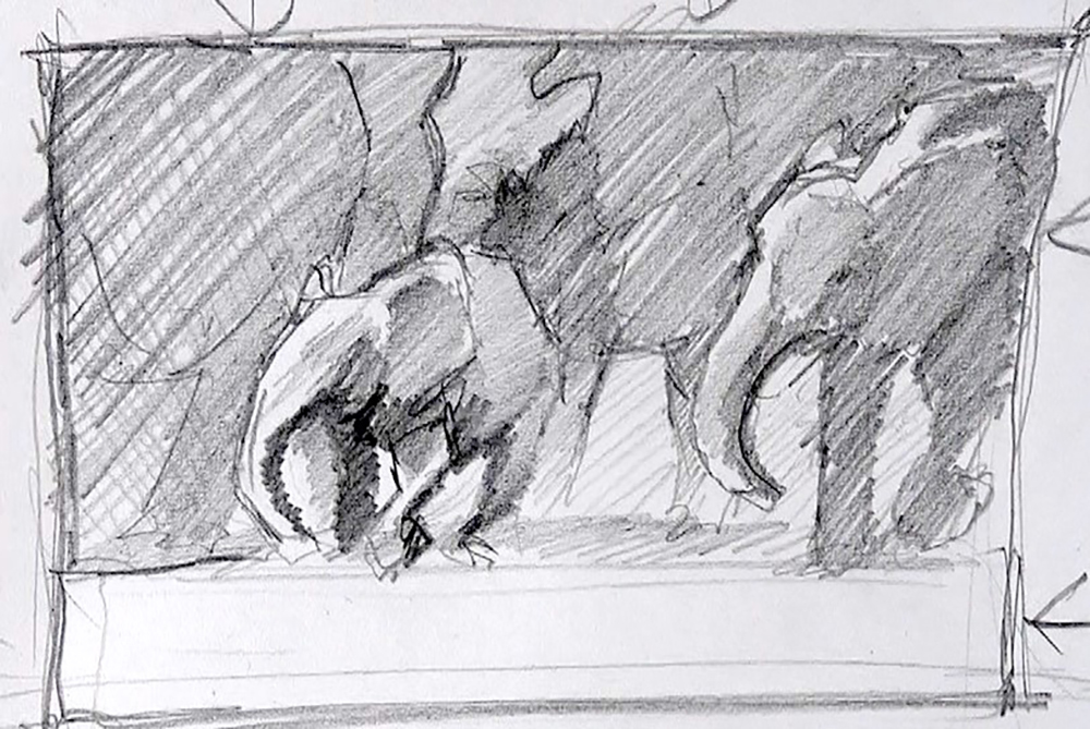
One thing that really helps me with any subject, but especially something seemingly quite complex like this one, is to look for simple patterns of light and shadow. These will give the painting it’s structure and hold it together.
We are looking for one or two big shapes and a couple or so medium ones. This anchors the painting and then allows us the freedom to explore a few details in select places.
In the above sketch you can see that although there are multiple animals, we actually forget this and instead look for nice simple shapes. The large mass of elephants in shadows, and snippets of background, actually come together tonally to create a large simple shape which then traps the light on the smaller baby elephant. This large shape also helps to visually describe the baby elephant and “throw it out” as the focal point. Even the shape of light on the front of baby elephant is a very simple shape.
Squinting at the above tonal study you can see that it is very simple from a tonal point of view.
Some pointers when working large
As mentioned above, really take time to consider your composition. Consider any problem areas, and maybe try and think of solutions ahead of time. We do not need to have all the answers at the start as it is always fun to leave room for spontaneity and improvisation. Although a little fore thought I find actually gives us more freedom whilst painting.
Look for large shapes which hold the painting together, and paint them simply.
Don’t be afraid of very large areas with nothing going on – keep large areas simple and not too visually noisy.
Let the paint do the work in large areas. Just some water and pigment laid down and left alone looks great in watercolour. So why do any more!?
Scale up your brushes and the shapes you paint; and also the size of shapes you use to create detail. In short, don’t use the same size of brushstrokes/marks as you would in a painting a quarter the size!
The Painting
Step one
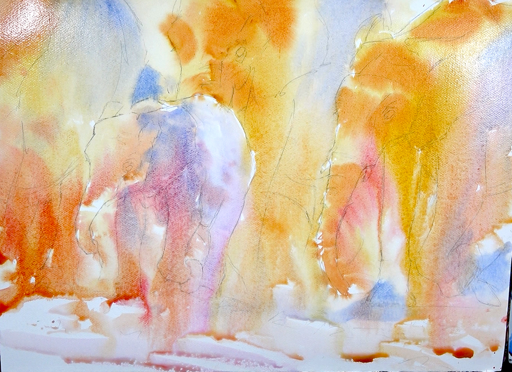
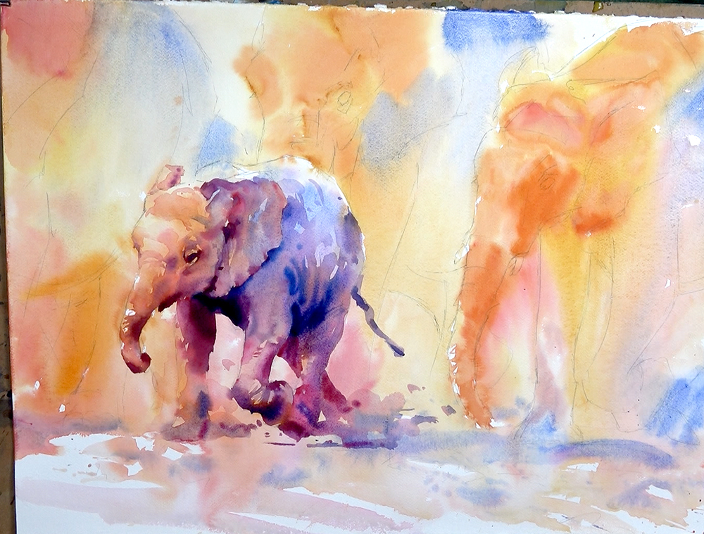
The first wash is about reserving the lights where needed (not many in this painting). Have fun with the paint, let colours run and flow together. As long as you don’t go too dark too soon, you can really let loose here. I think of it as laying down the colour foundations and colour gradients, or general colour feeling of the painting. I am generally aiming to keep everything in the light family at this stage. Don’t go too dark too quickly and stay away from detail – you can always go darker and add more detail later.
This first wash was a very watery Indian Yellow to start. Yellows generally being the lightest colours I find make them a great colour for lightly mapping out a painting and finding our “way in”. I then bring up the paint consistency to be a bit more milky, which gives slightly darker tones and stronger colours.
I then begin to drop in Quinacridone Reds and Quinacridone Golds. Still letting everything run and flow. The thicker paint and marginally drier page give a little more control.
I reserve areas where I want colours to be cooler and to have a more purple and blue feeling. I wait until the yellows have dried a little, then I come in and wash these cooler colours in. These cooler colours are all Ultramarine Blue and at times a touch of Quinacridone Red to push them towards purple.
I try to leave more lights of the page near the bottom for the light on the ground. Other than this I just let all colours run.
As it dries I do come in with creamier paint where I want really strong colours – but still not too thick or dark!
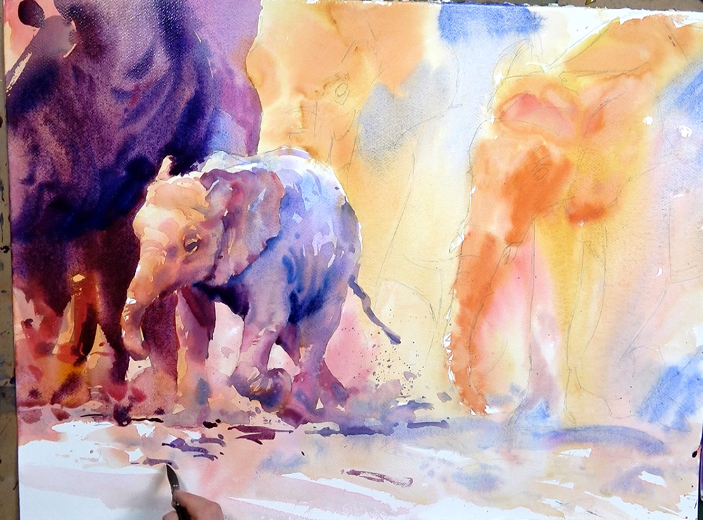
Step two
Once completely dry (it will dry lighter and softer) I decide to tackle the focal baby elephant first. With such a large painting I know I will need to leave large areas very simple and abstract. I will find this easier if the focal point is close to finished.
Each elephant has an underlying colour gradient of cooler and bluey, through to orangey on the head. So I follow this same colour pattern in the shadows.
I start in the head with yellow and red. A milky consistency gives a nice gentle shadow tone. I map out the shadow shapes simply first; I then use a soft damp brush to soften the odd edge.
As this wash dries I drop in some darker tones (creamier paint of the same colour). I continue to work into the rest of the head and ear, and down into the front leg.
As I come into the body I slowly introduce more Ultramarine Blue, until I get to pure Ultra Blue in the very cool back area. I still only use about single cream consistency (not too dark and still transparent).
This is now the shadow shape mapped in with the gentle/soft shadows. As this dries I drop in increasingly stronger mixes of the same colours (less water, more pigment). This slowly pushes the shadows deeper in select places and we begin to get a sense of shape and form.
Moving from gentle to deep shadow whilst the area is still wet gives this lovely atmospheric effect. This is created by soft and blurry shadows contrasting with our sharper and harder edges where the light is hitting.
It is this exact same process and way of thinking which I will carry into each of the other animals, although they will be even simpler in the way they are painted.
Step three
Apart from a few final touches to the baby Ellie later on, I am happy to move on into the background.
Although this mass of tone to the left of the baby does represents an elephant, I really just use it as an opportunity for a nice deep purple colour which gets warmer towards the bottom. I also use the negative shape of this background area to carve out and describe the positive shape of the baby Ellie’s head, whilst at the same time trapping the light.
The simplicity of this area, and the tone, contrast nicely the more complex and lighter focal elephant, really making it pop.
So far we just have simple shapes, simple tonal values and a simple colour scheme, all painted wet in wet with no detail…this is all that is needed!!
Step four
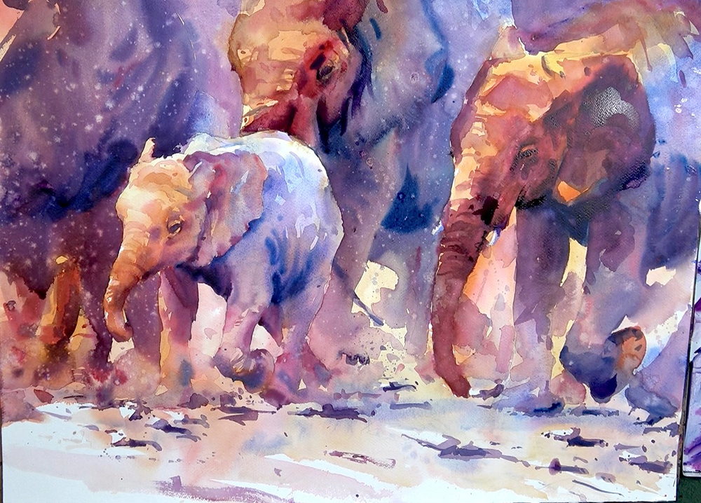
Whilst I use the same colour combos in the remaining two elephants, the lights are no where near as bright, and I paint in a much simpler way. By this I mean I do not use so many small shapes or subtle tones. They really are just painted with a simple warm colour for the gentle shadow; and a simple cool colour, more blue, for the furthest back areas. This is mostly French Ultramarine, sometimes with a touch of Quinacridone Red.
I then look to just drop in brushstrokes of dark – created by using less water and more pigment – to describe the deeper areas of tone. Doing this whilst the area still has a dampness gives varying degrees of softness. It is this softness and out of focus feeling in the background elephants which is important. It contributes to the contrast with the sharper edges and brighter lights of the focal elephant.
I try to paint the legs and large areas of the bodies as simply as possible too. Not too many big jumps in tones or colour, and generally wet in wet to loose plenty of edges.
You may notice that the painting now has what looks like splatters all over it. This is an effect I often like to create in shadow areas, particularly if it is a large mass of similar tone or colour. There’s absolutely nothing wrong with large areas of “not much going on”, but I find this technique creates some interest and texture which really appeals to me. I also find it can help to unify areas of a painting that are not gelling, as it provides a similar texture across them. Although be warned, I have often gone overboard.
I create this effect by simply misting or sparying clean water over a drying wash. A spray bottle or mister works really well. I sometimes splatter and spray clean water with my brush, splatter in opaque colours or even use my mouth to spray water over the piece (this approach not to everyones taste, no pun intended!). Different stages of drying create different effects. As always playing around, experimenting and having fun will allow you to add this great little technique to your bag of tricks.
The stones on the ground are fun! I simply pick the white patches left in the first wash; pop a gentle shadow behind them and then pop a deeper shadow in behind that – this is all that is needed to give and illusion of sun lit rocks.
Any final touches are just little dark accents to make features “pop” a little more. Or I deepen details and shadows. There are also some finishing touches of dry brush work which always adds a nice textural contrast to the smoother washers – and there we have it!
Notice the tonal similarity of the final piece to the initial small rough tonal study. From a tonal point of view they are the same. It is this strong underlying pattern of simple light and shadow that holds the piece together and makes it work! Always having this in mind not only makes the painting process easier, and will give a stronger and more impactive painting; it also is the foundation which allows us the play and get creative and to paint with more spontaneity and improvisation, in short it allows us to have a lot more fun if we have the safety net of simple tonal value plan to fall back on!
* The istock image used as the reference photo allows Tom Shepherd to use the image for teaching purposes. The license, however, restricts you from showing or selling a painting you have made following the tutorial whether that is online, on social media or in person e.g. exhibitions. Should you wish to sell or show your painting you will need to purchase a license yourself first and we ask that you credit Tom Shepherd & Ken Bromley Art Supplies when showing or selling your painting.


I love your tutorials and the way you give the different steps. I have been wanting to try watercolors, I usually paint with acrylics, but your instructions will help me understand in a much deeper way.
Thank you for this detailed instructions on Tom’s Elephants. After finding this painting here, and then in one of my social art groups. I was so inspired – I joined Tom’s Watercolour School of art membership and continue to learn more about the art and techniques of watercolour painting.
Thank you
excellent video