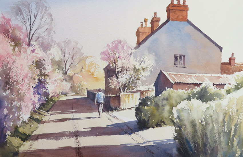
Tutorial Using W&N Twilight Colours By Charles Evans
Winsor & Newton have introduced a fabulous range of Limited Edition Professional Water Colour. The Twilight Collection features beautifully rich, deep colours of the best quality pigment. There are six hues in the range, including Aqua Green, Chromium Black, Cobalt Green Deep, Sanguine Red, Smalt Blue and Quinacridone Violet.
The Twilight Collection colours come in 5ml tubes and won’t be around forever, as in the case of the Desert Range. Ensure you purchase your Winsor and Newton Watercolours before they disappear!
2020 UPDATE: The limited edition Twilight Colours have now sold out. However, Aqua Green, Cobalt Green Deep, Smalt, and Quinacridone Violet have now been added to the main Winsor & Newton Professional Watercolour range. You can still follow this tutorial by substituting similar colours for the others.
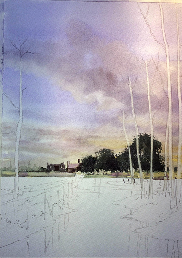
Step 1
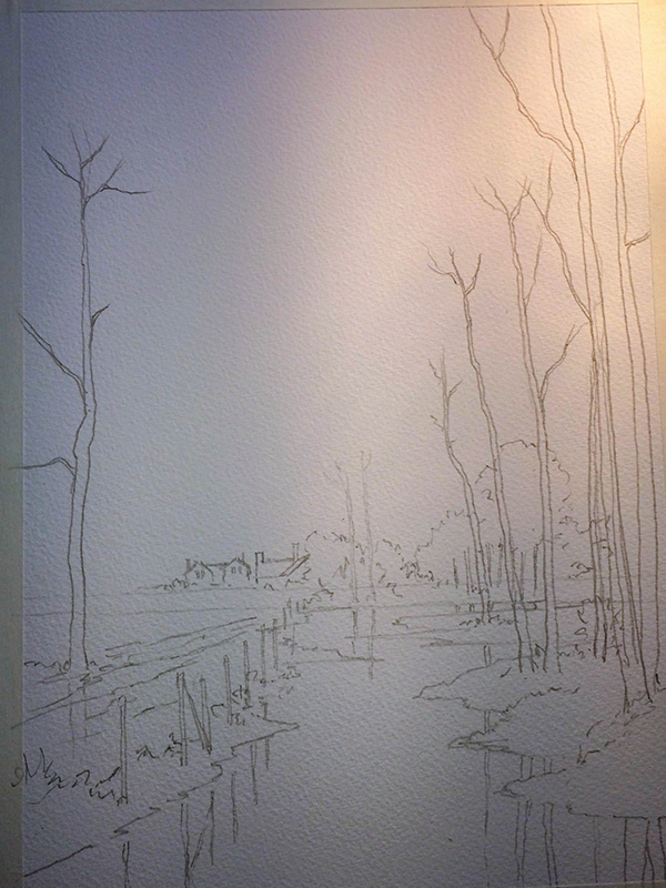
For this painting, I’ve added one more colour to my palette, which is Yellow Ochre, one of the core Winsor & Newton Professional Water Colours. In this first image, you will see that I have drawn a very simple outline sketch.
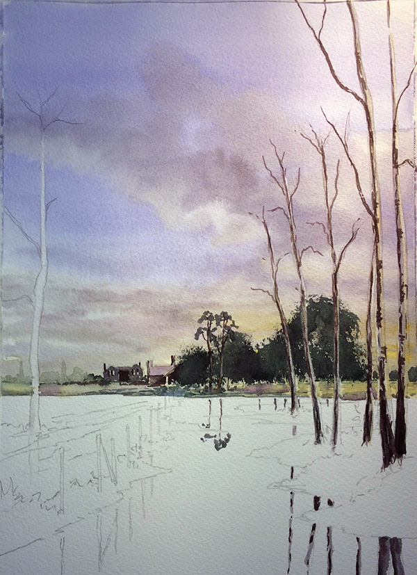
Step 2
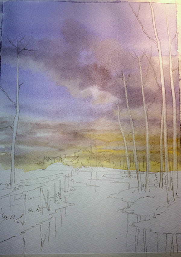
For the sky wash, I firstly pre-wet the entire sky area using my Cotman 1 ½ inch Flat Wash Brush, and then dropped in a little well-watered Yellow Ochre onto the bottom area of the sky. I then added well-watered Smalt from the top coming all the way down to join the Yellow Ochre. Next, I mixed a little bit of Quinacridone Violet in with the Smalt to create a few darker areas of cloud, before washing and squeezing out my brush and sucking out a few lighter clouds here and there. Then I let the sky dry thoroughly before moving onto the next stage.
Smalt, interestingly, is one of the oldest colours in existence, the original being produced by Winsor & Newton centuries ago. Quinacridone Violet is quite a mouthful, so I tend to call it ‘Violent Violet’ because it’s such a powerful colour! I’d recommend using it sparingly for these types of paintings.
Step 3
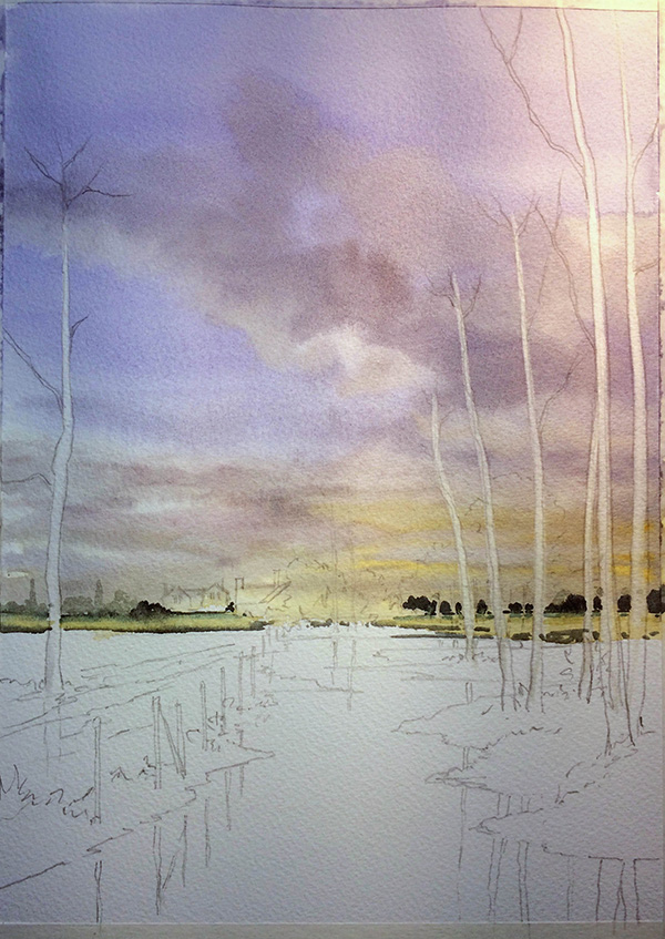
You’ll notice in this image that it appears I have painted around the trees, but actually I haven’t. I simply painted my whole sky wash and then used the sharp edge of my damp ¾ inch flat Cotman Wash Brush to suck out the paint and reveal light in the trees.
Next, I changed to my number 8 Round Cotman Brush and dropped in the far distant trees using a mix of Aqua Green and a tiny touch of Smalt into the green. With the point of the brush, I just tapped on the colour to create the shape of distant trees. Underneath this, I popped on a little bit of well-watered Yellow Ochre with a tiny hint of Sanguine Red here and there to warm up the area, and then went back to the original green mix underneath the yellow fields.
Step 4
Still using my number 8 Cotman Round Brush, I painted the buildings next. For these, I used Chromium Black which, unlike a traditional black, is not flat as it has a brown tint to it. For the roof of the building I put a tiny touch of the Smalt into the black and a lot of water to create a weak mix. For the big bunch of trees on the right, I mainly used Cobalt Green Deep mixed with a small touch of Sanguine Red and then a little Chromium Black here and there, all whilst still wet, to create some dark, shadowy areas within the trees.
Step 5
To create the trees in the foreground, I used my number 8 Cotman Round Brush. First, I put a touch of weak Yellow Ochre on the light side of the trees, and then Chromium Black mixed with a little bit of Quinacridone Violet up the darker side, all while the yellow was still wet so that one colour bled into the next. As I moved up the trees to the smaller twigs, I changed to my number 3 Cotman Rigger Brush. Notice that at this stage, I have repeated the colours underneath to begin creating reflections.
Step 6
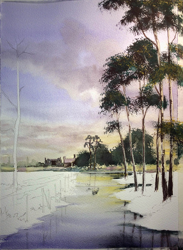
For the main foliage in the foreground trees, I went back to my ¾ inch Flat Wash Brush and stippled on a mixture of Cobalt Green Deep and Smalt. I ensured the brush was fairly dry at this stage so that I got a more ragged effect to the foliage, and then I finally added a little Chromium Black, using the same methods, into the darker areas of the foliage. Once all of this was dry, I pre-wet the stream area using the same Flat Brush and dropped in a little bit of Yellow Ochre followed by Smalt, with a touch of Sanguine Red. I quickly stroked through all the reflections so as not to disturb the paint too much. I then let everything dry before continuing.
Step 7
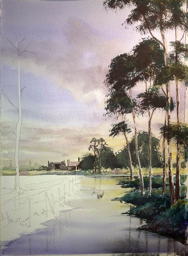
For the grasses underneath the trees, I used well-watered Aqua Green and dropped in a few touches of Sanguine Red while it was still wet. You can barely see this colour in the grass but it certainly helps to warm it up slightly.
Step 8
Now for the tree to the left. I used the same process as I did for the other foreground trees, but you’ll notice I’ve dropped some fairly strong Yellow Ochre onto the right-hand side of the foliage, creating the effect of light.
Step 9
The grasses on the left-hand side were all made using the same process and the same mixes as the grasses on the right. For the fence posts, I used my number 8 Cotman Round Brush and a mixture of Chromium Black and Sanguine Red. Notice I’ve left a touch of light to the right of each post.