
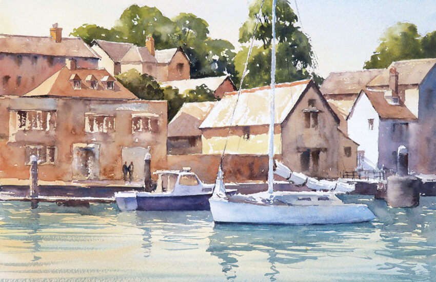
Winsor & Newton Professional Water Colour – Jewel Colours Tutorial ‘Beachcomber’
Originally launched as limited edition colours, due to popular demand Winsor & Newton have added these beautiful jewel like colours to their permanent range.
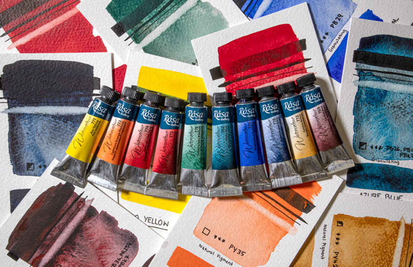
Available in Transparent Orange, Quinacridone Violet, Aqua Green, Smalt Dumont’s Blue and Cobalt Green Deep each beautiful jewel like colour has been formulated with the purest pigments to provide an unrivalled brilliance, transparency and lightfastness. This tutorial by Glyn Macey will show you in 9 easy steps how you can use these colours to paint an atmospheric beach scene.
Materials Needed
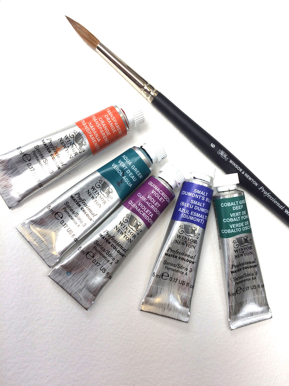
- W&N Professional Water Colour Sable Brush No 6 Round
- W&N Professional Watercolour Paper Cold Pressed 140lb
- Winsor & Newton Jewel like Professional Watercolours
- Smalt Dumont’s Blue
- Aqua Green
- Quinacridone Violet
- Transparent Orange
- Cobalt Green Deep
Step 1
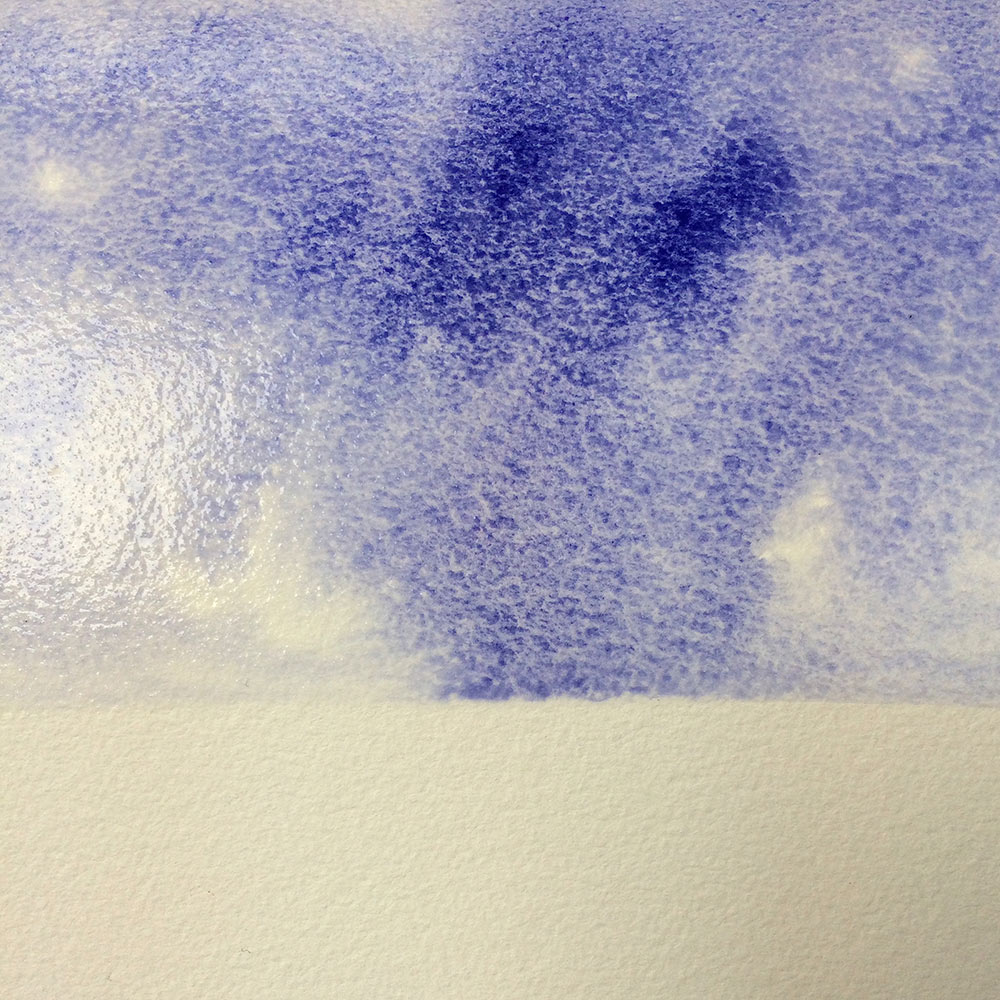
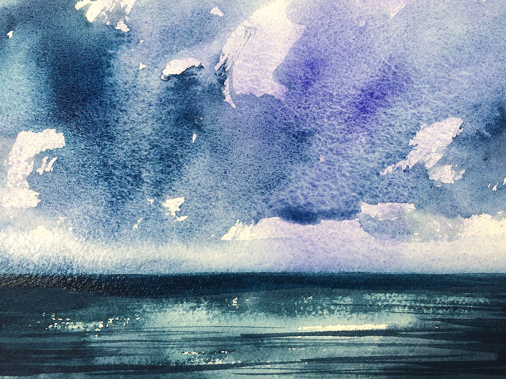
Working flat, I begin by adding a brush load of clean water to the sky area, from the top of my sheet to around one third of the way down. Just enough water to dampen the paper before adding the first of my watercolour paint colours, Smalt Dumont’s Blue. I allow this watercolour to disperse on the wet paper without trying to control the flow too much. The spontaneity of this way of working gives me a pleasing mixture of tone from dark to light. Let this sky area dry fully.
Step 2
Next, I mix together a wash of Aqua Green and Quinacridone Violet in equal measures. Together these colours create amazingly rich petrol blue which is perfect for a deep sea. Try using a dry brush technique over dry paper to capture the ‘sparkle’ of light on water. It’s a good idea to work fluidly but try not to cover the whole area with neat paint.
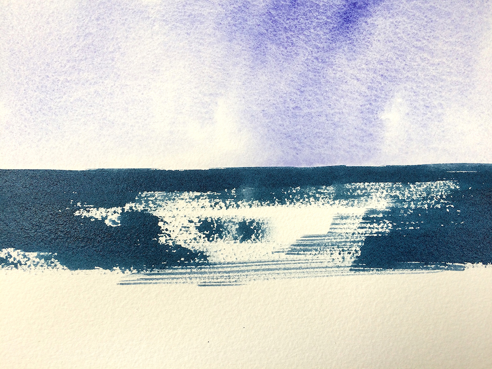
Step 4
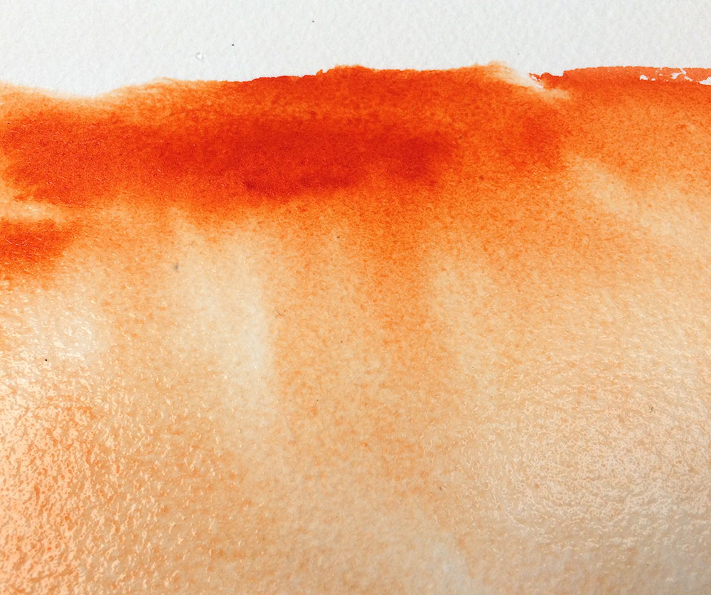
Working my way down my paper, I leave just a few centimetres of dry white paper before wetting the ‘foreshore’ bottom third with clean water. Along the top of the area, where the now wet paper meets the dry area I add a brush load of neat Transparent Orange. By adding this paint neat from the tube I maintain the ‘mass tone’, that is the name given to paint from the tube. I now tilt my painting to face me and allow the ‘mass tone’ orange to flow into the wetness below. This diluting of the paint is called the ‘undertone’.
Step 5
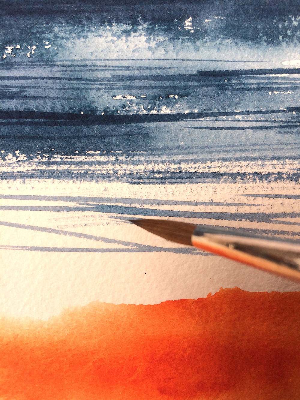
Using the point of my round watercolour brush, I add a few crisp lined marks to the sea and white areas using the same Aqua and Violet mix as before. Essentially these new marks are ‘glazing’ over the previously painted sea giving darker wave shadows and movement. For these marks to retain their crispness it is essential that the underlying paint is dry.
Step 6
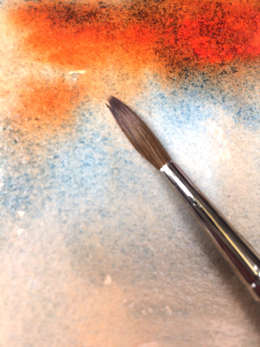
In contrast to Step 5, I add the same Aqua and Violet mix to the still wet Orange in the lower third of the painting. This wet in wet technique allows the colours to mingle, granulate and create fascinating ‘cloudscapes’.
Step 7
Working my way back into the sky, I add a dark mix of Aqua Green and Quinacridone Violet to bolster and describe dramatic cloud formations. Make these marks with confidence and try not to overwork these areas. With the brush still wet with a little paint, I drag it across the horizon line to soften this area, subtly blending the sea and sky together.
Step 8
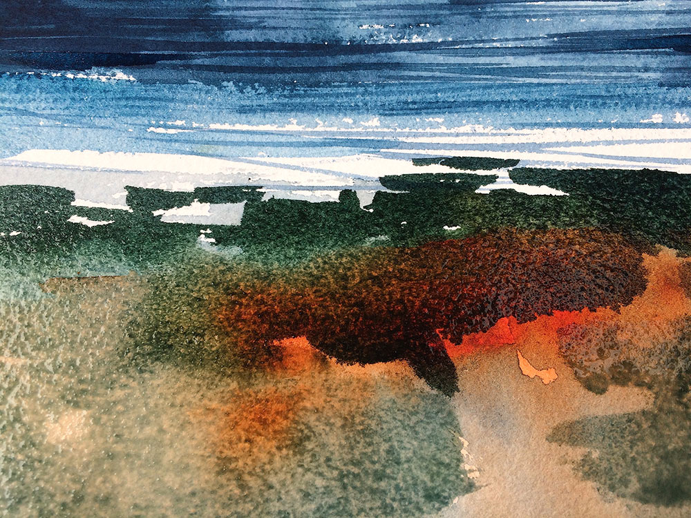
Keeping my dark mix of Aqua and Violet, I darken it further by adding a touch of neat Cobalt Green Deep. This colour adds extra depth and richness to the tint. Using the point and side of the brush I add a few calligraphic marks to indicate the shore edge. This gives a good counterpoint to the pale area behind, both making each other ‘sing’. This crisp shore edge also draws the viewer’s eye in, making a good focal point.
Step 9
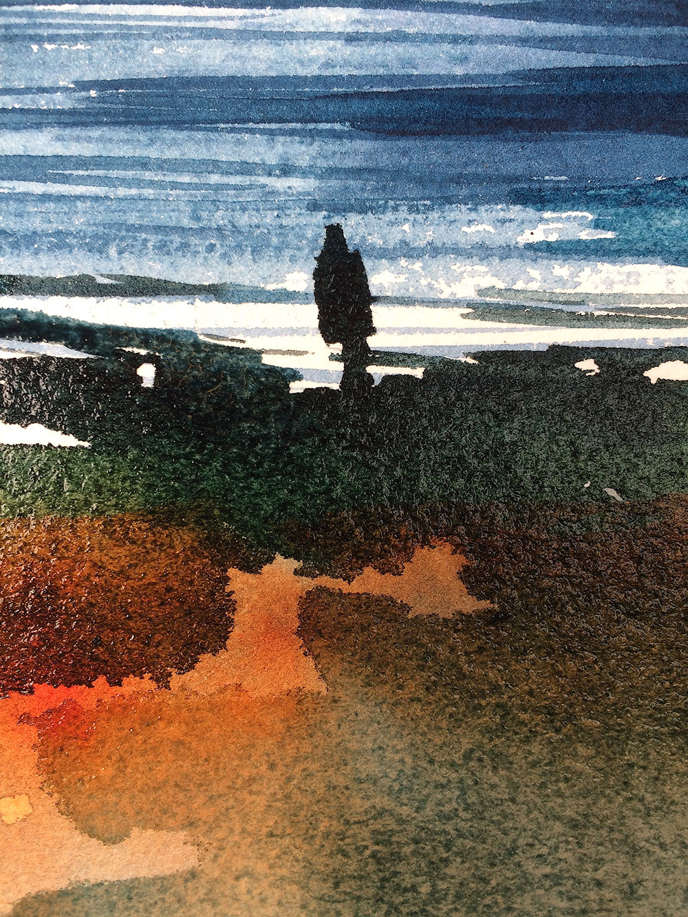
Using the same dark mix, I add a simple figure shape. This gives the main focal point to the painting along with a sense of scale. No need to get bogged down with describing the figure with too much detail, the viewer doesn’t need to know whether our figure is male, female, young or old. It would of course be easy to get carried away at this stage and to start adding boats and seagulls, but for me, the simplicity of one brush and a limited palette of five juicy colours is a joy.
Finished Painting
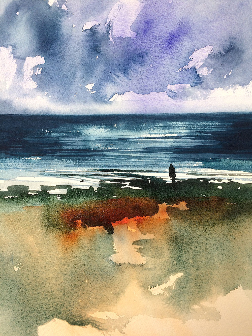
The spontaneity and freshness of watercolour is key to its success, so please, please, please don’t overwork. Instead, keep it simple and enjoy the ride! – Glyn Macey
To see our full range of Winsor & Newton Professional Watercolours visit our website.


Can we please have Step 3.