
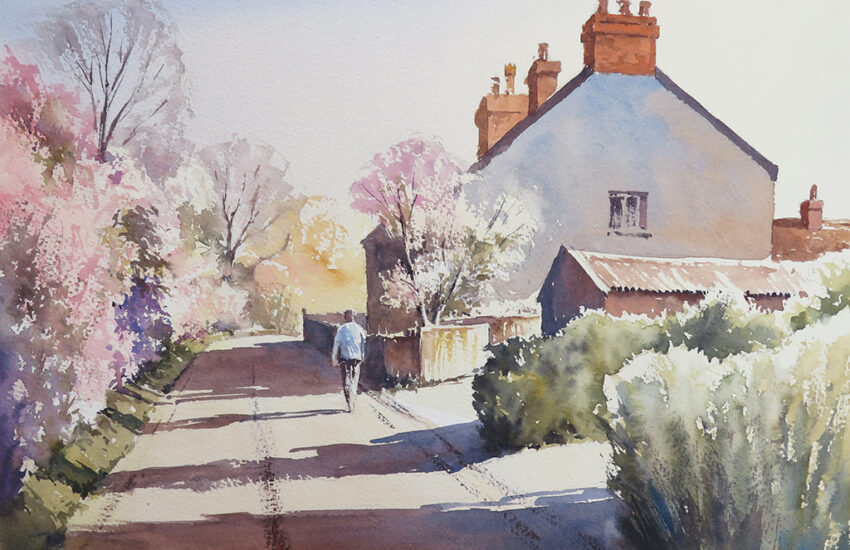
Winsor & Newton Desert Colours by Charles Evans
The launch of some new colours by Winsor & Newton is always going to be exciting because you know that whatever they are, they are going to be good, but Wow! These 6 new colours are really the business. They’ve called them Desert colours or Sahara, or some such thing but don’t be fooled by the names because they are not just for people who paint deserts as I have shown in this watercolour tutorial, as the highlands of Scotland could hardly be classed as desert!
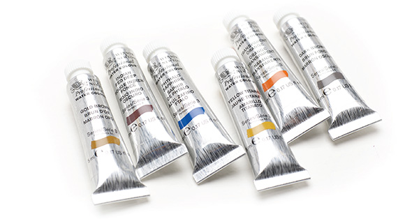
The colours themselves are called, Transparent Orange, Phthalo Sapphire, Gold Brown, Yellow Titanate, Dark Brown and Indian Red Deep and the strength of pigment and clarity of colour is just amazing. Why they named them this, I don’t know. Personally I would have called them the Vibrance Range because they truly are.
2020 UPDATE: The limited edition Desert Colours have now sold out. However, Transparent Orange, has now been added to the main Winsor & Newton Professional Watercolour range. You can still follow this tutorial by substituting similar colours.
The paper I’m using is the new Winsor & Newton Bockingford Watercolour Pad and its 140lb weight or 300grams and this is the paper that has fabulous texture and a rough surface.
STEP 1
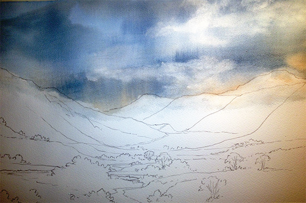
I’ve done a very basic outline drawing followed by my sky wash and for this I used my 1 ½ inch Cotman Wash Brush. Firstly pre-wet the whole sky area and then drop on a mix of Gold Brown and Yellow Titanate just in to the bottom part of the sky then a mix of the Phthalo Sapphire with a tiny touch of Dark Brown and bring this from the top all the way down to the base of the sky and then darken the same mix with a touch more of each colour for the heavier cloud areas. Now I simply washed and squeezed out my bush and suck out a few clouds here and there. Importantly this is all finished whilst all is sopping wet.
STEP 2
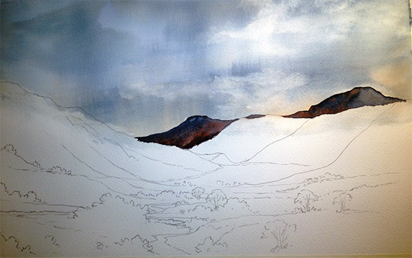
Once my sky was totally dry I used a mix of Phthalo Sapphire and Dark Brown, good and strong but be careful with this because these colours are so strong that you can practically make black with this mix, I don’t want it that dark. With my number 8 round Cotman brush I simply blocked in the far distant hills. Then again, whilst still wet, put a few splashes of Indian Red Deep here and there and with a clean damp brush, soften and move the colours together. This deep red will give a lovely glow to anything you put it in to but it is very strong so be careful. Now again, let it dry.
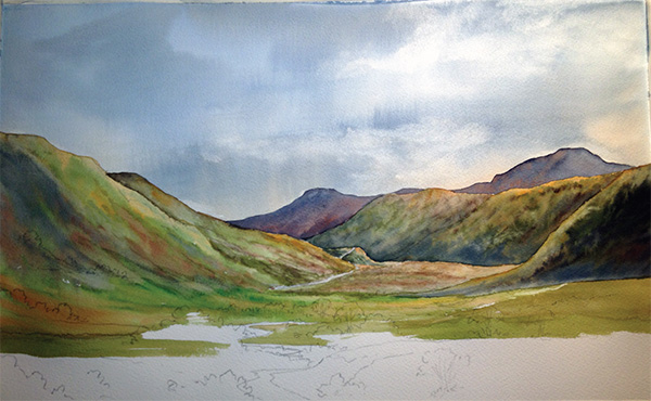
STEP 3
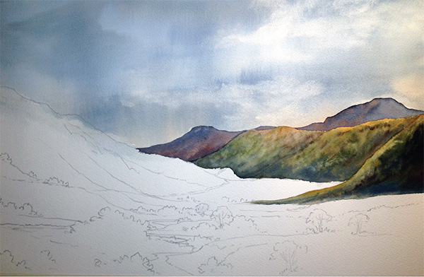
Again with my number 8 round brush I pre-wet all of these hills and popped a little of the Gold Brown into the top areas of the hills and then mixed Hookers Green with a little bit of Dark Brown and softly stroked the colours together, helping to merge and avoiding hard sharp lines. Now I popped a few touches of the Dark Brown in by itself, just a few hints here and there in the darker areas of the hill and then do the same with my Phthalo Sapphire and Dark Brown mixed. Soften the colours in with a clean damp brush and, importantly, finish whilst it’s still damp to avoid watermarks.
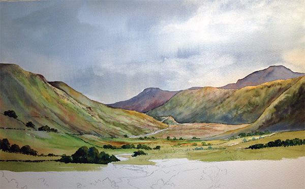
STEP 4
In the next image it looks like I have done a heck of a lot between stages. That’s because I have, but its all really the same colour mixes and for this I used my ¾ inch flat Cotman Wash Brush. I firstly pre-wet the areas I was painting and then used a few strokes of Yellow Titanate here and there and Hookers Green mixed with Gold Brown, a few touches of Gold Brown by itself for the darker Yellow areas and then to add some real warmth, drop in a few hints of Transparent Orange. Importantly, again, work fairly quickly so all of these colours can be stroked together gently to give a softer edge between mountains and also giving a lovely warmth to the scene with the addition of the well watered Transparent Orange. For the darker areas, especially in between hills, I’ve used a mix of Phthalo Sapphire and Indian Deep Red. Remember with all these mixes to keep plenty of water because these colours are very powerful.
STEP 5
In the next image I started adding a few bushy bits, hedge lines and trees. I used my number 8 round brush for all of this and started off with the lighter sides which was a mix of Hookers Green and Gold Brown followed by, whilst still wet and to the darker sides, a mixture of Hookers Green and Dark Brown and finally, to add some real impact, a touch of Phthalo Sapphire to the darker sides and base of some of these bushes. It always sounds odd putting blue in to trees or grasses but if you are working whilst everything is still wet it doesn’t come out bright blue it just adds more depth to your green.
STEP 6
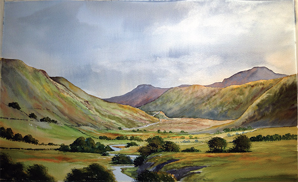
In the Penultimate image I painted in the river, which was purely Phthalo Sapphire with one heck of a lot of water in it, an extremely weak mix because, again remember, this is a very powerful colour. I finish off all the trees and for this foreground lot I used my ¾ inch flat Cotman Wash Brush and split it slightly and stipple on a few touches of fairly strong Yellow Titanate to get a little bit of light, followed by Hookers Green mixed with Gold Brown, then Hookers Green mixed with Dark Brown and finish them off with a little bit of Phthalo Sapphire mixed with Dark Brown for the extreme dark edges.
I also used this same mix, practically black, for the darker sides of this tall riverbank. Add more water to the same mix and I just daubed in a few hints of darker areas in the river. At this stage, I also warmed up the whole of the foreground and middle distance by carefully placing a few strokes of, firstly Transparent Orange, very well watered down, and a few of the tiniest little hints of Indian Red Deep, again very watered down. It is very clear to see where I have put these colours.
STEP 7
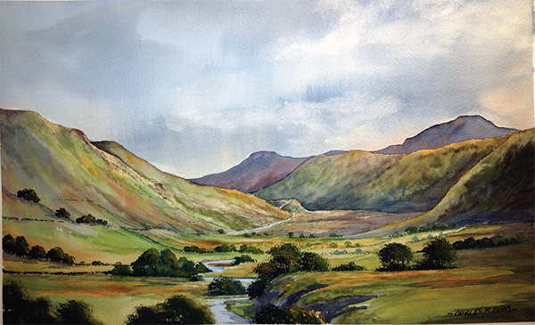
Now for the extremely scary bit, the adding of the shadows. Remember, all of those hills on the right hand side are going to cast a bit of shadow onto the landscape below, also some of the larger bushes and trees are going to cast a little bit of shadow. Make sure the entire thing is dry and don’t prevaricate with your brush strokes. Use clear, strong and quick strokes so as not to disturb the underlying colours. You can see where I’ve put this shadow, especially the ones cast by the hills in the middle distance and foreground right hand side. I used my ¾ inch Cotman Wash Brush and a mix of Phthalo Sapphire and Indian Red Deep with plenty of water in it.
I hope you enjoy using these new paints. Once you get over the initial shock of the strength and impact of these colours I’m sure, like me, you will find them an absolute joy to use.


Ok.Charles Evans.I like your paintings.
Wonderfull