
Rosa Gallery Acrylics Review & In The City Tutorial
As a professional painter in acrylic, oil, and watercolour, I have experimented with just about every technique, every surface and tried all the available mediums throughout my 25-year career. I have also used numerous different makes of acrylic, so I was delighted to be asked to review the new Rosa brand of acrylics for Ken Bromley Art Supplies. I have also produced two tutorials for you to follow, my first in this article is using Rosa Acrylics on watercolour paper to produce a city scene. The second tutorial, of a Dales landscape on acrylic paper, is included in the final part of my review to be published shortly.
Introduction
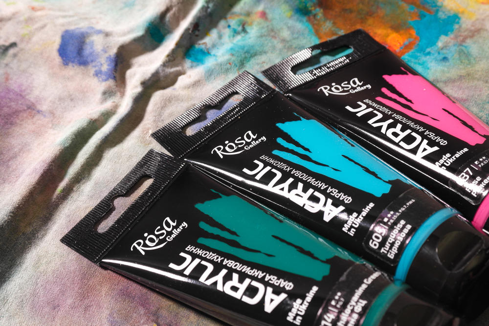
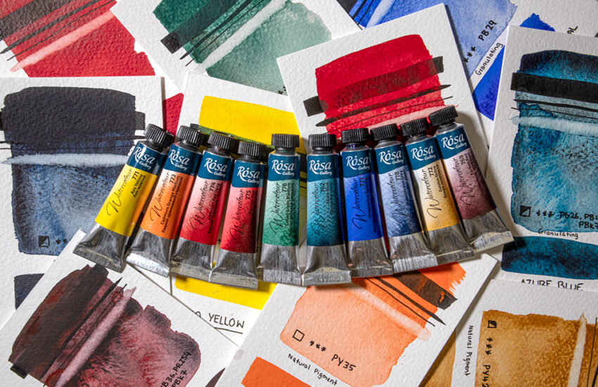
In this review I am using the 60ml tubes, which I would consider to be painter friendly on three points. The tubes are printed with the company logo but with a clear window so that you can see the actual colour inside – great for a quick grab and ensures there is no rummaging through rolled up unidentifiable tubes. There’s an easy flick open lid, which is flat to allow the tubes to stand on the table. This is helpful on those occasions when there’s not much paint left as you can let the colour run to the cap. Also, the retail hanging tab is useful if you’re the type to hang your paints in the studio.
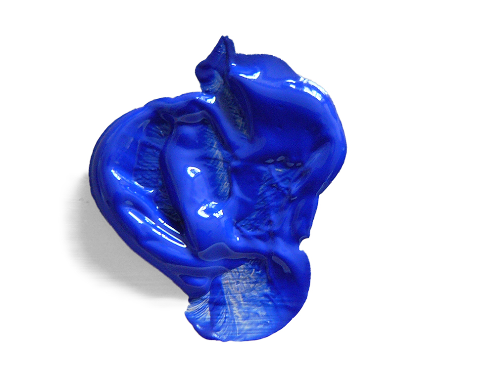
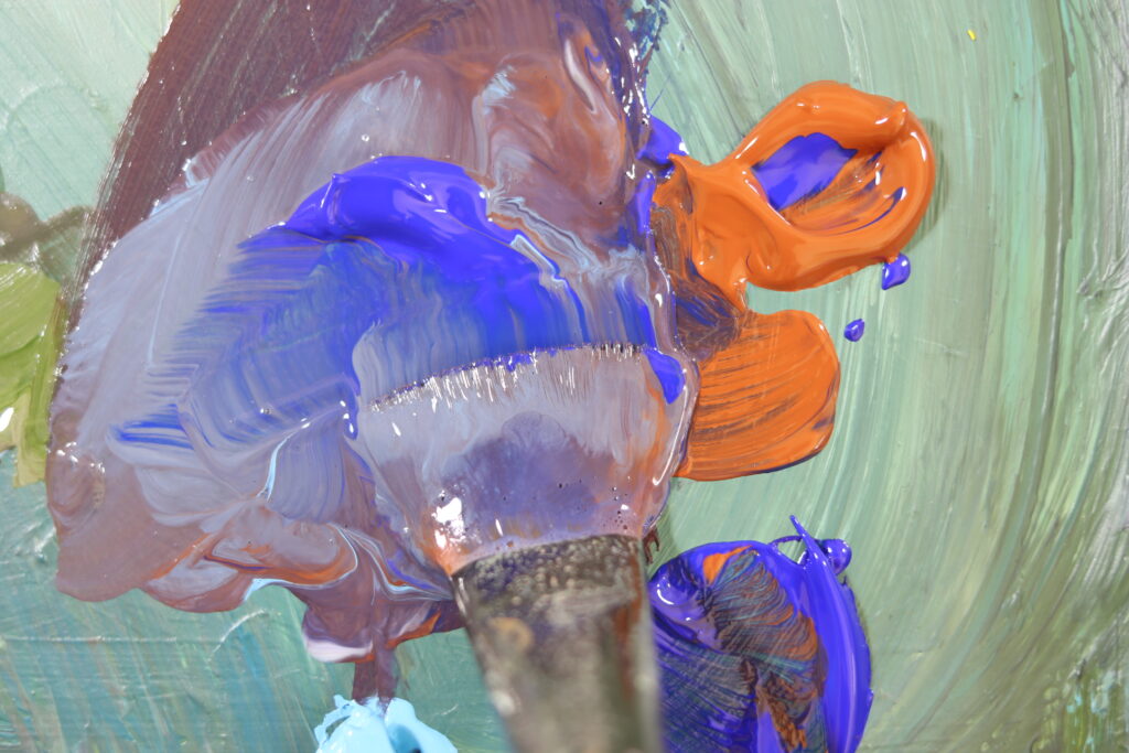
I started by getting a general feel for the colours. They have a nice workable consistency, not too heavy and not too runny, somewhere about the consistency of thick yogurt. The information on the tube says they are good for outdoor works, and I can imagine that. The range is made up of 56 colours with a mixture of opaque, semi-transparent as well as transparent colours.
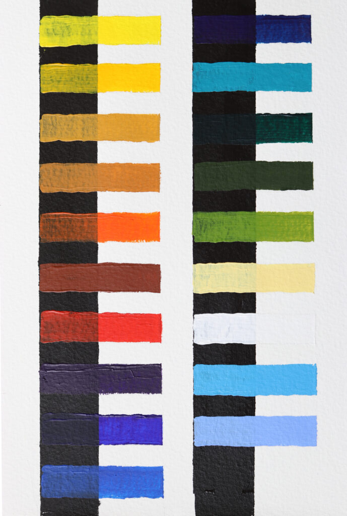
Opacity Test
I began with an opacity test to get a feel for their coverage, transparency, and opacity. Painting each colour thickly over a strip of black on watercolour paper, I noted how they performed. They have a strong covering power with most colours entirely blocking out the strip underneath apart from the semi-transparent hues. The paint flows well in its neat form due to its workable consistency. When dry, the colours remain strong and vibrant with no detrimental dulling or colour shift noted.
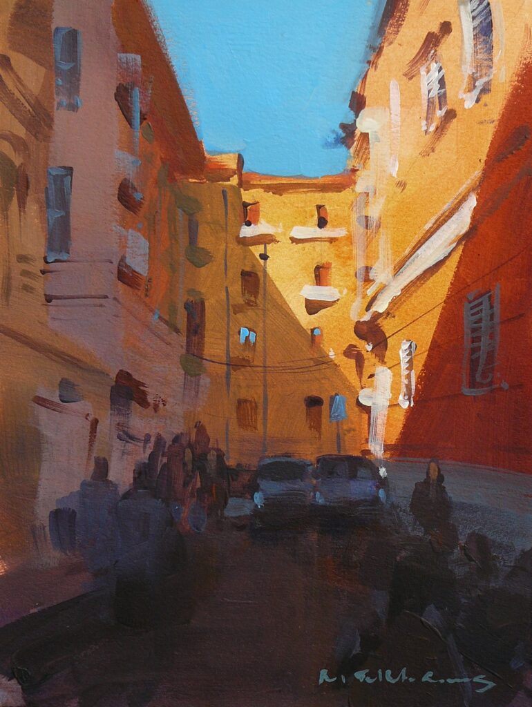
In The City Tutorial

My first venture with the paints was on a piece of Canson Moulin du Roy 140lb NOT surface watercolour paper. I wanted to begin with a thin application of colour and to work on something fairly absorbent to see how the colours performed.
Rosa Gallery acrylic paint colours used:
- Ultramarine
- Violet
- Naples Yellow
- Burnt Sienna
- Ochre light
- Titanium White
- Cadmium Red Light (hue)
- Sky Blue
Rosa Gallery Acrylic Painting Medium
Stage 1
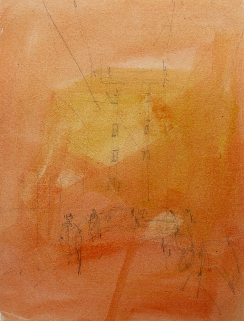
I began with a thinned application of Cadmium Red Light (hue) and Ochre Light mixed with some Rosa Medium and water. The colour behaved as expected at this stage, soaking into the paper, and leaving some interesting marks. Working with acrylic on cotton watercolour paper is tricky because of the absorption of moisture leading to faster drying, so I thought this would make a good test.
Stage 2
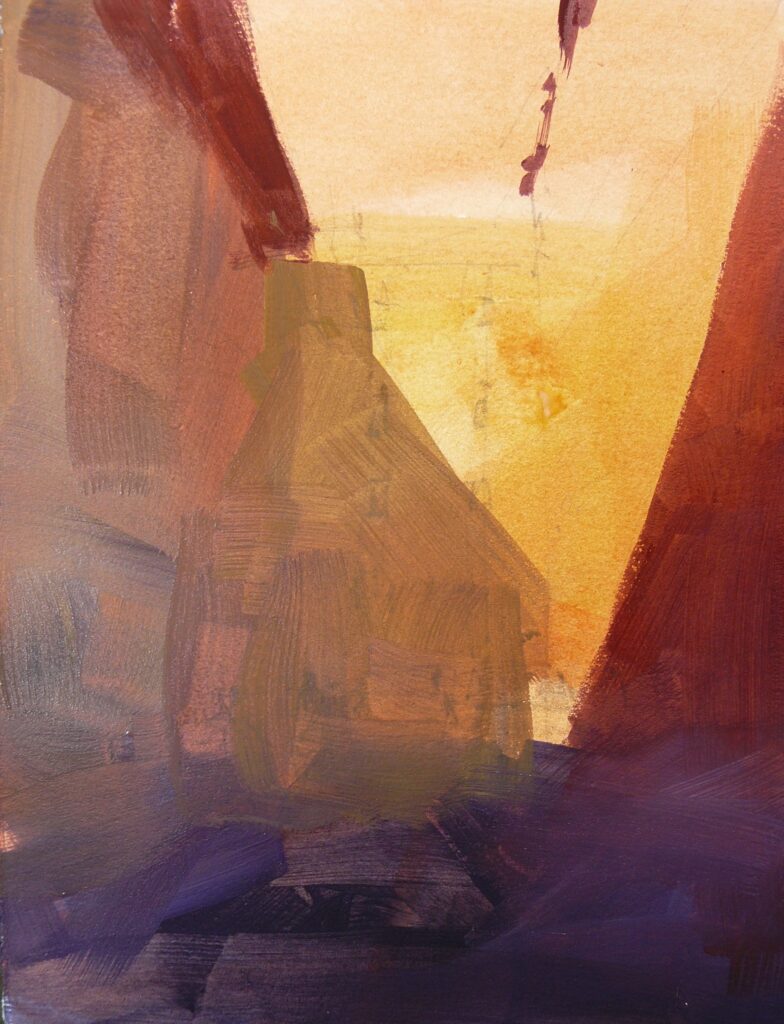
When the paper was dry, I blocked in the darker values and shadows, beginning with Ultramarine, Burnt Sienna, and Violet at the bottom and working into the shadows adding Cadmium Red Light (hue) and Violet on the right and Ochre Light with Violet over the middle building. I used no water and allowed the consistency of colour to dictate the flow. The mix of Ultramarine, Burnt Sienna, and Violet struggled a little to make a solid dark, but I was pleased to see the paint retained some brush marks in the broad application.
Stage 3
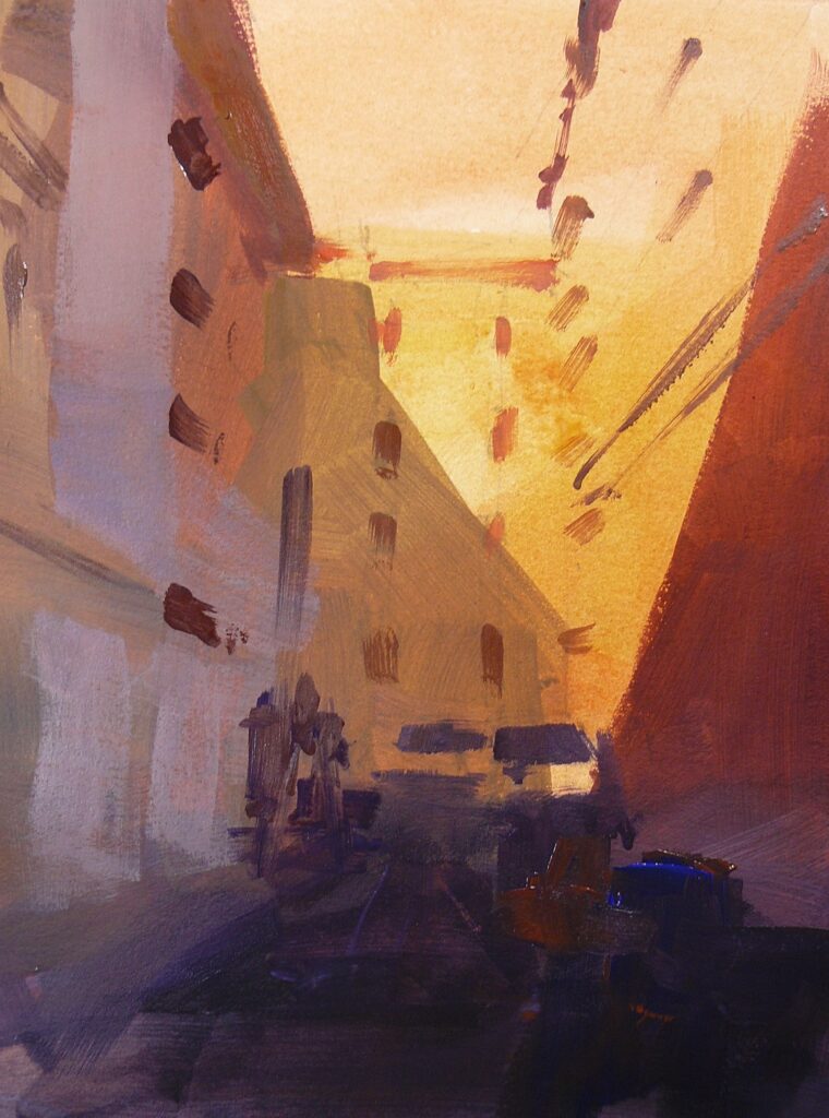
I added a second application of Ultramarine, Burnt Sienna, and Violet to the street and the values increased to give me the intensity I was looking for. With Cadmium Red Light (hue) and a touch of Titanium White, I marked the thin section of roof and sunlit windows. The paper grabbed the moisture from the paint which allowed me to create a little drag brush against the texture. Lower down in the shade I used Cadmium Red Light (hue), Ultramarine, Burnt Sienna, and Titanium White to depict the various lines and marks of the architectural details. I mixed Titanium White with Cadmium Red Light (hue), ultramarine, and some medium, and painted the left-hand light reflection at the corner of the building and the doors underneath.
Stage 4
I spent a little bit of time enjoying the flow of the paint, sometimes using neat colour without adding medium. I increased the marks and details of the buildings, noticing the various transparent and opaque effects that were emerging. The colours are quite runny and when used in conjunction with the medium, require no water for further dilution unless you want to use super thin washes of a watercolour style. I finished the section with the Sky Blue and a little Titanium White. Wow, what an intense colour! Perfect.
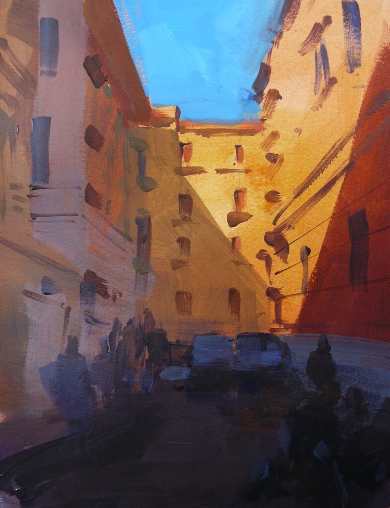
Stage 5
I gave the sky a second application of colour to make it solid. The Sky Blue turned out to be a fantastic colour to add into cool shadow and I enjoyed mixing it with Ultramarine and Burnt Sienna for the window details in the shadows, along with some of the shapes of the figures and highlights of the cars. Finally, to bring the painting to a close I mixed Naples Yellow and Titanium White and painted the sunlit lights.
In Summary
I did enjoy using the paints on watercolour paper. To reach some of the deeper values I had to apply two or three layers, but the advantage in that is each layer generates its own interest, a bit like watercolour. The fact that some colours are transparent helps to connect colours and details together. The paint finish was matt to satin with a nice lustre to the colours.
The second part of my review covers how Rosa Gallery acrylics perform on acrylic paper. I have included a tutorial too which you can follow, be sure to check it out.
Paul Talbot-Greaves RI teaches watercolour and acrylic painting in his workshops and demonstrations via his website and to art societies throughout the UK. He has received many accolades and awards including Best in Show at Holmfirth Artweek 2013, The Artist award in 2017 and again in 2021 at Patchings Art Festival, and The Chaoshan Watercolour award at the 2021 RI Watercolour exhibition, London. He was elected a full member of the Royal Institute Of Painters In Watercolours in 2023.
www.talbot-greaves.com | Email | Instagram | Facebook | Twitter


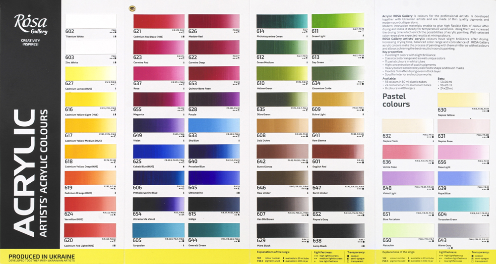
An interesting article by Paul. I noticed that the section entitled ‘Opacity Test’ has a reference to the colours used, only the there are two blue colours at the top of the RH column that have not been mentioned (the RH column does not start with Phthalocyanine Green). Regards.
Hi Trevor, many thanks for comments and well spotted! I have amended the article – the two missing colours were Phthalo Blue & Turquoise.
I have been looking at using Rosa acrylics for some time now. However every time I look the cadmium orange is out of stock. Is this a situation that is will continue?
Hi Richard. Thanks for your comment. Unfortunately it does look like the Cadmium Orange in ROsa Acrylics has been long term out of stock. I’ll get in touch with our stock controller to see if our suppliers know when it’s likely to be back in stock again.