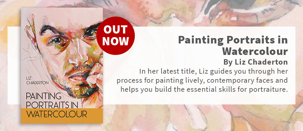
Line & Wash Portraits – a perfect blend for Inktober inspiration
Line and wash is a wonderful mix of media in which to capture a dynamic portrait of your subject. It brings together the expressive qualities of drawing and the fluidity of painting, resulting in dynamic portraits that burst with energy and character. If you aspire to paint more loosely in watercolour, the reassurance of the line can help you work more freely with the washes which in turn add energy and expression to the portrait.
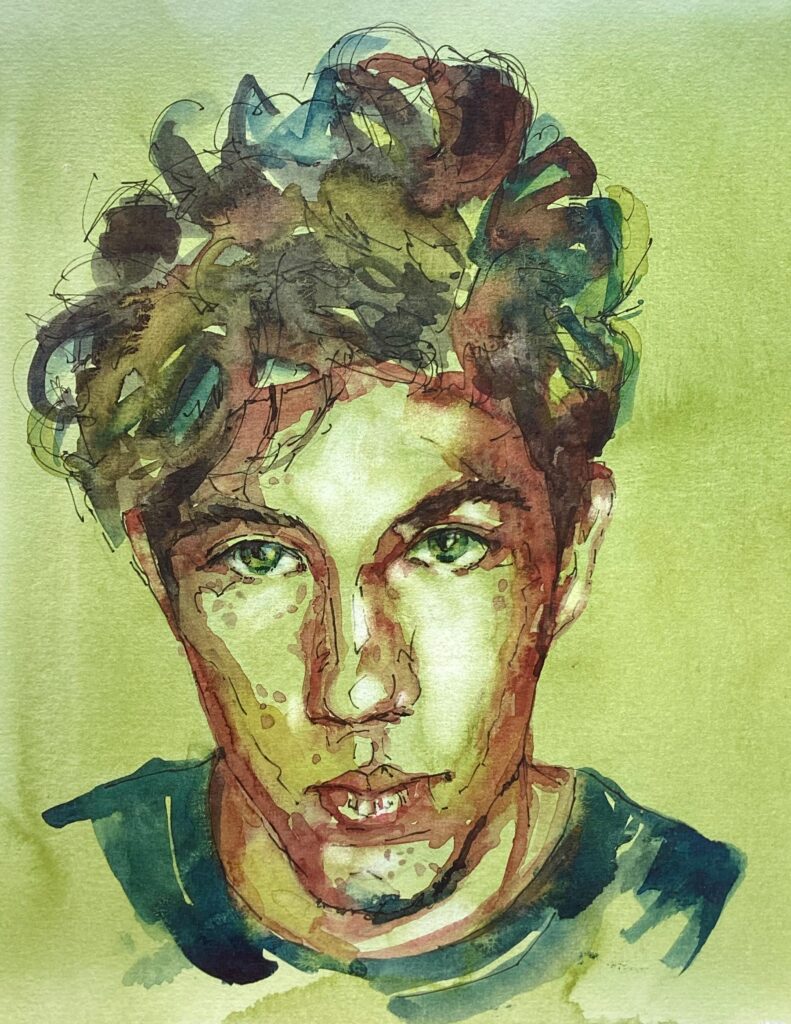
Traditionally, artists work on white paper, which can render a rather stark portrait. However, the choice of a toned paper introduces cohesiveness and depth to your work. You have the creative freedom to select warm skin tones or venture into more unexpected colour palettes.
Materials needed for this tutorial
• Bockingford NOT (cold pressed) 140lb/300gsm, quarter imperial sheet (38x28cm/15×11 inches)
• Watercolours of your choice. I used tubes of Green Gold (Winsor and Newton), Gamboge (Rembrandt), Prussian Blue (Winsor and Newton), Perylene Maroon (Winsor and Newton)
• Brushes – round with a decent point – size 10 or 12, plus a larger brush for the background wash – if you wish to paint loosely, use a brush which feels a little too big for your paper size. A small flat brush for lifting colour.
• Pens – 0.4mm fineliner – make sure it is waterproof. Look for pigment ink and check with your paper. You will find that some pens bleed on some papers, but are fully waterproof on others.
• Reference photo: a royalty free image of a young man with striking eyes. (pixaby https://pixabay.com/photos/portrait-people-adult-man-face-3353699/)
Toning and outlines
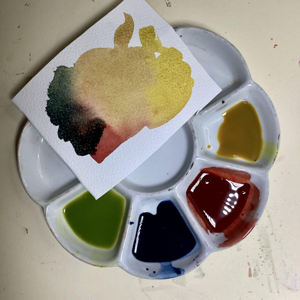
I swatched my colours to ensure they played nicely together. Perylene Maroon and Green Gold (or Sap Green), make an unexpected tan skin tone. The Prussian Blue mixes with the maroon to make an excellent dark. The yellow was simply to brighten the palette if required. I mixed them to a milky consistency, so that I can respond quickly to any magic happening on the surface.
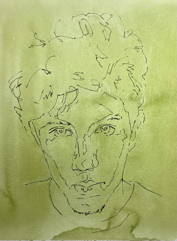
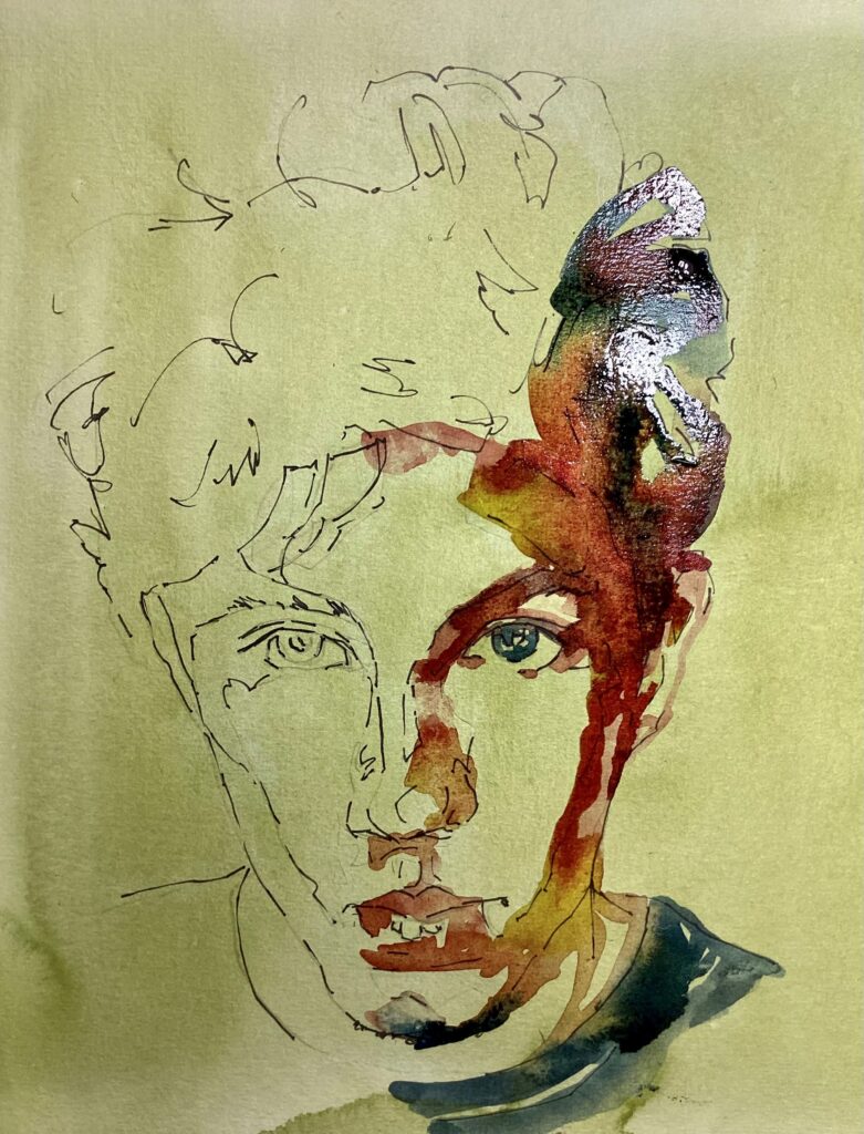
Begin by securing your paper without stretching it, and paint at a slight angle to control water flow. Your choice of background colour will set the tone for the entire piece. Inspired by the subject’s striking eyes, a green background was chosen. However, you could create a more realistic skin tone by mixing Perylene Maroon and Green Gold. Apply a flat wash of diluted Green Gold, aiming for a dark light tone or a light midtone. Allow it to dry. I worried that it was a touch too dark, but allowed it to dry and pressed ahead.
Once dry, the image can be transferred in your preferred way. To expedite the process, consider using a light pad rather than drawing freehand. Remember, the primary focus here is mastering the line and wash technique.
Using a 0.4mm fineliner, I marked in the main contours only putting in a few marks in the eyebrows and hair. I inked in the outer edges of the highlights, making sure to break lines and keep them flowing, then erased any surplus pencil lines.
Starting with the right eye
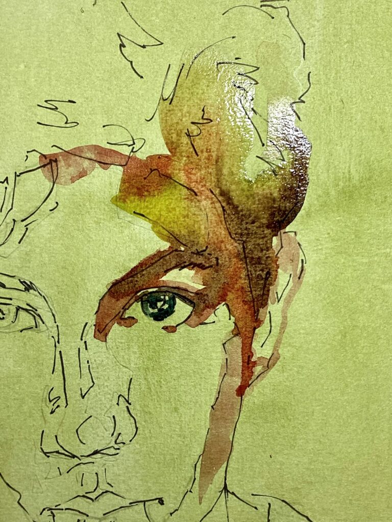
With the washes mixed and ready, the fun begins. Paying close attention to the tonal map of the face and using the paper surface as my midtone, I started to add paint. Colour is irrelevant here; tone is king. Starting on the right eye I note how the dark of the brow joins with the dark of the eyelid, hair and shadow to the side of the face, so painted them as one continuous shape. I worked wet in wet and let the colours merge. You can see the amount of water on the surface by the reflection in the photo. The paint will not be able to flow if it is too dry.
Continuing the right side of the face
I concentrated on connecting different areas of the face, painting shapes rather than individual features, then extended this into the clothing, creating a cohesive composition.

Building the portrait
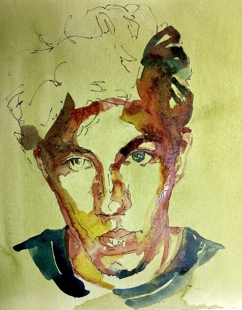
I then worked back up the left side of the face in the same way, before using the same four colours to paint the hair. I was working pretty quickly to avoid unwanted hard edges forming which would stop the colours merging into each other.
Dry and assess
At this point I allowed it to dry and admired some of the lovely water marks which had formed. Watercolour will reward you if you leave it alone.
Adjust
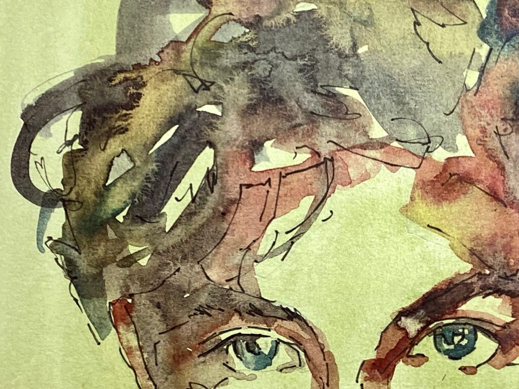
Now it is time for gentle adjustments, such as refining the mouth, softening edges and adding shadows to the eyes. I had to decide what to do about his freckles as I did not want them to look like acne. Erring on the side of caution I added a few using dilute Perylene Maroon.
Regain the light

I used a short, flat, damp brush to gently scrub areas catching the most light, lifting away loosened pigment with a piece of kitchen towel. I focused on the forehead, nose, cheeks, and the whites of the eyes, which are rarely pure white. Even with staining colours, you can achieve a lighter tone. Alternatively, you can add highlights with an opaque white or pastel pencil.
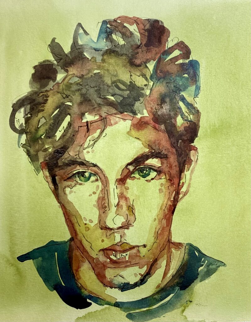
I completed the portrait with a few more pen marks to define features such as tousled hair and his scruffy beard. It is important to maintain the freshness and spontaneity of the portrait, knowing when to stop rather than overworking it.