
How to Read a Daniel Smith Watercolour Colour Chart: Unleashing the Power of Informed Choices
Understanding how to read a colour chart is an essential skill for artists, enabling you to make informed decisions about the colours you want to use in your artwork. In this comprehensive guide, we dive into the art of deciphering a Daniel Smith watercolour colour chart. By learning to read and interpret the valuable information presented on the chart, you can gain the power to select the perfect colours for your artistic vision.
Lightfastness, Staining, Granulation, and Transparency: Key Characteristics Unveiled
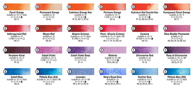
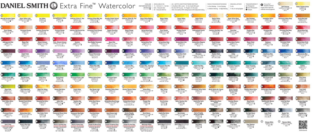
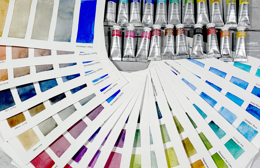
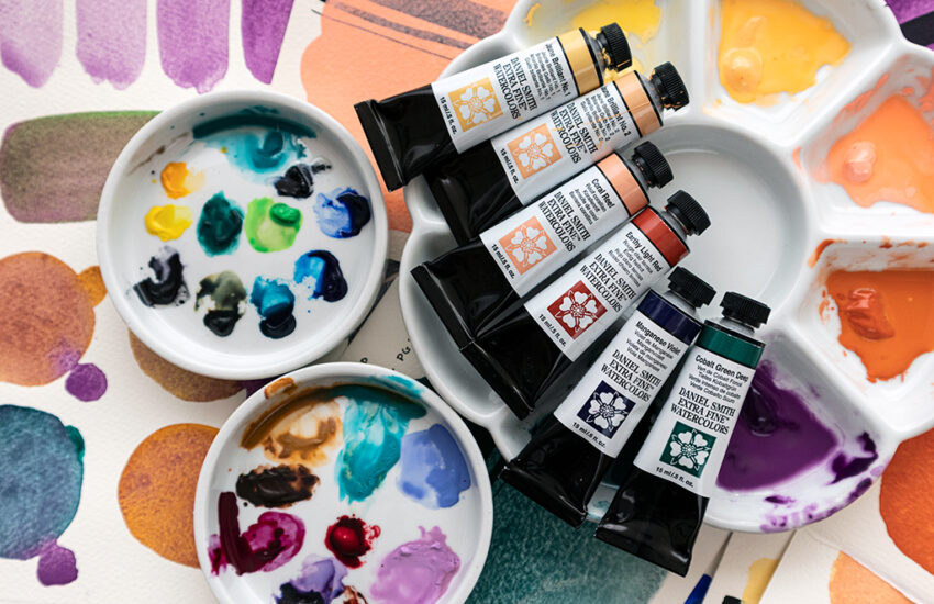
The colour chart provides additional information for every colour in the Daniel Smith range including the Series, the colour name, availability in different formats (such as tubes, sticks, or pans), and the specific pigment designation. The key to deciphering this crucial information is the legend, by referring to the legend, artists can quickly gather essential details about each colour.
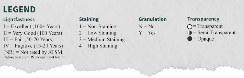
The colour chart also reveals important characteristics of each colour. Lightfastness is indicated by Roman numerals, with higher numbers representing greater lightfastness. Staining is denoted by a scale from one to four, indicating the degree to which a colour will stain the paper. Granulation is represented by the letter “Y” or “N” for ‘yes’ or ‘no’, indicating whether a colour will produce captivating granulation effects. Transparency is indicated by terms such as transparent, semi-transparent, and opaque, letting you see at a glance how transparent a particular colour is.
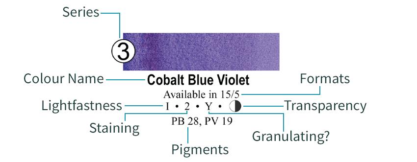
The series number indicates what price that colour is in comparison to the others and will depend on the cost of the pigments in that colour. Daniel Smith paint is split into 5 series, the more expensive the pigment, the higher the series it will be in.
The pigments in each colour are displayed in order with greater quantities coming first. So in the example above, we can see that there is more PB 28 than PV 19.
Analysing Staining and Transparency: Insights into Pigment Behaviour
By examining the staining and transparency attributes of a colour, artists can make more informed decisions about its suitability for their artistic needs. Staining refers to how much a colour adheres to the paper, with non-staining colours being easily lifted, while highly staining colours remain permanent.
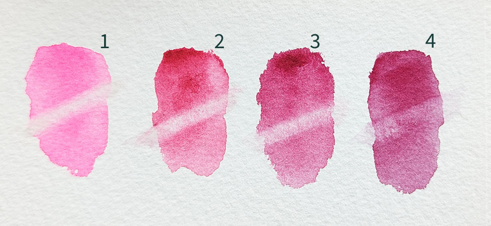
Transparency determines how much light passes through the colour, affecting its layering and glazing potential. Transparent colours allow light to pass through, creating luminous effects and are perfect for glazing techniques, while opaque colours offer more coverage.
Unravelling the Naming Conventions
Colour names on the chart may seem complex, such as Isoindoline or Quinophthalone. However, these names pay homage to the pigments used in the paints. Single-pigment colours often carry their chemical names, while multi-pigment colours can have more creative names.
The Power of Choice: Tailoring Colours to Your Artistic Vision
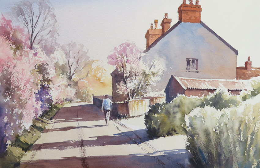
By carefully examining the chart and considering the unique qualities of each colour, artists can select pigments that align with their artistic vision. Whether it’s choosing colours for specific subjects, exploring granulation effects, or creating layered glazes, the colour chart serves as a valuable tool in the decision-making process. For example, if you are painting a car and require a flat even colour, you would not choose a granulating colour. If you wanted to lift areas of paint from a wash on your paper to leave a negative space, you would choose a colour with low staining properties. If you wanted to paint something using a series of glazes, the best way to achieve this is to use transparent colours.

Mastering the art of reading a Daniel Smith watercolour colour chart grants artists an incredible amount of power and control over their artistic choices. Through understanding lightfastness, staining, granulation, and transparency, artists can confidently navigate the vast spectrum of colours available. Armed with this knowledge, artists can effortlessly communicate with art supply store professionals, discuss the qualities they seek, and select colours that bring their artistic visions to life. Embrace the colour chart as your guide and savour the joy of creating art with the perfect palette of Daniel Smith watercolours.
Read the other articles in this 3 post series:


I would advise those intending to purchase Daniel Smith watercolours to watch the video by Kimberley Crick. She conducted an extensive LIGHTFASTNESS test on almost all the colours. Slightly more than 20 colours were found to be problematic, either fading or the colour changing. Colours such as Mayan Blue or Opera Rose should not be used. But the vast majority of colours are safe to use.
How to get a color chart – Extra Fine Watercolors?
Love the colours just wish they were not so expens. i amalways looking for the offers.
Hi Mai. We’re thrilled you’re enjoying these fantastic colours! Daniel Smith watercolours are exceedingly good quality which does reflect in their price. We do strive to keep prices competitive and even offer price matching. Keep an eye on our rotating offers; subscribing to our email newsletter ensures you’ll receive the best deals directly in your inbox!