How to create your own painting with a palette knife
Many of you may have read my previous blogs and teaching videos. Hopefully learning to paint in oil paint or acrylics. But this one I have created for you. To give you the opportunity of creating a painting that you will be proud of with a palette knife.
Since time began, artists have copied others work. Rubens was one of the most prolific, and he began learning to paint by copying earlier Dutch artists work. Do not concern yourself with the not copying dilemma. When painting with a palette knife it is almost impossible to copy someone else’s artwork, your painting will be your painting, created by you.
Materials
Now this important advice, I have travelled the country, giving demonstrations and workshops, and have found that most people do not come prepared with the correct tools, or materials.
Pay attention to buying the correct tools and paints to work with.
Some of the issues I’ve come across are small palettes, not enough paint, paint that has hardened in the tube, palette knives and hardened brushes that are unusable, and incorrect for the painting to be produced.
You must look after your materials and tools, they are expensive, and you will always want to get the best out of them.
Materials for this Tutorial
- Canvas – You will need a canvas or board 500 mm x 400 mm or (16ʺx 12ʺ) stretched and the wedges fitted to tighten the canvas. If you are using board, it must be primed with gesso on both sides. As it will warp if not. If you are using a board purchased from an art shop, this should already be prepared.
- Easel – An easel to rest the canvas on to paint, any type will do. As long as you are comfortable when painting. Make sure your canvas is well secured on your easel before beginning to paint.
- Palette – You need a largish palette for palette knife work, it doesn’t have to be shop bought, you can use a board or a plastic dinner tray, if you use a board, make sure it is sealed, as the paint will dry quicker if it isn’t, and it will make it difficult to use when painting. it wants to be as large as you can manage, so that you can spread and mix your paint before using it on the canvas. And you certainly will need enough paint to produce your painting.
- Paint – For this painting, whether it be oil paint, or acrylics. You will need colours as follows. Titanium White, Flake White, Cadmium Yellow Hue, Cadmium Orange Hue, Cadmium Yellow Dark Hue, Pains Grey, Sap Green, French Ultramarine Blue, Burnt Sienna, Burnt Umber, Viridian Green, Payne’s Grey and Cerulean Blue, and a Purple or Violet to your choice.
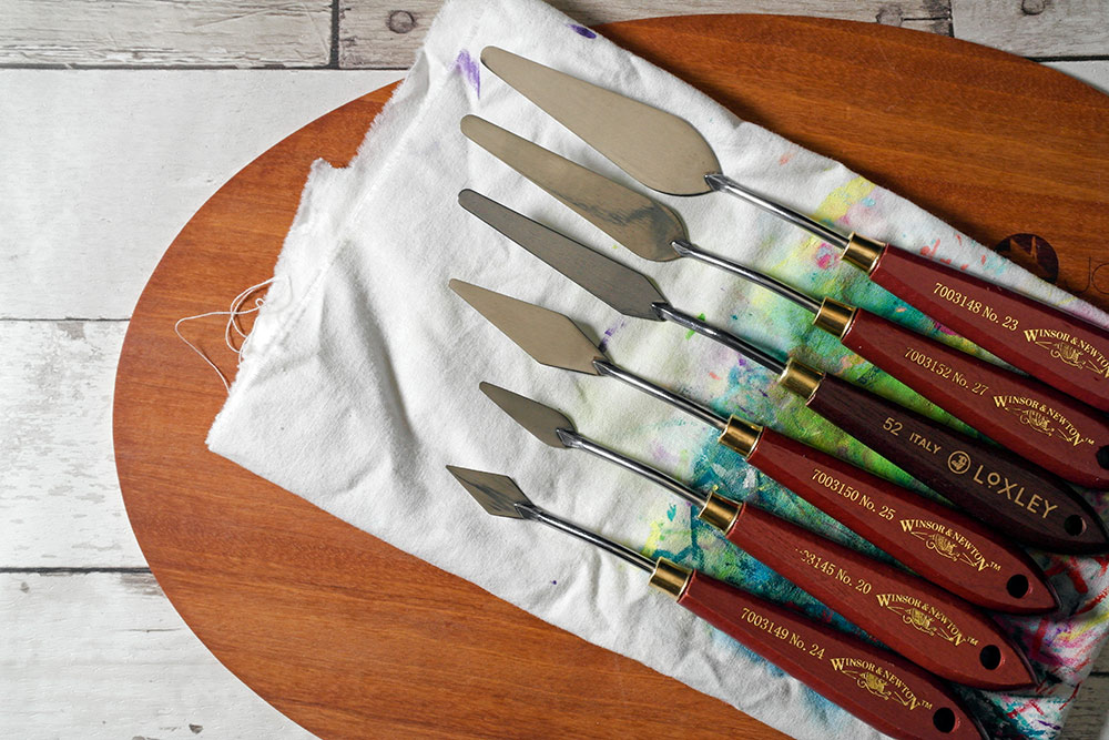
I normally paint with Winsor & Newton Winton oil colours, but you can use any make of your choice, and buy the relevant colours as near as possible to those I have mentioned above be it oil paint or acrylic. - Palette Knives – For this particular painting, you will need a small palette knife, a medium one, and a larger one. All the palette knives need to be comfortable to use, anything similar to those shown below.
Intro
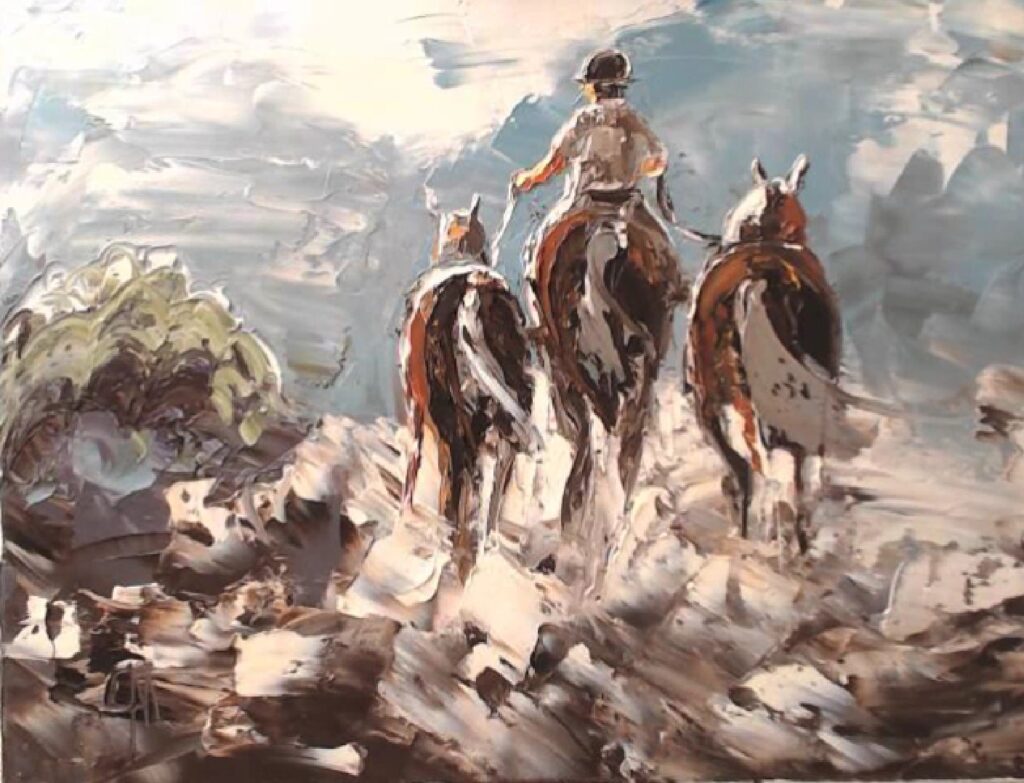
The painting is set in the evening sunshine, with a wind and dust blowing around.
First you have to put in your drawing, it might be best to find a photograph of some horses to give you an idea of relativity, but it is not imperative that you do, if you look at my painting you will see that the figures take up half of the canvas, leaving approximately a quarter at the top and also at the bottom, so it might be an idea to draw some lines in the two positions, where the head of the rider is, and the feet of the horses.
Please understand, palette knife work is a resemblance of the subject that you are painting. It’s abstract work, and doesn’t have to be picture perfect, so relax when you are painting. You may be pleasantly surprised by your skills and your results.
Be Sparing When You Use White Paint
One discipline I would like you to adopt, is avoid putting pure white paint directly into your painting, White, especially Titanium White is your sunshine, and should be the brightest colour in your palette, adding a tiny amount of Payne’s Grey colour to white will dull it slightly, and when you lay it on the canvas, it will show as white, but not bright white.
White Deadens Some Colours When Mixing
This still leaves room for a brighter colour, white deadens colours, and makes them slightly opaque, and in many cases spoils there vibrance.
It’s not always white you need use to lighten a colour, look for a lighter colour of the same family to add to your colour.
The Sky
Ok so first we create the sky. Mixing the bright sky colour is achieved by using the paint colours Flake White and Cadmium Yellow Pale Hue. Firstly, squeeze paint onto your palette, keeping them far apart, so that the colours don’t mix before you want them too. Then add a little (not too much) of the Cadmium Yellow Hue, then mix well together, until it becomes a lovely creamy mix. Try and avoid any of the paint not mixing together. Mix until you are satisfied with the colour, as per the video above. Then add it to your canvas. Being bold and lay it all over the top part of the canvas. But not too thick!
Mixing the Grey for the Sky
Use whatever palette knife you are comfortable for this stage. I adapted mine from a Kitchen Cake spatula, it was very pliant and bendy. Which is what you need when palette knife painting. Although watch out, many are not.
The first colour is Payne’s Grey, just mix it with the Flake white. Then bring it to a consistency similar to mixing the cream sky as before. Do try and keep the colour a little dark, as per my painting.
Blue/Green Colour for the Sky
If you look at the completed painting at the beginning of the tutorial, you’ll notice the sky is a green / blue / grey. To get to this colour, you add small amounts to your taste of Viridian Green, Flake White, Cerulean Blue, Payne’s Grey, and a little French Ultramarine together as shown in the video demonstration below.
Mixing the Green Blue Colour
Once you have added the grey. Add the green blue grey mix. It’s worth noting that there is no set method. Just be bold and slap it on all over.
If when you are laying on the paint, something happens that looks good. LEAVE IT.
Now add a little more Payne’s grey to the green mix and apply it to the bottom of the sky. Again, no set pattern, just slap it on all over.
Next take a little of the left over creamy white mix that you used in the beginning. Apply it as I have done in my video above. I have left the video in normal speed for you to study, you may find it a little long. But stick with it, as it is very important for you to study the video and get your sky to your satisfaction. This determines what the finished painting turn out like. But it also foretells the excitement that is to come when you begin to add the figures.
Mix until you are happy with your colour. When you look out of your window, the sky is ever changing, and the colour you mix is your sky. Don’t use to much paint to mix in the beginning. Just mix small amounts to find the preferred colour. Then step it up to the amount you need. Adjusting your mix as you have done with the small amount.
Now enjoy the video above, observation is the word, and you can stop and start at any time.
Laying in the ground colour
The ground colour is just burnt umber, again just slap it on as shown in my video below.
Very near the end, you add a little of the creamy sky mix, just to denote the ground cover.
Horseman
Then you begin to enter the horseman, take it slowly, as mistakes now will be costly to the finished painting. I don’t normally draw in my figures at this stage. As I refer back in my mind to my original drawing. I have drawn them in for you, to give you the confidence of painting the figures, as you will be able to follow your drawing along with my video.
Technique is so important at this stage. I want you to digest the technique I am using in my video. You will see that I am working on the body of the rider. Watch it many times to digest the technique, of projecting movement!
Even the slightest difference of the position of the body, related to the arm, will give an impression of movement. Paint it in incorrectly, and it will remove the feeling of movement.
How to know when you have got it right? I use a feeling within me to gauge when I have got it right. I resemble it to when you hear a musical song that turns your attention. And you get that little feeling within, saying, ‘HEY THAT’S A GOOD TUNE’ that’s what I want you to feel.
When you think you have got the position right to create movement, look at your painting again and again, and if you feel that it’s not quite there, change it. You can always change again.
Angle of Sunshine
It is important at this stage. To know where your sunshine is coming from. And as a result of that, I would like you to define your highlights. To depict your sunshine.
Colour of the Riders Body
Note in the video, that I have now made the rider’s body darker, and just a little lighter, on the left-hand side. Because subsequently, that is where the sunshine is coming from. Therefore I want you to do the same. Enable yourself to make the highlights to shine brighter when you add them to the rider and painting.
The Brightest Colour in Your Palette
Above all this is most important. Titanium White mixed with your Indian Yellow, is your sunshine colour. The brightest colour in your palette. Your painting should always be darker than this white. For this painting, you should lean a little more to the white. To keep the highlights strong. and always remember, that you should try to avoid putting white directly from the tube onto the canvas. Just add a little Paynes Grey to dull it down, (not too much) it will always still look white.
Scraping Technique by Using the Side of the Palette Knife
Use the scraping technique to shape the body or parts of your subject. Therefore, enhancing the form. Most importantly, scrape gently with the side of the palette knife. You should try to perfect this action with all your palette knives. It’s a great help, when you wish to change a shape, or just get rid of a mistake.
Depicting Movement
Movement is important! Above all. You must always stand back and look at your rider. After that, even a little tweak to his riding position. Will give more feeling to movement.
You are now entering a little darker colour to define the saddle, add a little Burnt Umber with just a little more Burnt Sienna to lighten, then add it to depict the saddle, just behind the rider. Now commence the beginning of the Horses rear. Which is painted in Burnt Umber.
Painting in the Horses, and the Blowing Dust
Always remember, that it’s an abstract painting. Your actions with the palette knife need to be loose, as you enter in the blowing dust. When you load the paint, be bold, don’t worry about perfection, it will look good, especially if you lay the paint on with enjoyment.
The Horses
The horses’ rears are laid in with Burnt Umber. Then add a little Burnt Sienna, to give form to the muscles. Subtle differences in colour, give the shape, and although the painting is of a rough genre, I would still like you to understand that we wish to avoid the painting looking flat. So try to change the colours a little on the Horses rear, to give them roundness.
The Horse on the Right
The Horses Ears and Forehead
If you own a horse or ride, you will be able to identify with the following text. Although adding the ears look a simple task. You need to understand a little of the horse’s anatomy. A horses’ ears are his defence to detect danger, as he will hear something behind him, long before he sees it. The position you paint them in, will define his mood. Horses can turn their ears into amazing positions, they are never still, always listening. Pointing forward he is alert and interested, pointing backwards, he is angry. If you paint them in too large, they will make him or her look like a mule, so do try to understand, that his ears are the most important faculty he has. They will make your painting.
Also note the shape of his forehead in my video, its subtle, but again it shows which way the horse is looking.
Highlights to the Ears
Your highlights will certainly define which way the horse is looking. The forehead is entered in with Burnt Sienna. Just a touch, although small, it is an important part of the painting, as it will define the mood of the horse, as he has no rider. He needs to look calm, your highlights to the ears will define which way the sunshine is coming from. His ears show that the horse is alert, as they are upright and pointing a little forward.
The Lead Rein Attached to the Riders Hand
First, I would like you to complete the highlights to the side of the horse. As this creates more interest to you, the artist, painting the picture, as it is now beginning to all come together. You will note that in my final photograph of my painting. The reins look loose, as they are attached to a calm horse. I would like you to paint them in looking loose. As if they are tight, as I first entered them, it would make the horse look stressed.
The Horse on the Left
The left-hand horse, is quite simple. Use just a little Cadmium Yellow to depict the head and sunshine. And again, add a little Burnt Sienna to depict his forehead. Then it’s just laying paint on the horses where you think it would help your painting.
The Blowing Dust
It’s very important that you enter the dust when the horses’ rears are still wet paint. Mix a little Indian Yellow, with White, any White will suffice. Then add a little Payne’s Grey. Then daub it on as I have shown in the video. Use the side of your palette knife to scrape the paint in, and it will mix with the paint on the horses’ rumps to produce a hue that will look like blowing dust to the viewer. Try to be bold with your strokes, and take the dust up the horse’s rump, to enable you to paint their tails in later.
The Final Flourish to the Completed Painting
The majority of this stage is fine tuning. You will need to be observant, and look at the video a few times. First fine tune the dust to your satisfaction. Never forgetting that this is your painting and should not be a copy of mine. It’s just a resemblance, and anything you wish to enter is ok by me.
Then it’s onto the highlights, extending the horse legs to show through the dust, then entering the tails, with a bold sweep with your chosen knife. The colour can be of your choice. You can have a brown or black or grey tail or another colour as you wish.
The bush can be a tree if you wish and enjoy adding the highlights.
I hope you have enjoyed the journey of painting ‘At The End Of The Day’ with a palette knife.